Sector
Childrenswear
Position
Brand designer
Year
2024
Scope
Brand identity, packaging, art direction, brand guidelines
Overview
A full brand identity for a sustainable childrenswear label, covering everything from the mark to the care label. I led the design at Branxl Design, working with two other designers who supported the research and the design process.
The challenge
Childrenswear splits into two camps and both of them converge. The expressive end runs on bright primaries and illustrated motifs, but on conventional cotton. The sustainable end has the fibre credentials and answers with restraint, minimal palettes and quiet gender neutral basics. A parent looking for both has to give one of them up. The brief was to build a brand that did not ask them to.
Process
The work ran in four stages: research, concept development, design execution, and presentation. Research established where a sustainable childrenswear label could sit in a category where almost everything looks alike. Concept development produced the mark and the lockup system. Execution built the colour, type, pattern and artwork the brand runs on, and presentation covered showing it applied and handing over the guidelines.
The decision that shaped everything was made early. Rather than putting the personality into the logo, where the category expects it, I moved it into the art direction and the palette. That let the mark stay quiet enough to sit on a garment label at a few millimetres tall, while the wider system carried the warmth.
Research
We analysed the childrenswear market to find where a sustainable label could sit, running competitor research, audience analysis and client interviews. I synthesised the findings into the direction the project would take.
What the category was doing
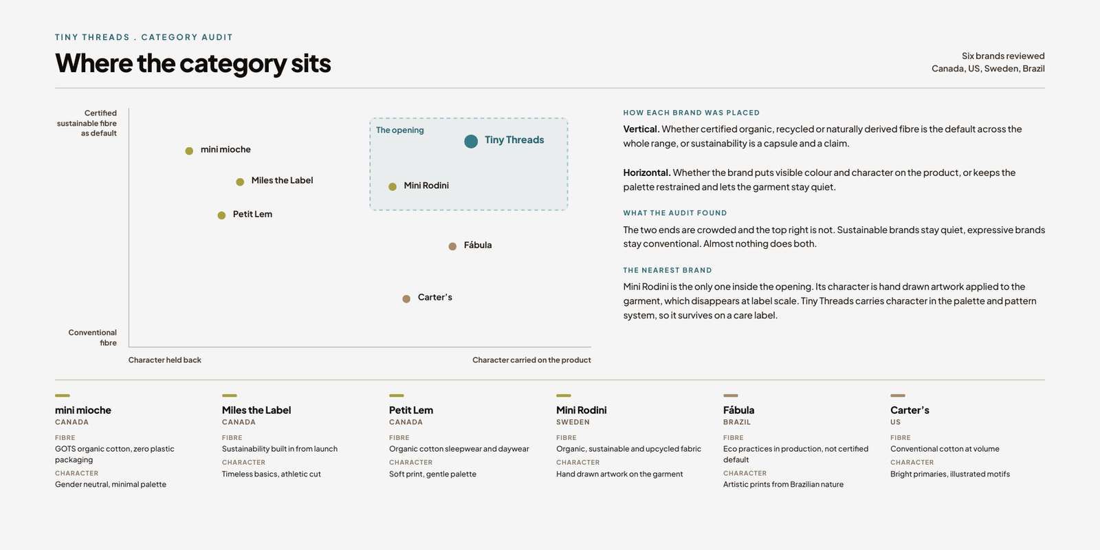
The pattern was consistent enough to be useful. Bright primaries, rounded sans serifs, illustrated animals, and on the sustainable end, muted greens and unbleached card. Almost nothing sat between those two positions. That gap was the opening: a brand that felt considered and natural in its materials but still had colour and character on the garment.
Who it was for
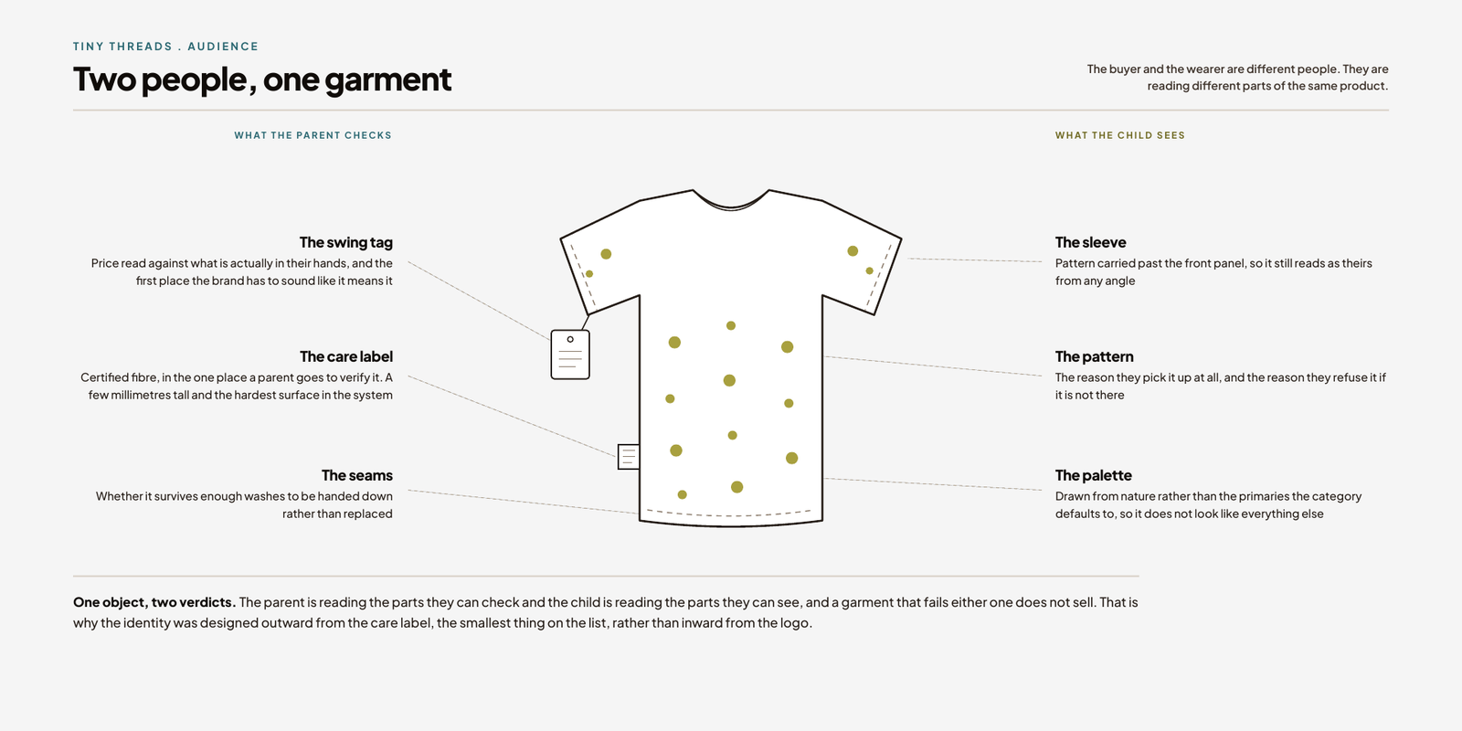
The buyer and the wearer are different people, which is the defining fact of this category. A parent is deciding on quality, values and price. A child is responding to colour and character, and will refuse an item they do not like regardless of how ethically it was made. I distilled the client interviews and the research into a direction that had to satisfy both, with sustainability, comfort and whimsy as the three anchors.
Concept development
I explored the visual language through mood boards, typeface studies and early logo iterations, testing how far the identity could move from the category norm while still reading as childrenswear.
Building the mark
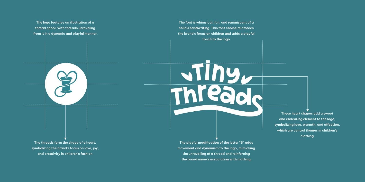
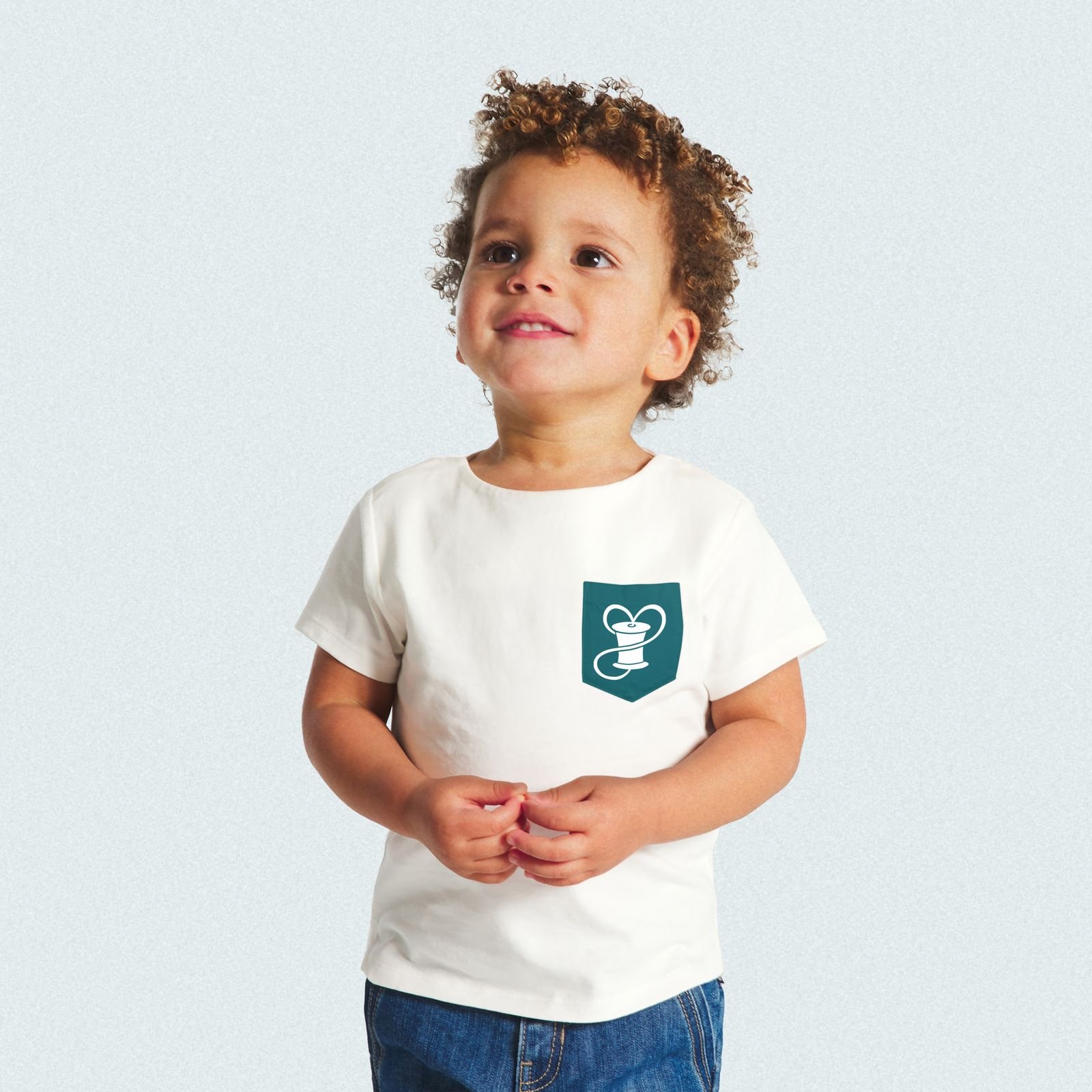
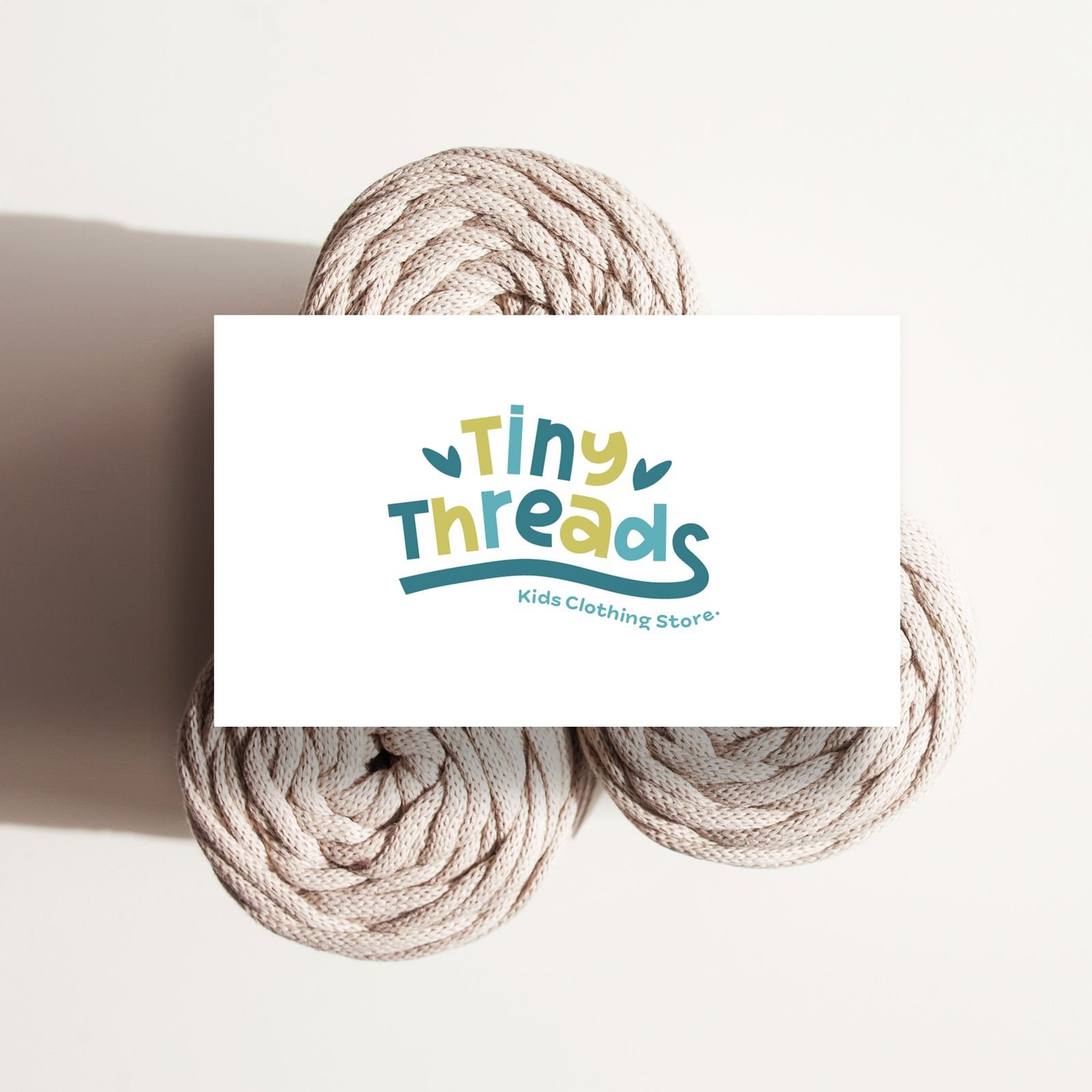
The mark is a thread spool with the thread unravelling into a heart. The lettering is drawn to read as a child's handwriting, and the S is modified to carry movement, echoing the thread. It says clothing and it says warmth without needing an illustrated character to do either. It also had to survive embroidery on a garment and a single colour stamp on a box, which ruled out fine detail from the start.
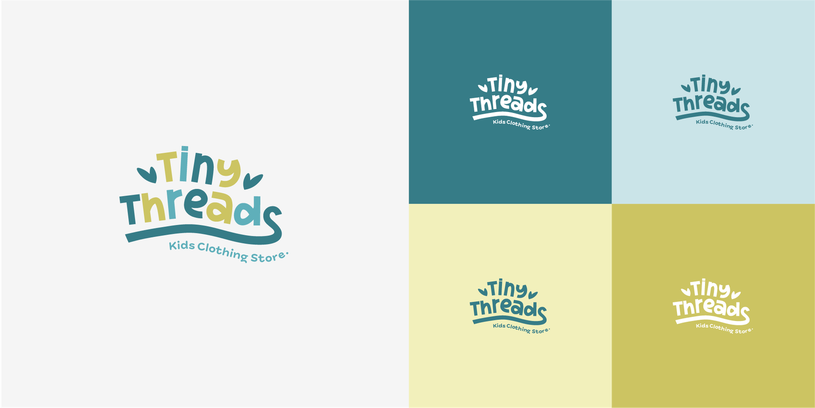
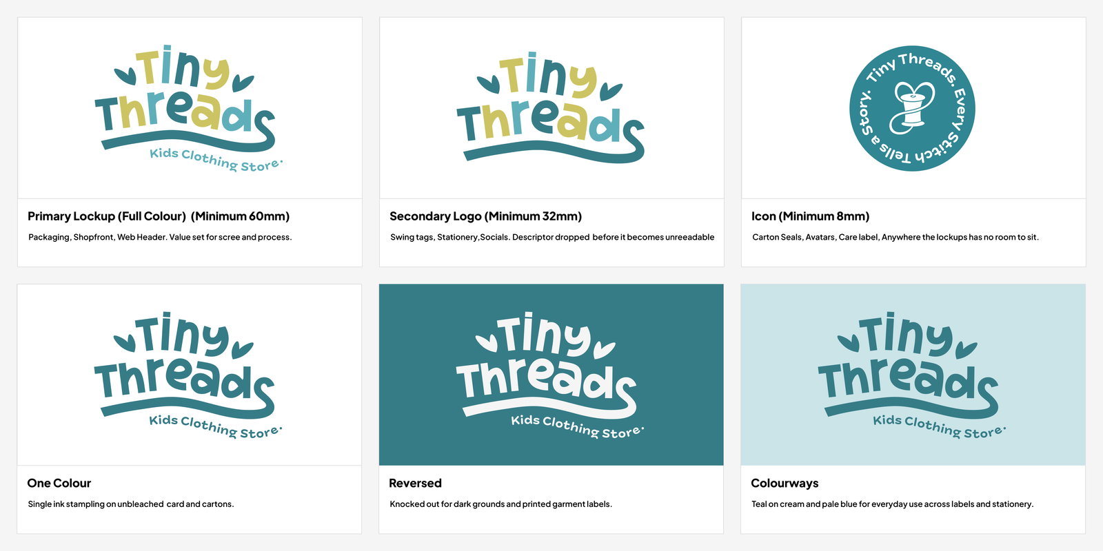
From it I built a responsive logo system: a primary logo with descriptor, a secondary lockup that drops the descriptor for tighter spaces, a circular stamp carrying the brand line, and a standalone icon for the smallest applications. Each version was tested on light and dark grounds and across the full palette.
Design execution
With the direction agreed, this stage was about building the assets the brand would actually run on, so that anyone applying it later had a complete set to work from rather than a logo and a hope.
Colour and type
The palette is drawn from nature rather than the primaries the category defaults to: deep teal, warm ochre and soft olive. It supports the sustainability story without the muted greens that make eco brands read as worthy rather than warm. I set colour values for print and screen, and defined a type hierarchy pairing the drawn brand lettering with a clean secondary face for body copy, so the handwriting stays a brand signal rather than something a customer has to read a paragraph of.
Pattern and icon library
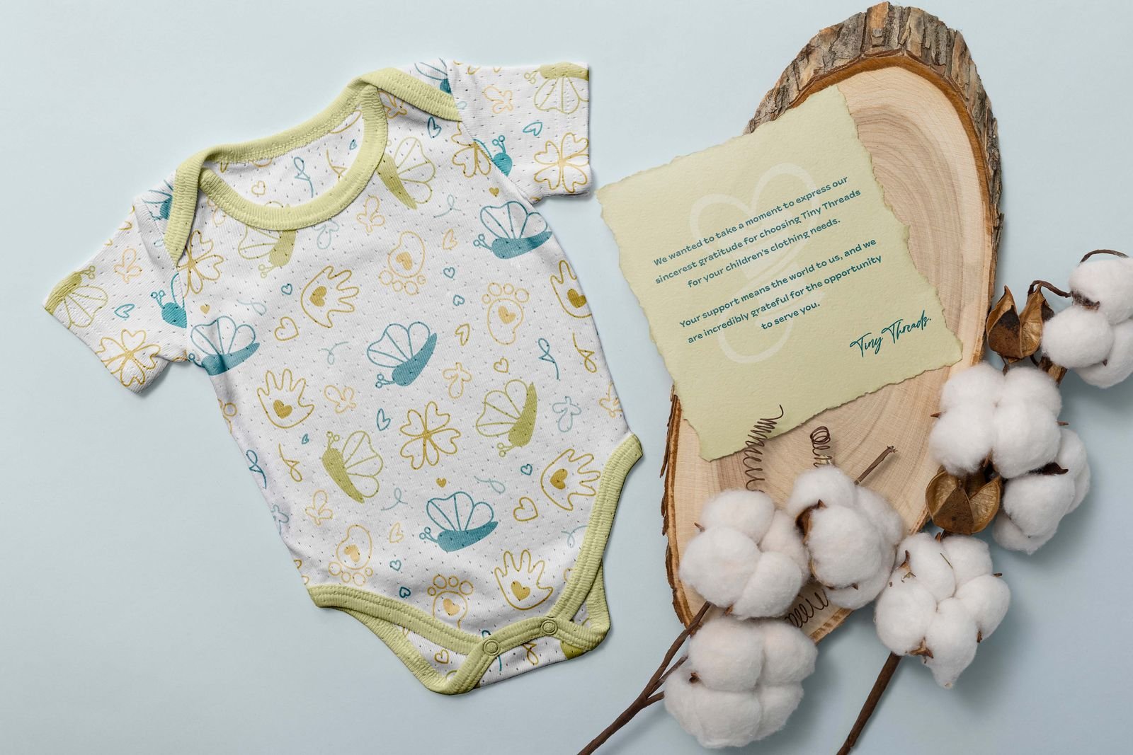
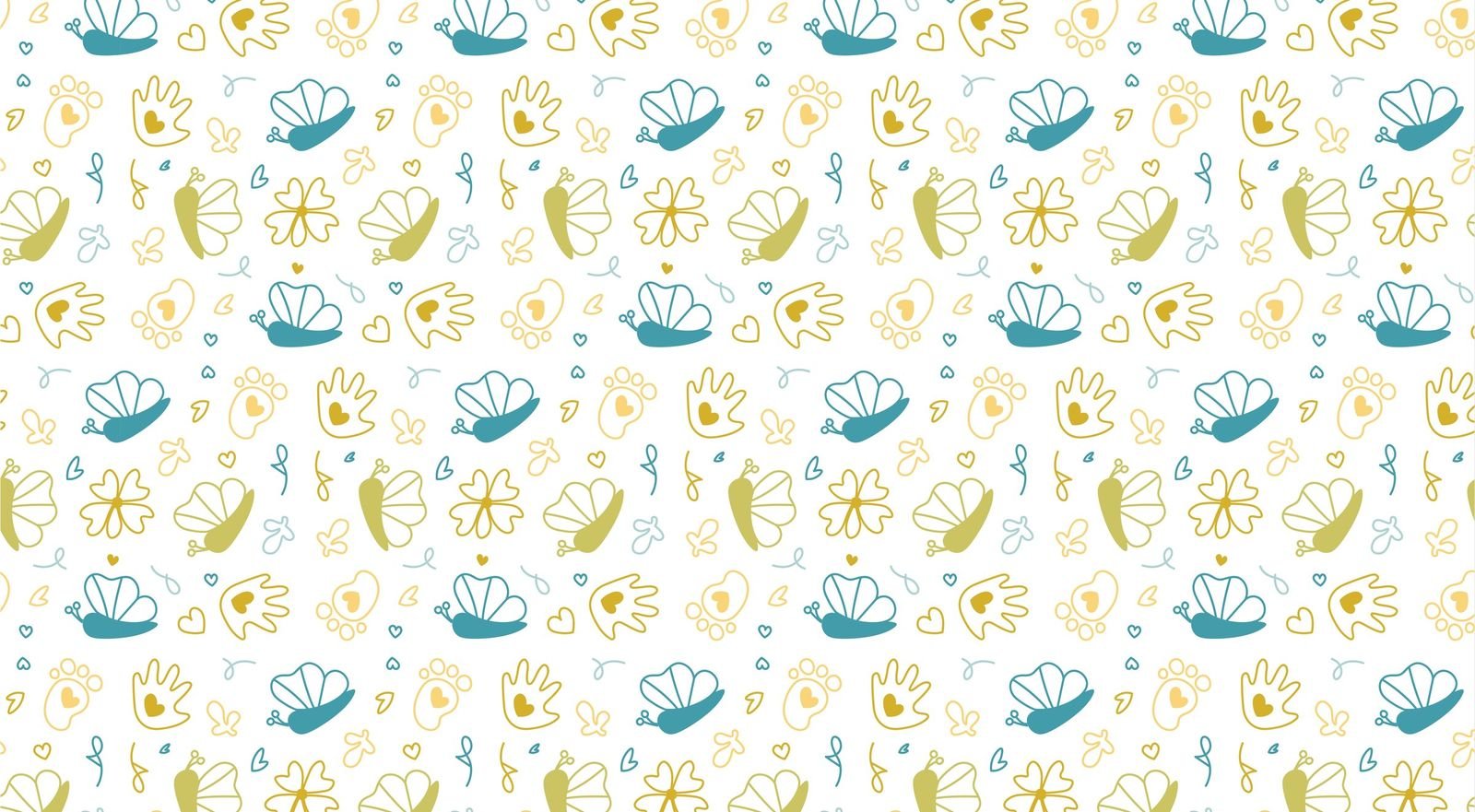
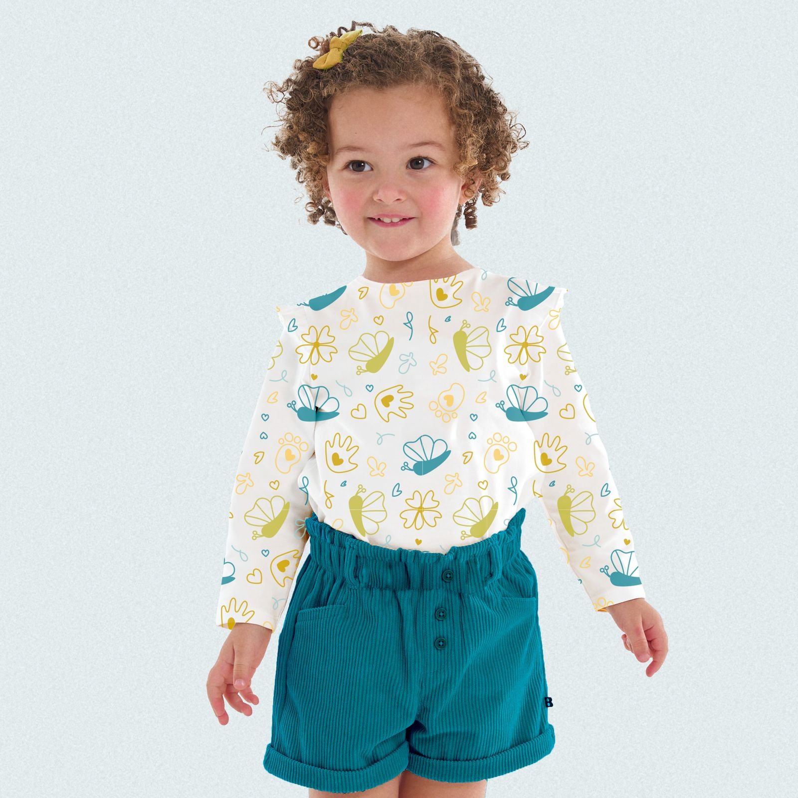
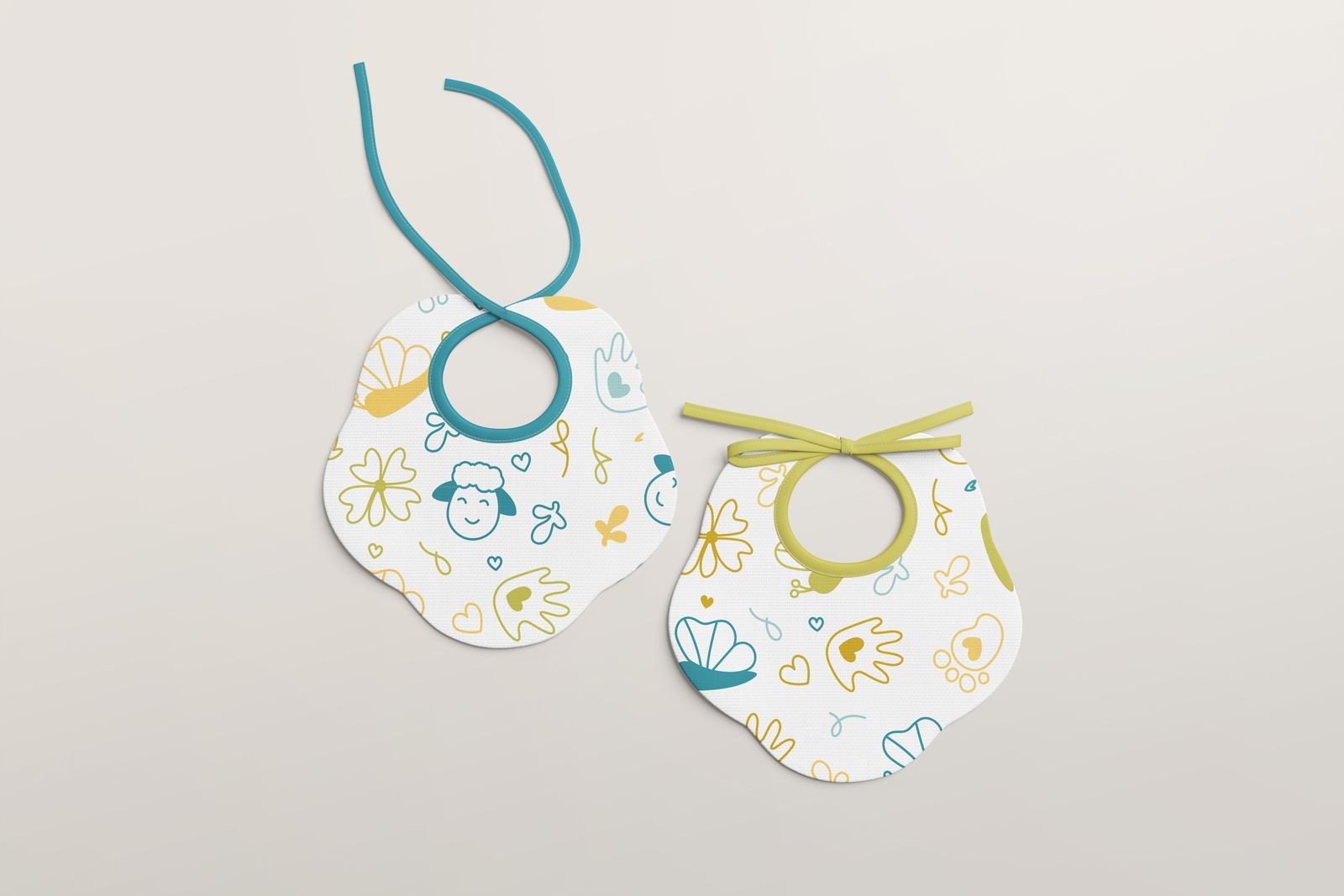
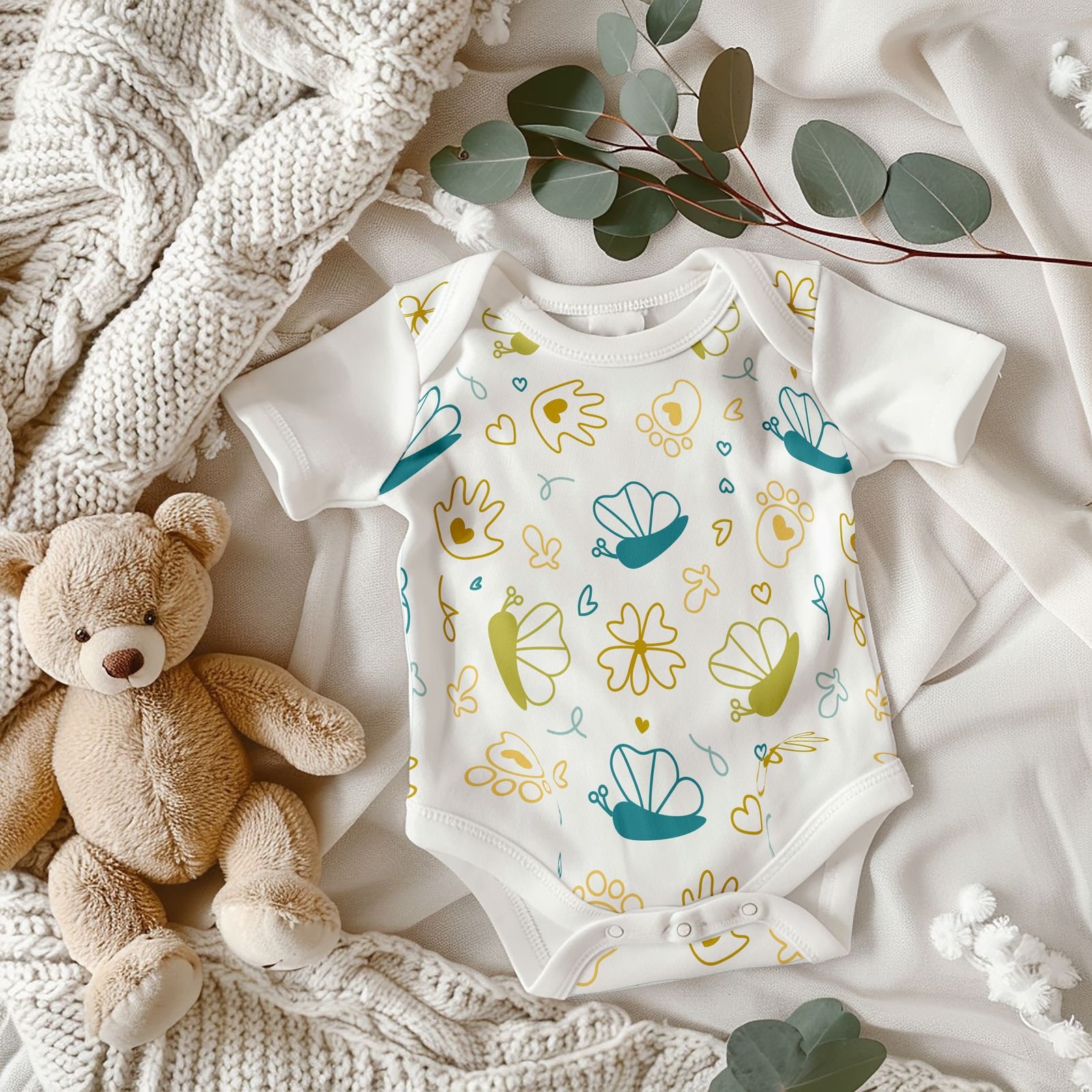
I drew an icon set of butterflies, hands, footprints and flowers, then built it into a repeating pattern that tiles cleanly at any scale. This is the element that carries the playfulness the logo deliberately gives up, and it does the most work across the applied brand: dense on a garment print, sparse on packaging, cropped to a single motif on a care label. Building it as a library rather than a fixed artwork meant it could be applied at any size without redrawing.
Artwork production
Every element was prepared as production ready artwork: vector files at the sizes each application needed, colour separated for print where the process required it, and the mark supplied in single colour versions for embroidery and stamping.
Presentation and refinement
I presented the identity to the client applied across the surfaces it would actually appear on, rather than as artwork on a page, then refined the work against their feedback.
Showing it in place matters with a founder led brand, because the questions are rarely about taste. They are about whether the identity will hold up on a product they have to manufacture and sell.
The identity applied
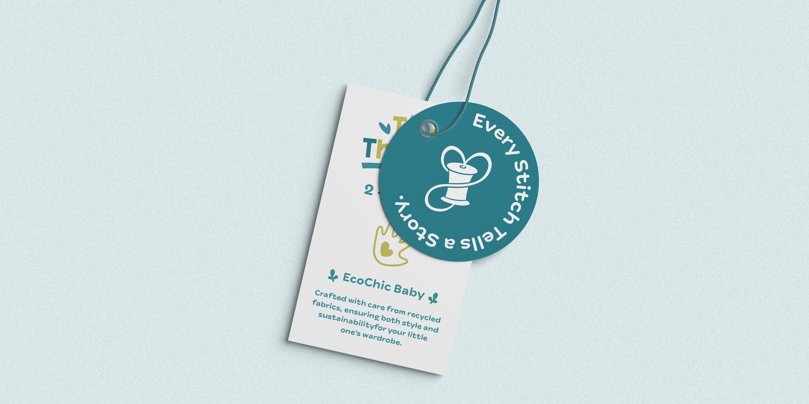
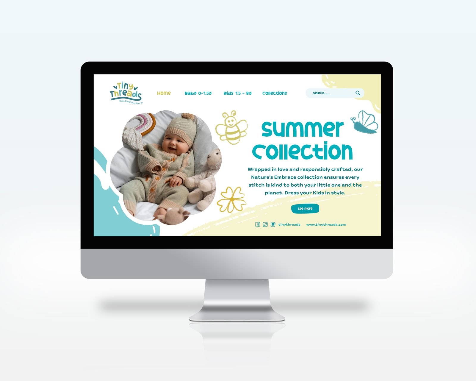
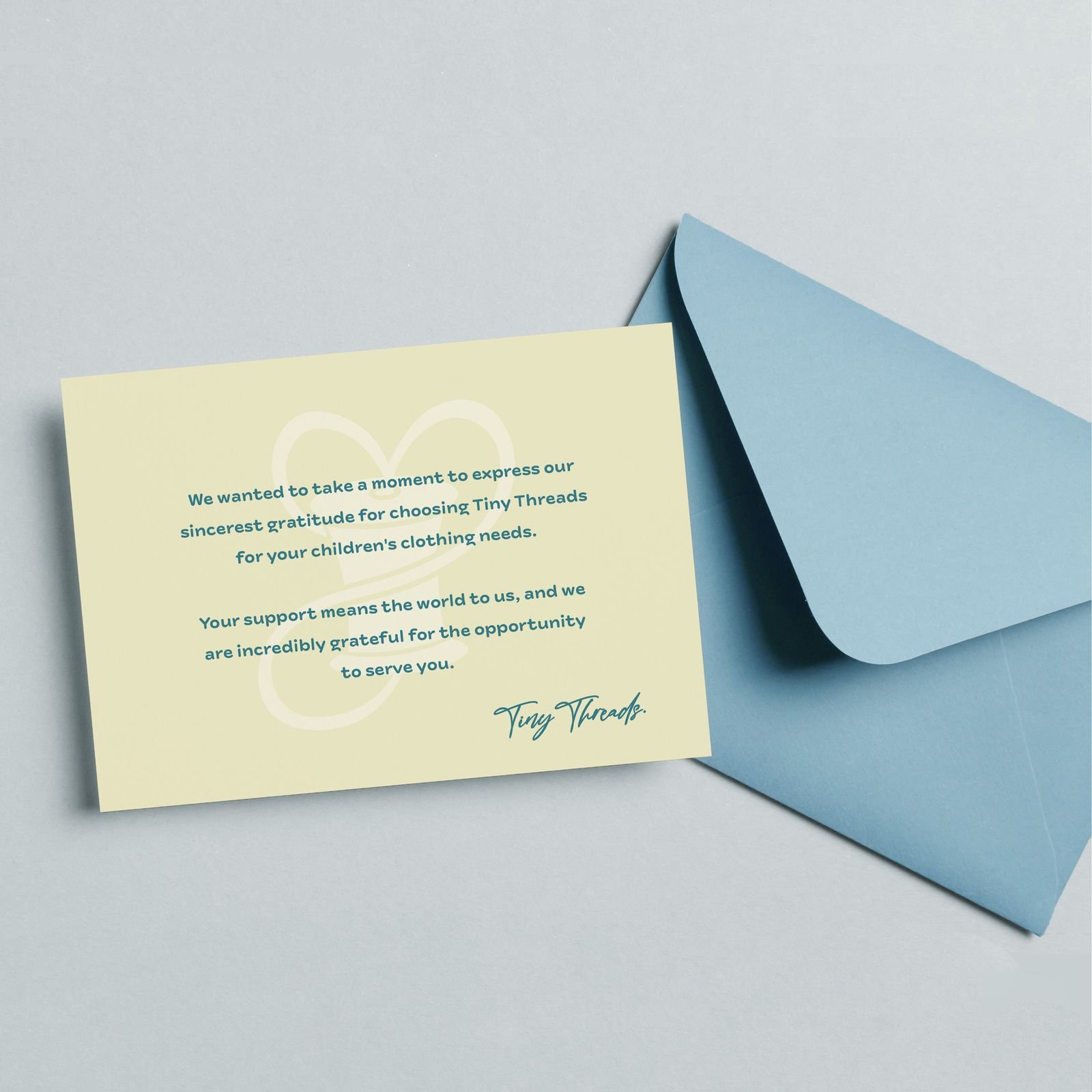
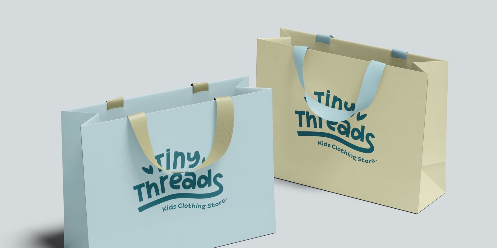
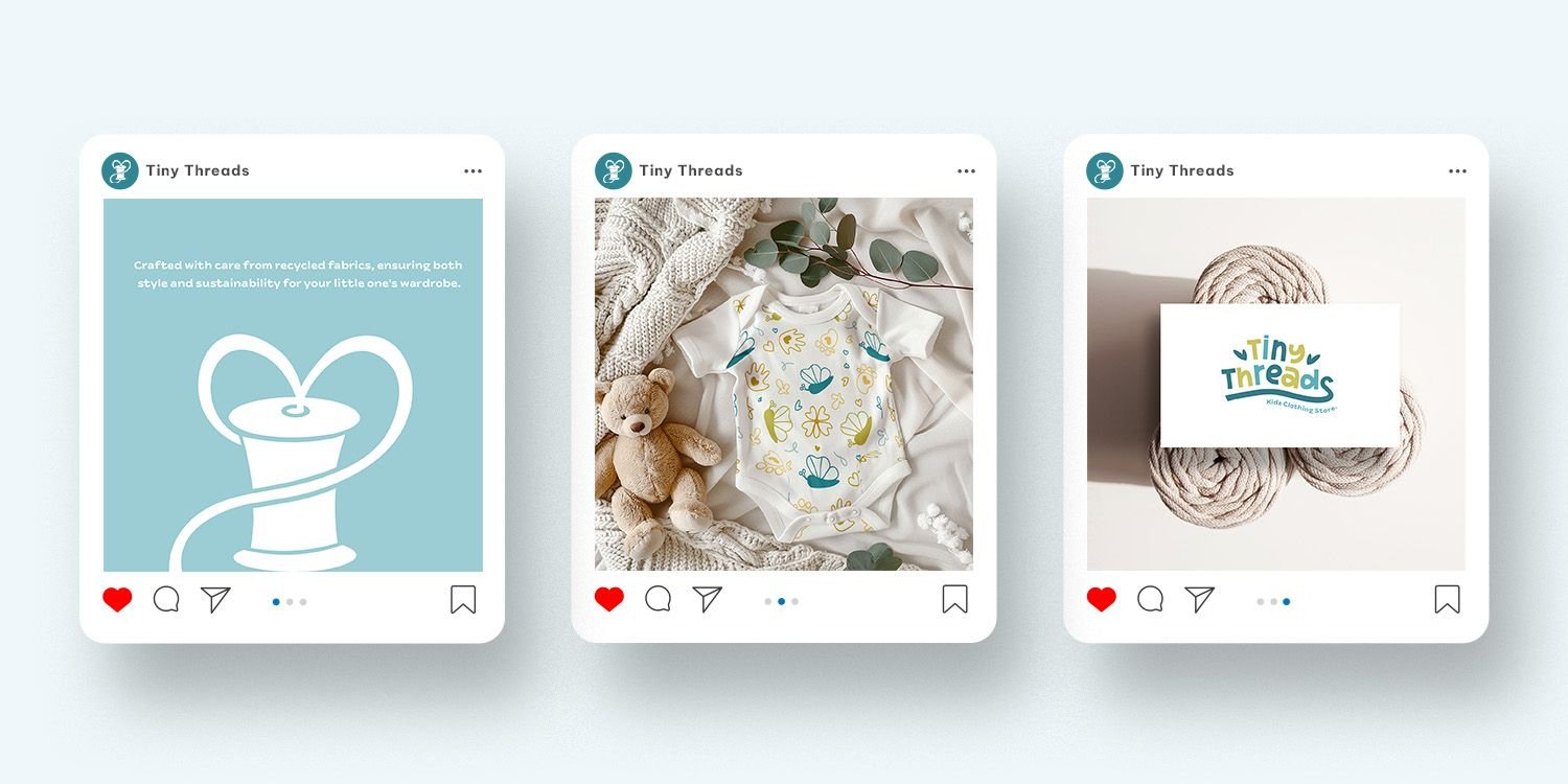
The system holds because the mark stays constant while the pattern varies in scale and the palette shifts between pieces, so the range has variety without any item looking like a different brand. The swing tag was the hardest application: a tag and a care label are small enough that most of what works on a mood board disappears.
Outcome
Delivered as a complete identity: primary and secondary logos, an icon, a stamp, the illustrated pattern, the colour and type system, packaging, swing tags and care labels, garment prints, stationery, social templates and a website design, all documented in a brand guide.
The client signed the work off and the identity went into production across the range. The part that mattered most was that it held at the smallest application. A care label a few millimetres tall is where most identities fall apart, and designing outward from that constraint meant nothing had to be reworked when the range grew.
Building it as a system rather than a set of files also means the label can add a new product without a designer. The pattern, the palette and the lockups cover what a new item needs, which for a small business is the difference between a brand that lasts and one that drifts.
What I took from it
Designing from the smallest application outward was the thing that made this work. Starting at the care label rather than the letterhead forced every decision to survive the hardest condition first, and everything scaled up without rework. I now begin identity projects by asking where the mark appears at its smallest, before drawing anything.