Sector
Education
Position
Lead designer
Launched
October 2025
Scope
Brand architecture, identity, applied brand, and product design across three connected products: student portal, instructor tools and admissions CRM
Overview
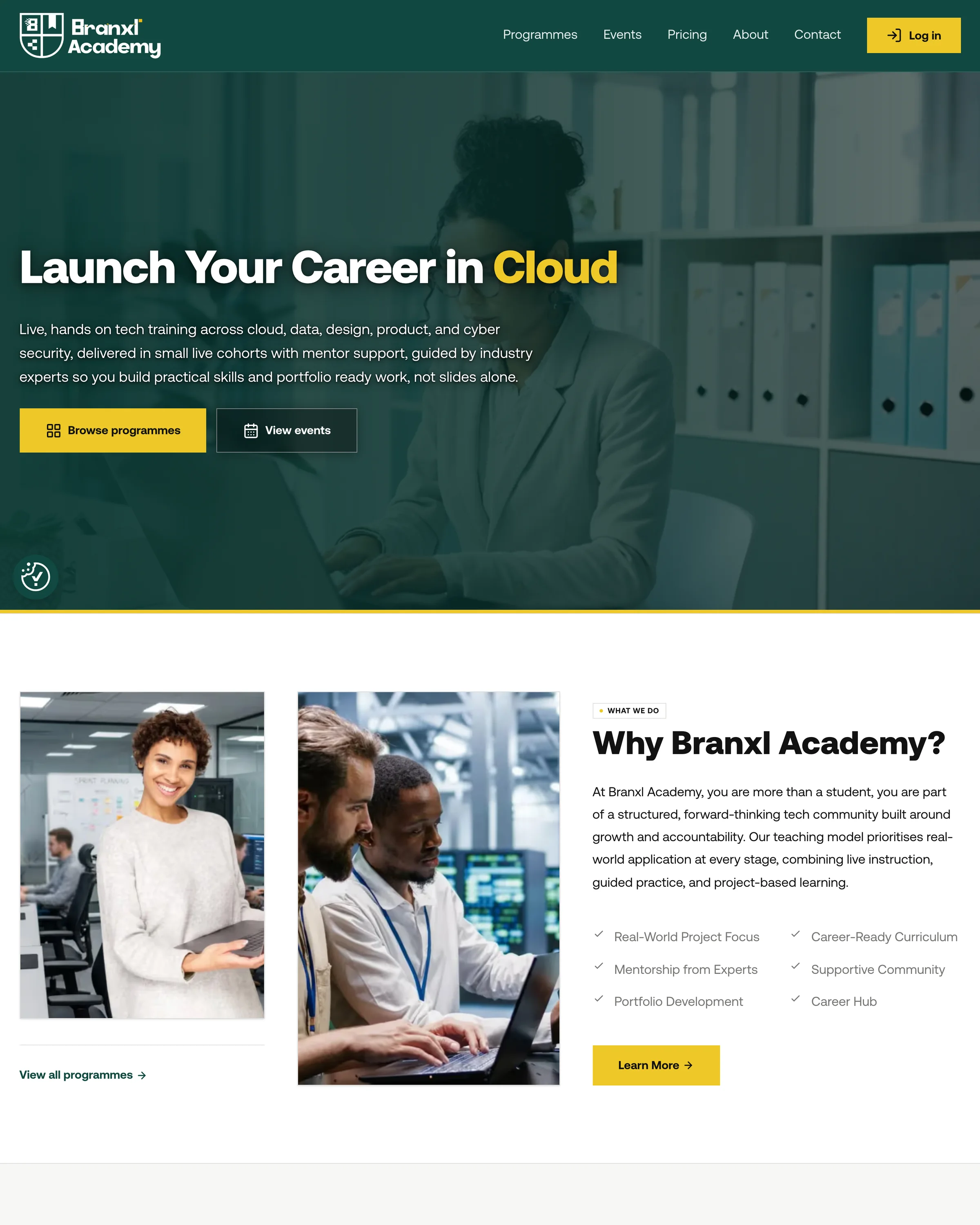
Branxl Academy is a creative and tech education platform launched by Branxl Design. There was no name, no identity and no product when it started. Scope ran from naming and brand architecture through the applied identity to the platform itself. I led the design and designed the platform, with a graphic designer and a motion designer alongside me on the applied brand and campaign material, and a development team of three building it.
The challenge
The studio already had an identity, and the academy needed its own. Those two things pull against each other. Too close to the parent and the academy reads as a side project rather than a place you would pay to study. Too far and it loses the credibility of the studio behind it, which for a new education brand is the only credibility it has.
The second problem was scope against date. The academy had a fixed launch, no existing audience to test against, and a platform to design alongside the identity.
Process
The work ran in four stages: research, brand architecture, identity system and product design. The last stage was the largest, because the academy is not a brochure site. Research established who the academy was for and what would make someone choose it. Brand architecture resolved how it should relate to the studio, which was the decision everything else depended on. The identity system built the colour, type and applied brand. Product design covered the marketing site, the enrolment flow, and the three portals the academy runs on afterwards.
The order mattered. The relationship to the parent brand had to be settled before anything was drawn, because it determines every decision that follows.
Research
Branxl Academy began as a response to demand the studio was already receiving. Our founder holds a masters in computer science and mentors alongside running the studio, and was asked consistently how to get into tech and whether we taught. I ran the audience and market research to establish who was asking, what they had already tried, and what would make them choose us over the alternatives, then wrote the brief from it.
The Survey
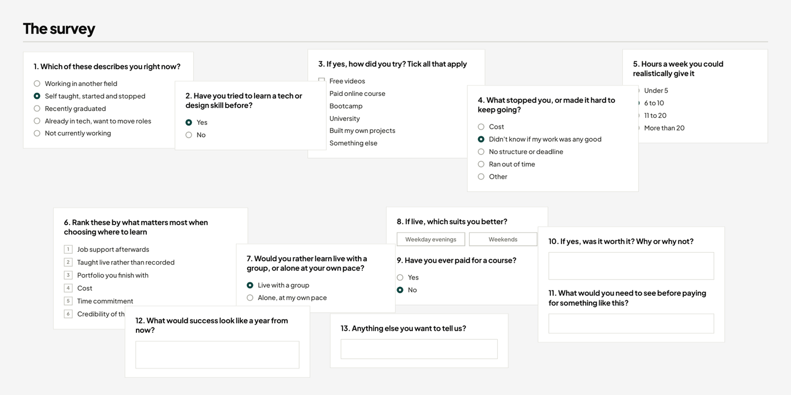
Thirteen questions, about four minutes, distributed through tech communities and paid social rather than our own channels so the findings reflected the wider audience rather than the one we already had. 147 responses over three weeks, then twelve follow up calls with people who agreed to talk. Alongside that I signed up to nine competing routes and used them where I could.
The question that did most of the work asked people to rank six things when choosing where to learn. We had assumed the certificate would rank near the top. It came sixth of six, behind job support, live teaching, the portfolio you finish with, cost and time. That single result moved accreditation off the front of the messaging and put the finished portfolio there instead.
What came back
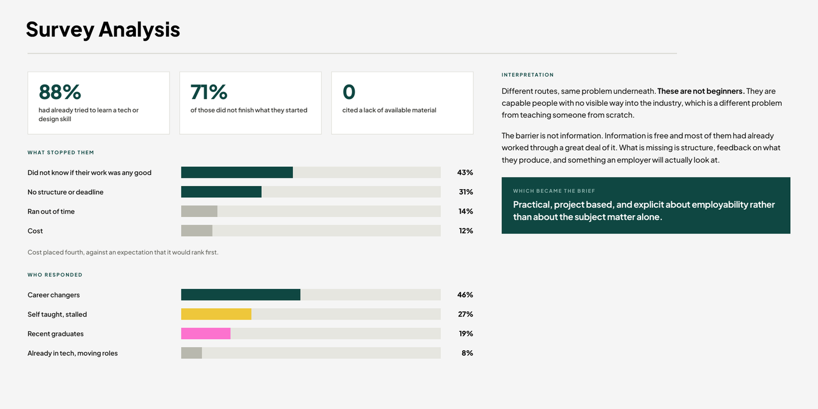
147 responses over three weeks, distributed through tech communities and paid social rather than the studio's own channels, followed by twelve interviews with respondents who agreed to talk.
Prior experience. 88% of respondents had already attempted to learn a tech or design skill before taking the survey. Of those, 71% did not finish what they started. No respondent attributed this to a lack of available material.
Reasons for stopping. Asked to select the main reason, 43% chose not knowing whether their work was any good. Absence of structure or deadline followed at 31%. Cost placed fourth at 12%, against an expectation that it would rank first or second.
Respondent profile. Career changers accounted for 46% of responses, self taught learners who had stalled 27%, and recent graduates 19%. The remaining 8% were already working in tech and looking to move roles.
What the brand had to say
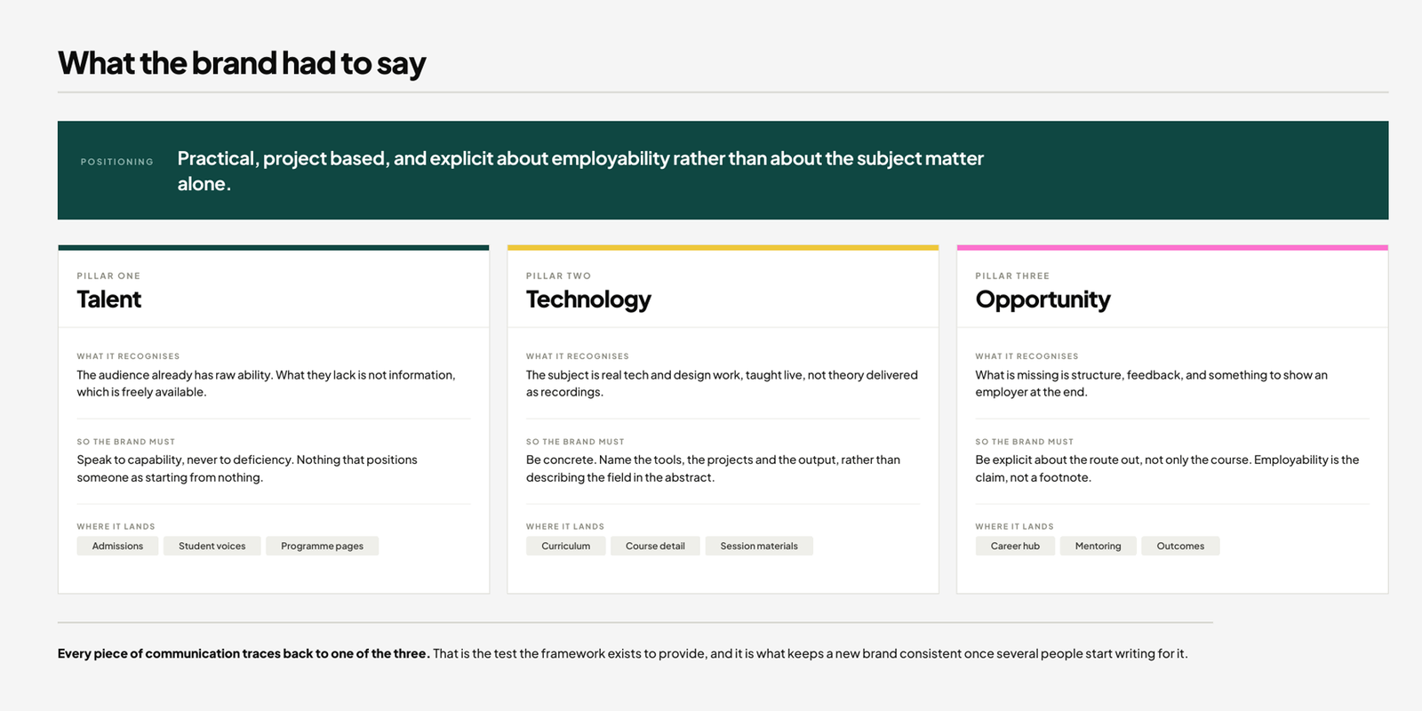
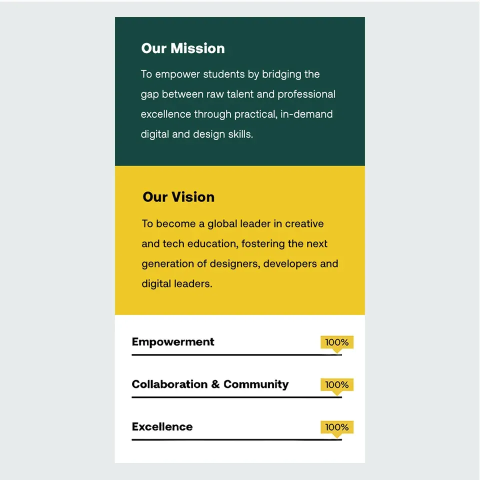
From the research I wrote the positioning and messaging framework the brand runs on, built around talent, technology and opportunity. Each one comes out of a specific finding. Talent, because they arrive capable and the brand should never talk down. Technology, because the gap is practical taught work rather than more material to read. Opportunity, because job support ranked first and nothing else in the market serves it properly.
Every piece of communication traces back to one of the three. That is the test the framework exists to provide, and it is what keeps a new brand consistent once several people start writing for it.
Brand architecture
This was the decision the whole project turned on: how far the academy should sit from the studio.
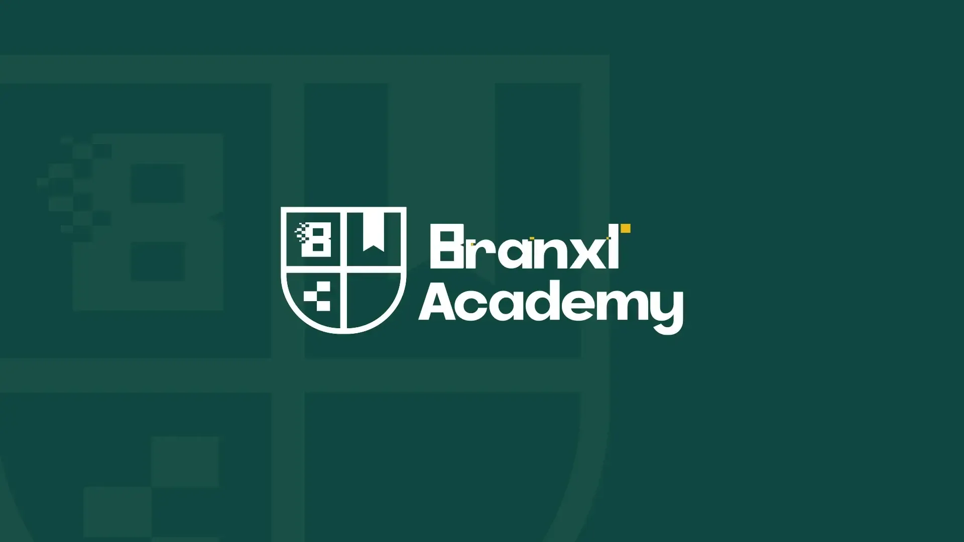
I resolved it by carrying one element across rather than the whole mark. The Branxl wordmark has a pixelated B that dissolves at the edge, and that pixel treatment is the studio's signature. I took it into a crest for the academy, so the shape says education and the detail says Branxl.
From studio to academy
The crest is quartered: the pixel B in the first quarter, a bookmark in the second, and the pixel motif repeating in the third. A crest is the most legible signal for education there is, which does the positioning work immediately, and the pixel detail stops it reading as a traditional college. Anyone who knows the studio sees the connection instantly. Anyone who does not still sees a credible education brand.
The lockup system
I built the crest into a full system: a primary lockup with the wordmark, a horizontal version for narrow spaces, and the crest alone for small applications such as a favicon, a badge or an embroidered garment. The crest carries the yellow accent from the parent brand so the family relationship holds even when the two marks appear apart.
Identity system
With the architecture settled I built the system the brand would run on: colour, typography, and the rules for how the crest behaves across surfaces.
Colour and type
The palette is a deep green with a yellow accent carried from the studio, plus a pink used sparingly to keep the brand from reading as institutional. Green does the credibility work that education brands need, yellow keeps it energetic, and the pink appears only where something needs to feel current rather than formal. Typography is a single geometric sans across the whole brand, which keeps a small team consistent without needing a type decision on every piece.

Applied identity
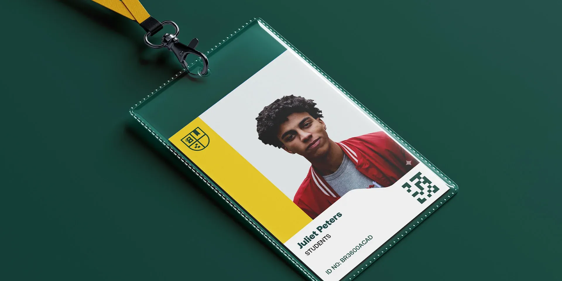
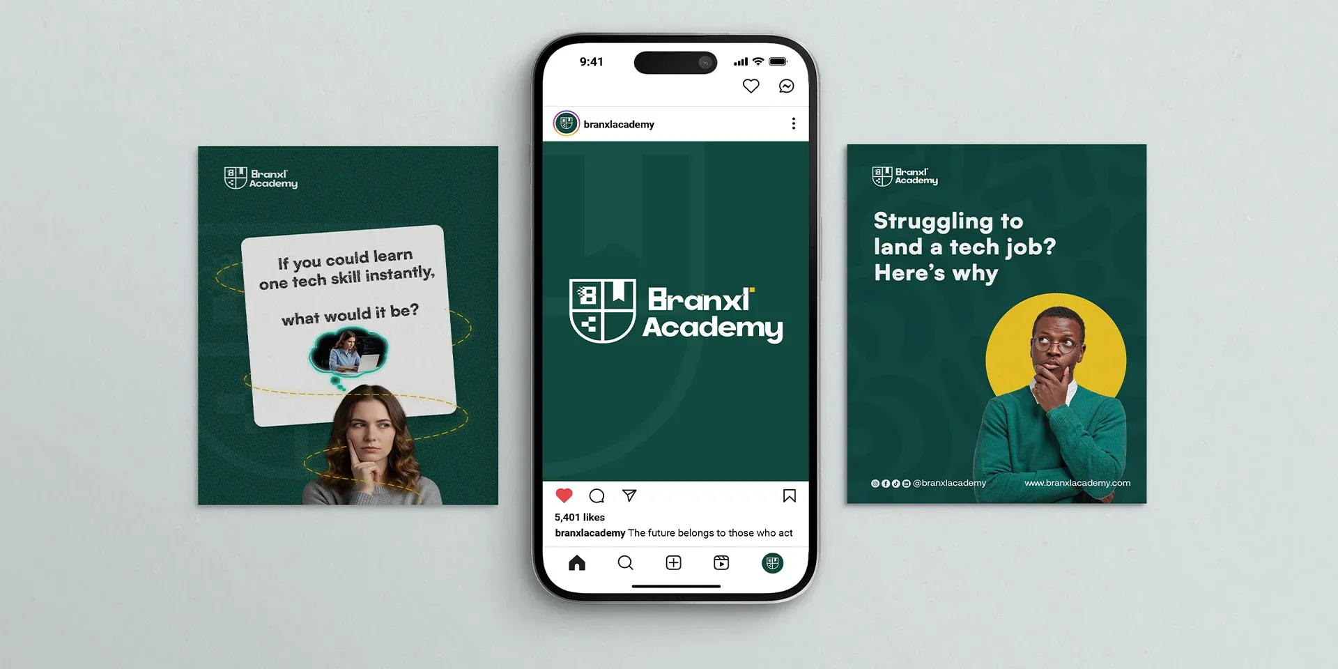
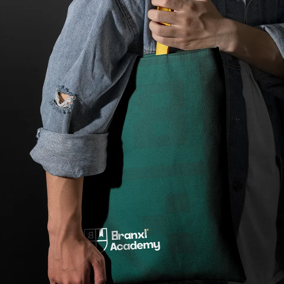
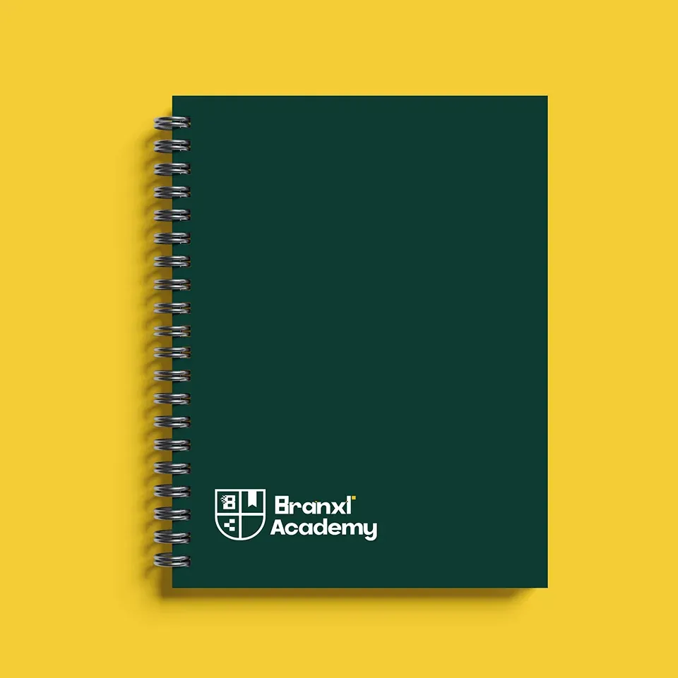
The system was built out across everything a student would encounter, from the ID card they wear to the notebook they write in. Merchandise matters more for an education brand than it does for most: a tote or a hoodie is a student choosing to be publicly associated with the institution, which is why those pieces were designed with the same care as the website.




Product and platform design
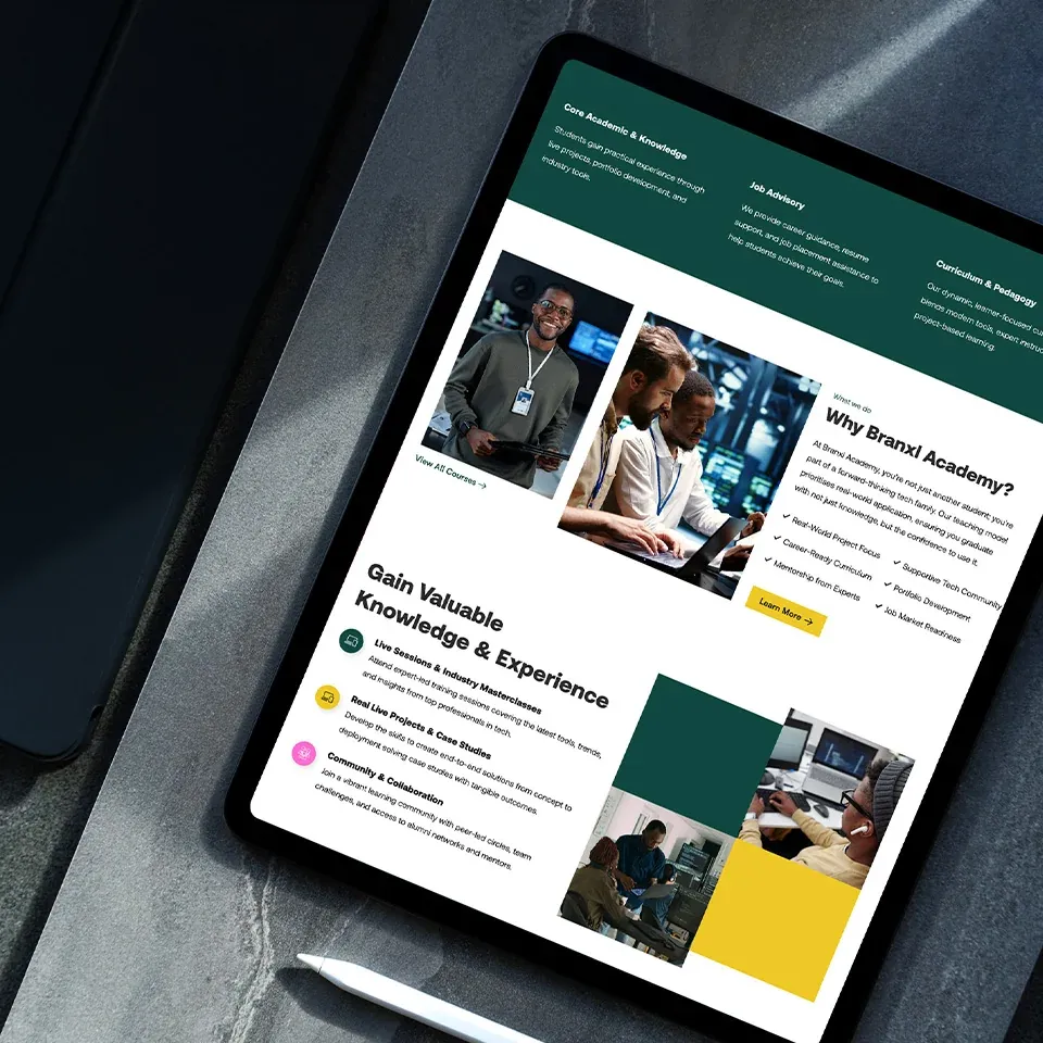
Before the platform, the academy ran on WhatsApp and Zoom, with recordings downloaded and uploaded by hand after every class and bookings and payments handled over email. The version I designed for the October launch did not fix that. It gave students somewhere to look, and I had assumed that was the gap. One cohort was enough to show it was not. Everything requiring an action still happened outside the platform, so the work stayed in the threads and inboxes and the portal became one more place to check.
>So we rebuilt it around actions rather than content. Classes running inside the platform instead of on Zoom, students booking mentors against real availability instead of asking in a group, and payments, messages, attendance and assignments on one dashboard. That meant four products sharing one identity: a learner, an instructor, a mentor and an administrator.
Working with development
The longest stage, and not because of the drawing. I worked alongside the three developers throughout, specifying journeys rather than pages and walking every feature end to end with them, which is where the states nobody had listed turned up and where much of the platform actually got designed.
The platform, in six journeys
Six journeys, and within each the screens that carry the decision: where someone commits, where they get stuck, and where the design had to earn its place.
Click any frame to open the full page.
Enrolment and payment

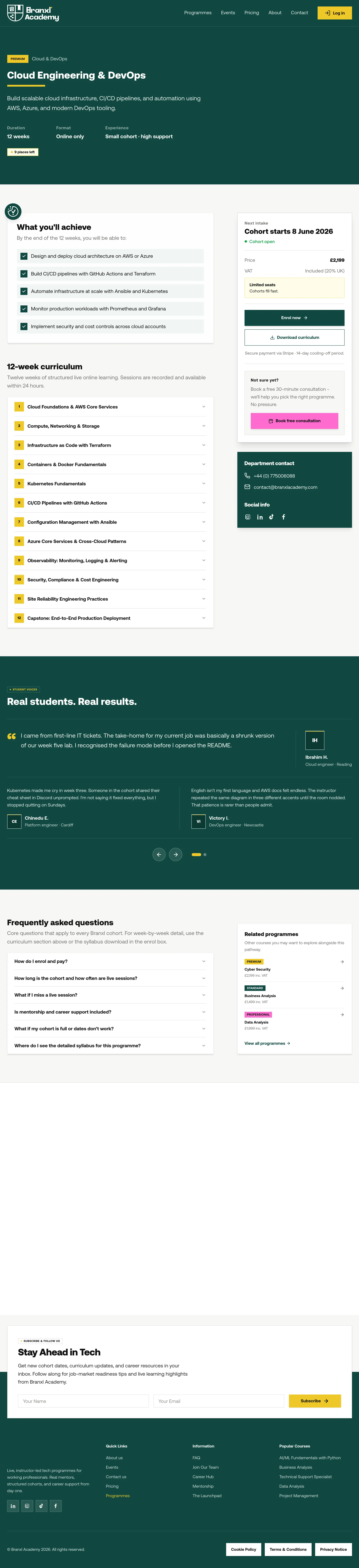
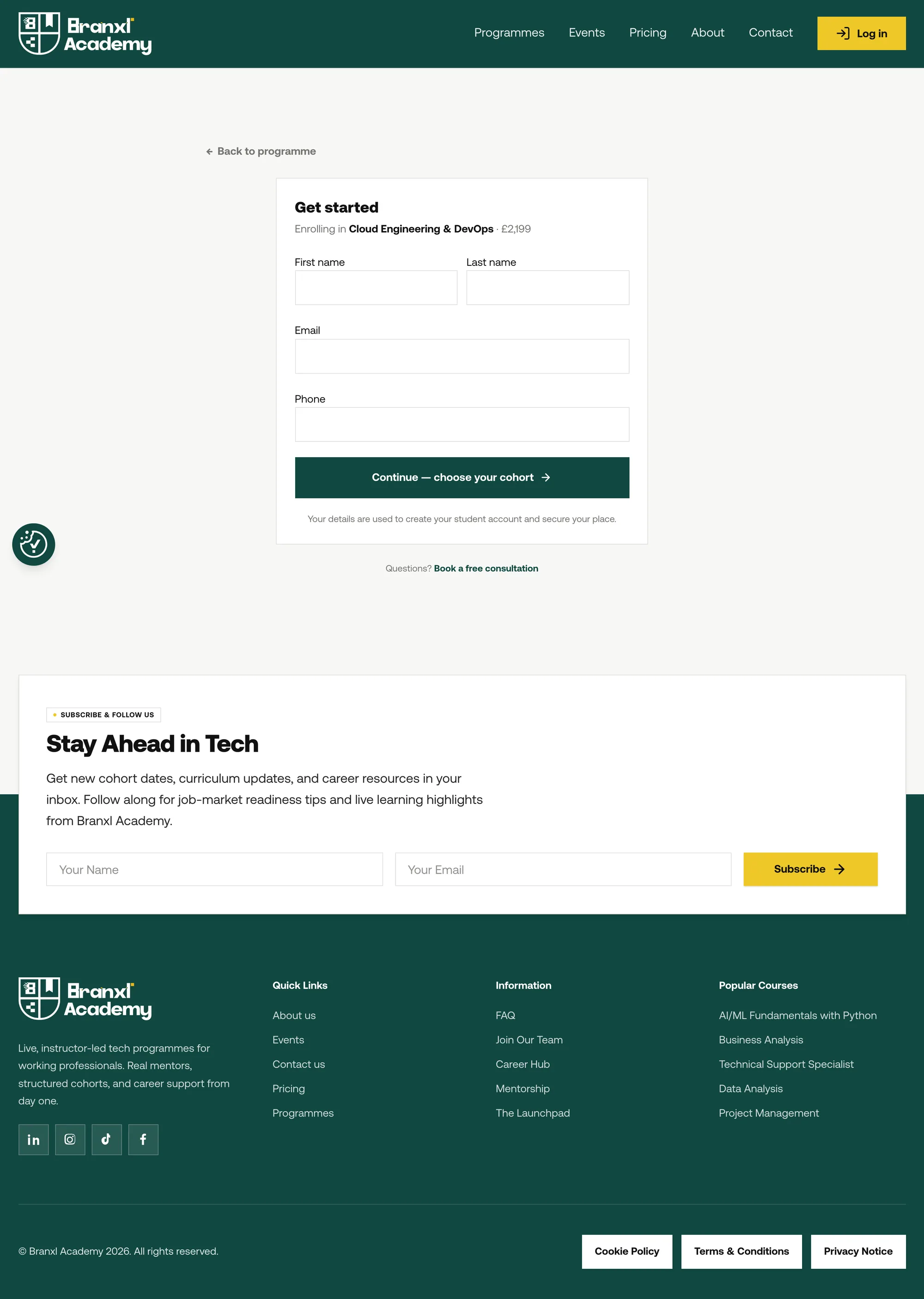
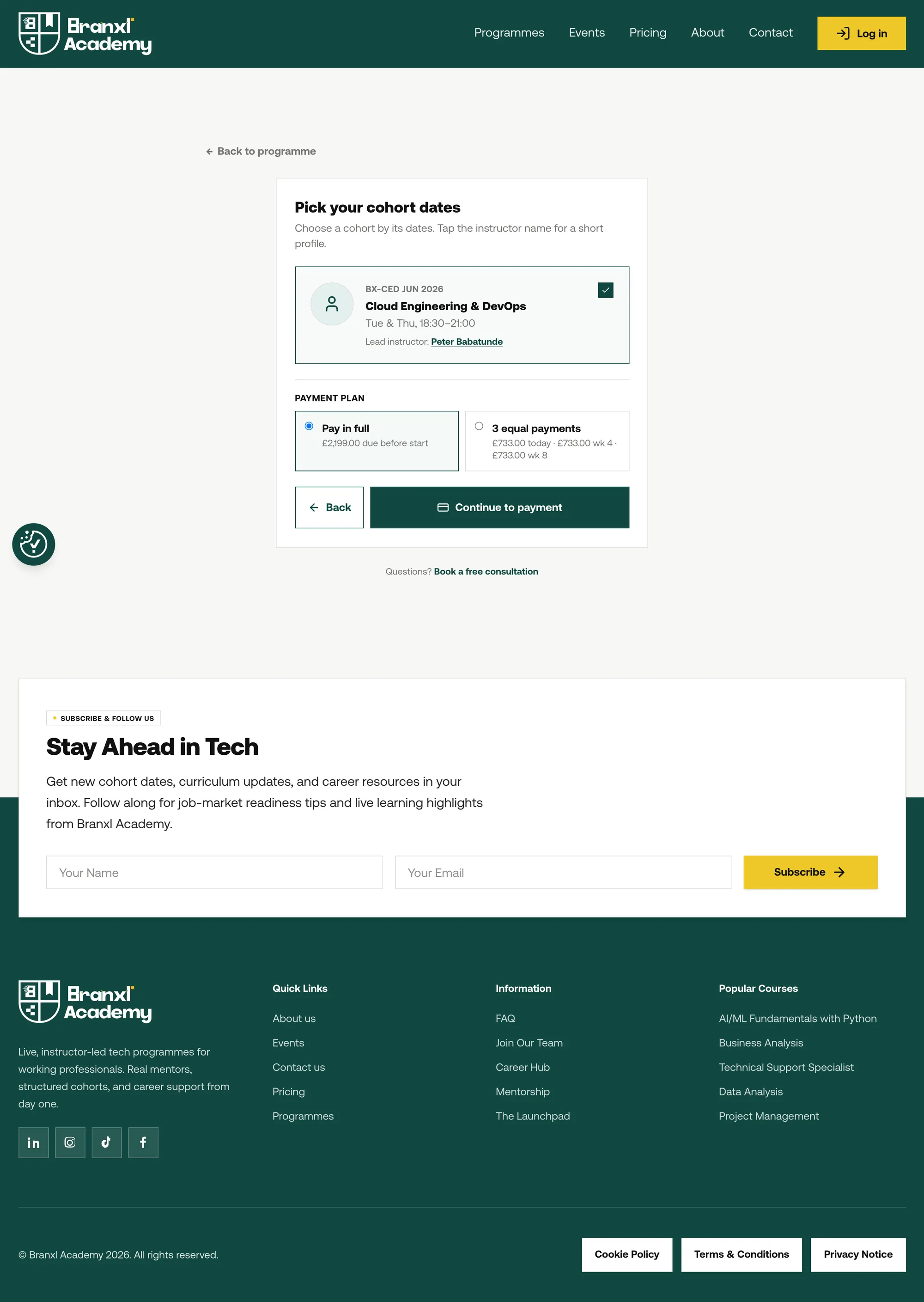
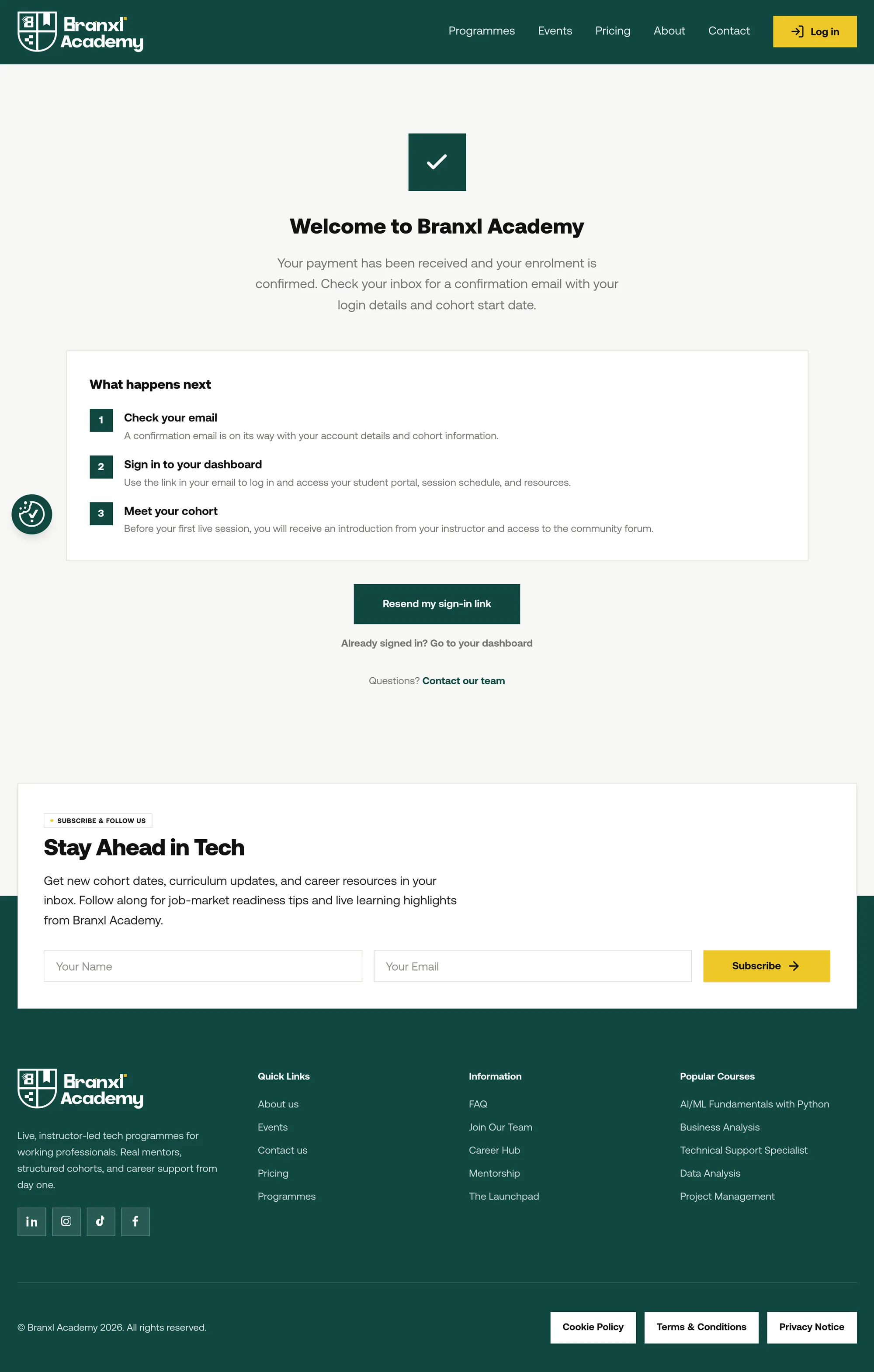
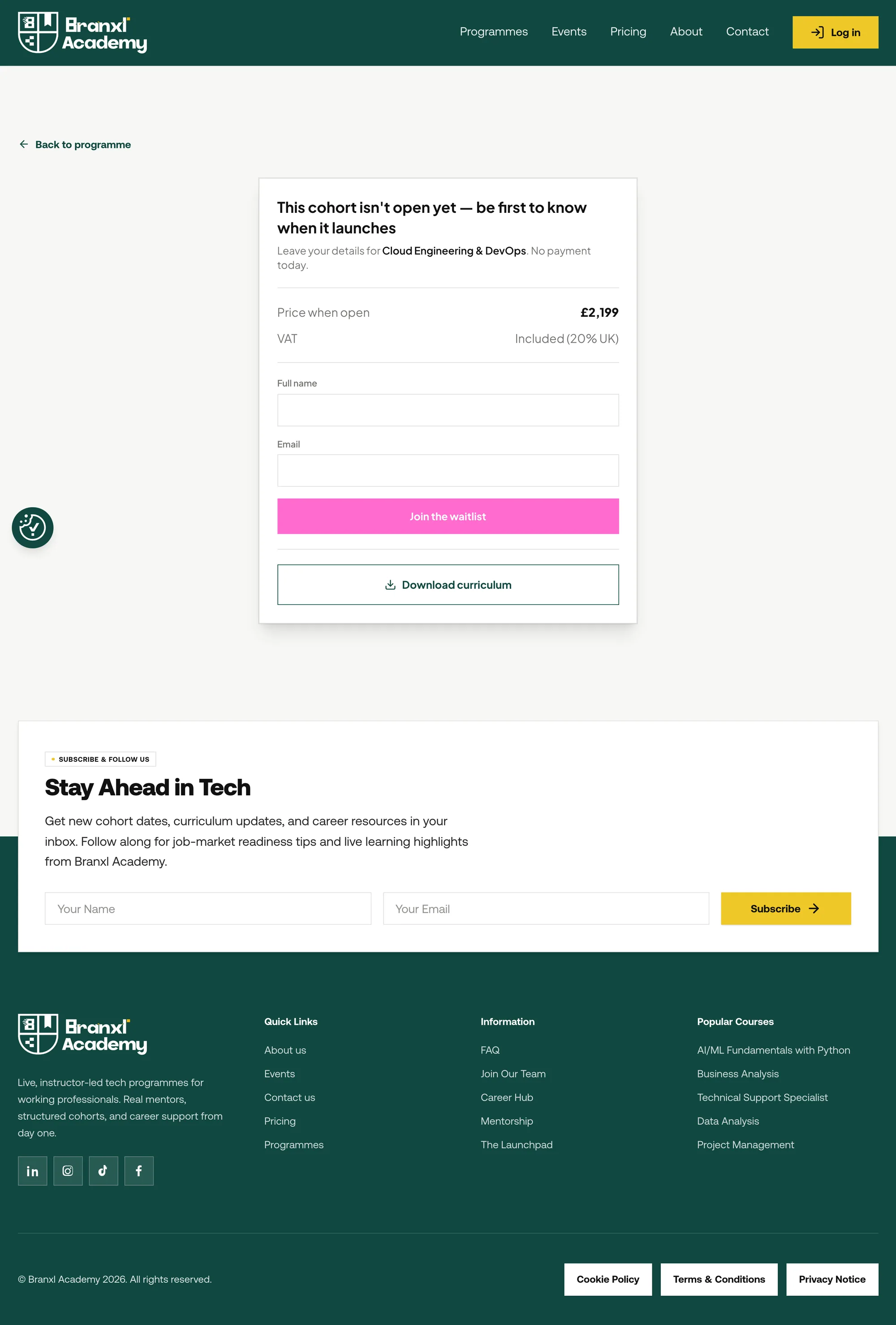
Everything before payment has one job: make someone believe this is worth their money and their time. The research said people weigh employability, not module lists, so the hierarchy leads with outcomes and puts curriculum detail underneath. Accounts are created by the payment webhook, not by a signup form, so there is no register step and no half-finished account. Shown as designed in February 2026, with the June intake open.
Getting started
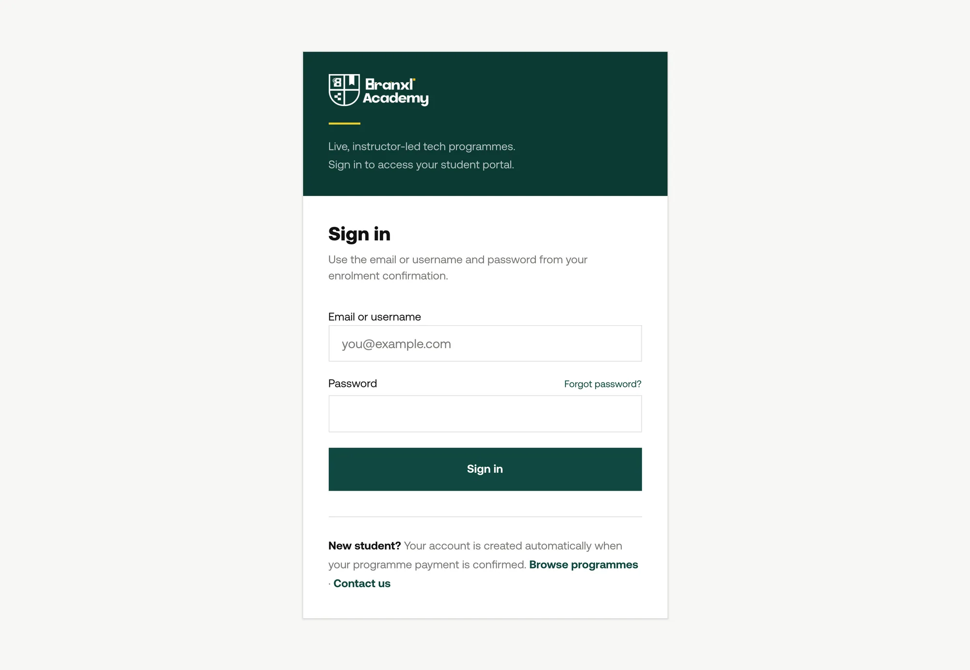
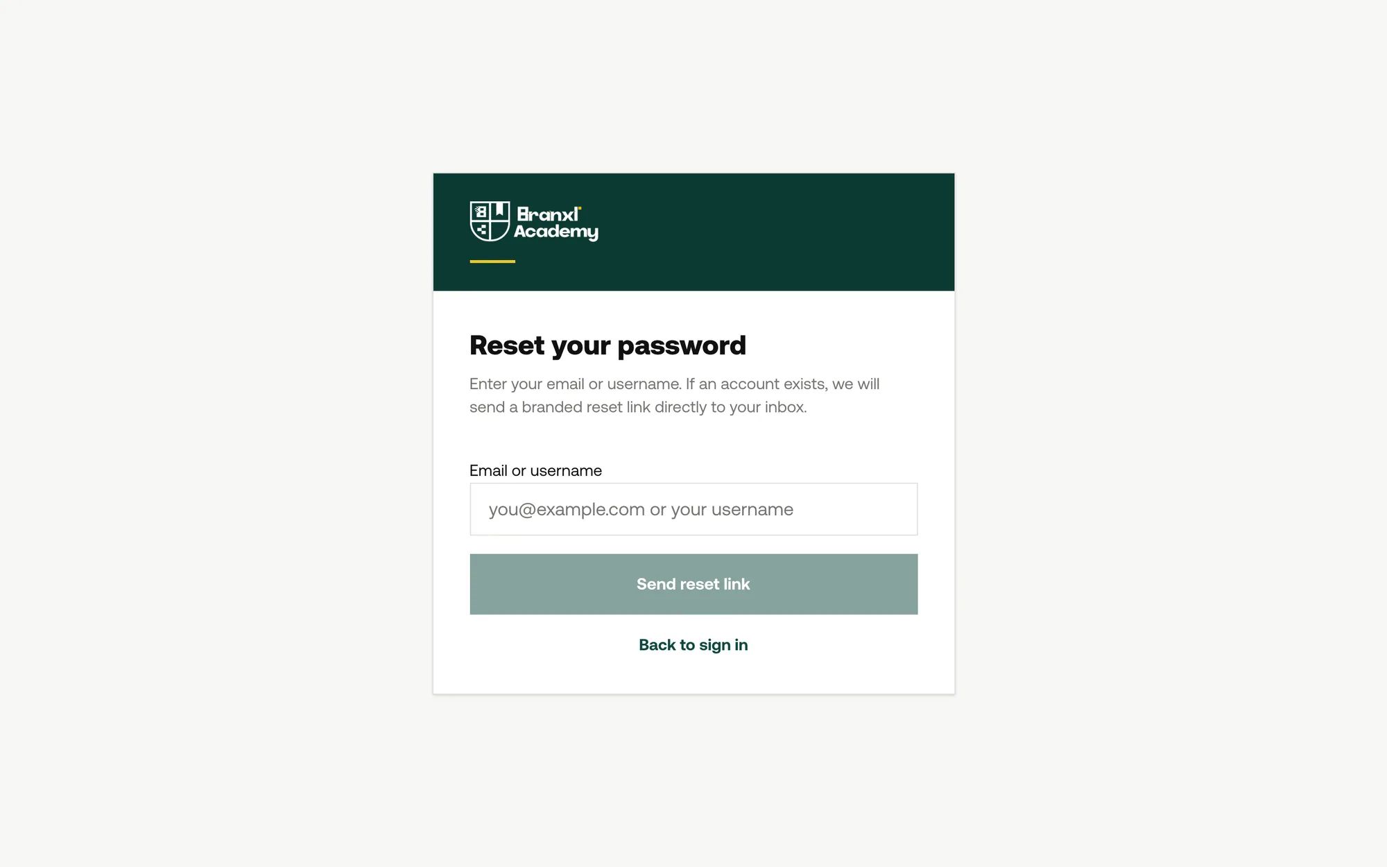
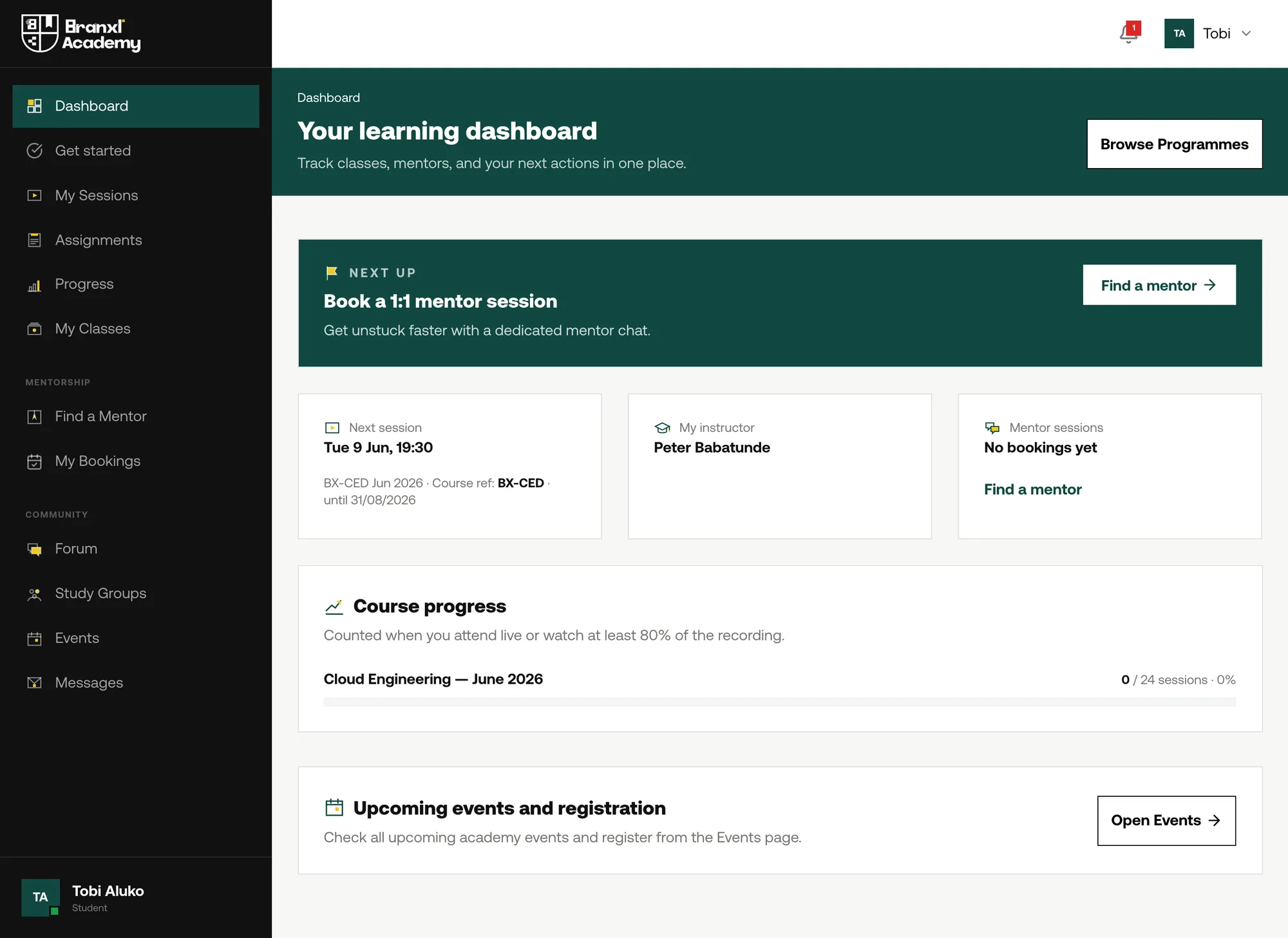
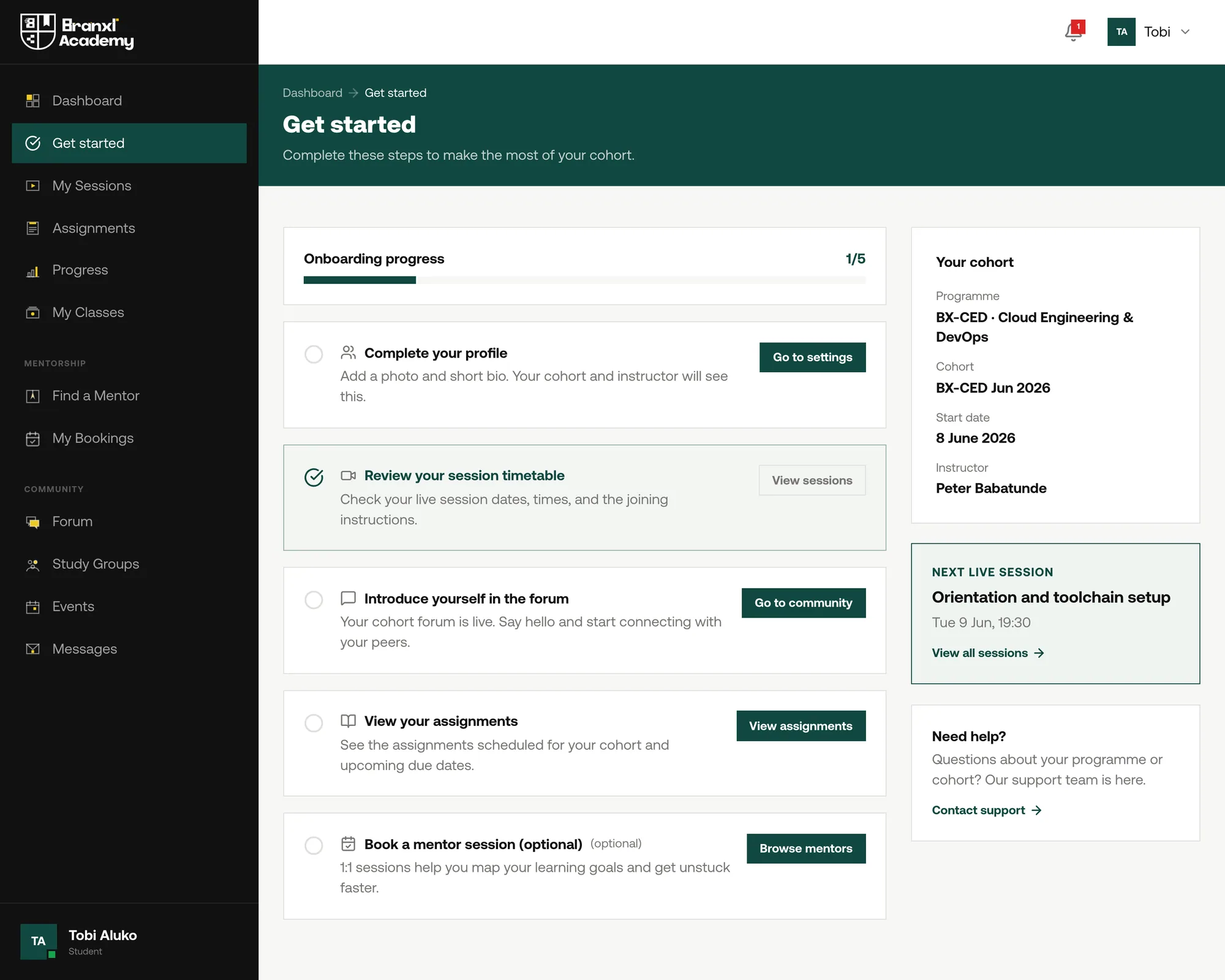
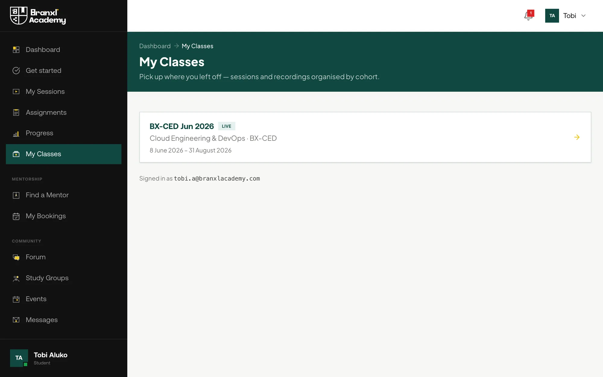
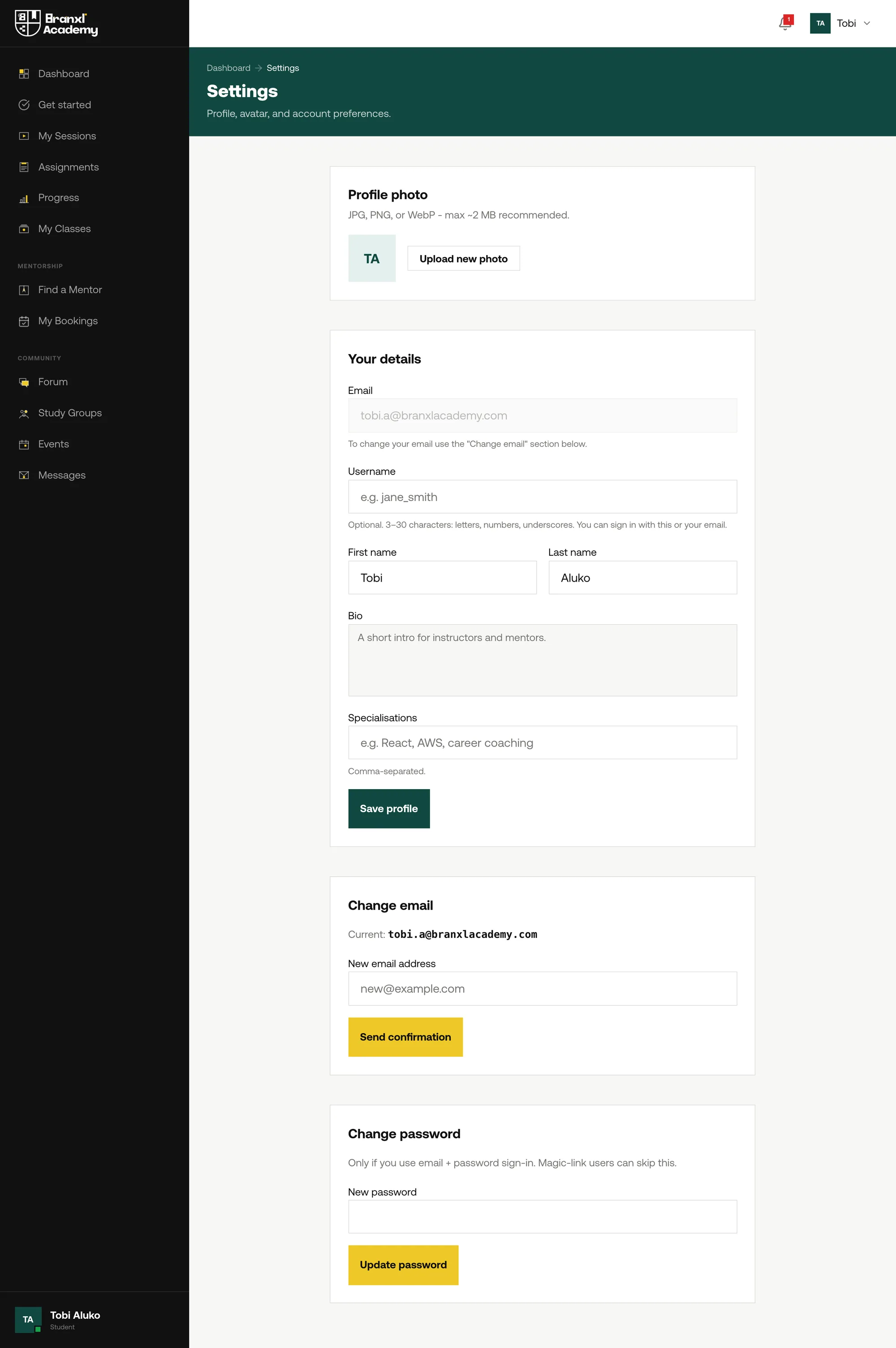
Five roles sign in through the same form and land somewhere completely different. It cannot ask which one you are, because people do not reliably know, so routing happens on role after authentication. These are the day one screens, shot on an account that has paid but whose intake has not started — the state most case studies skip, and the one a new student actually meets first.
The student
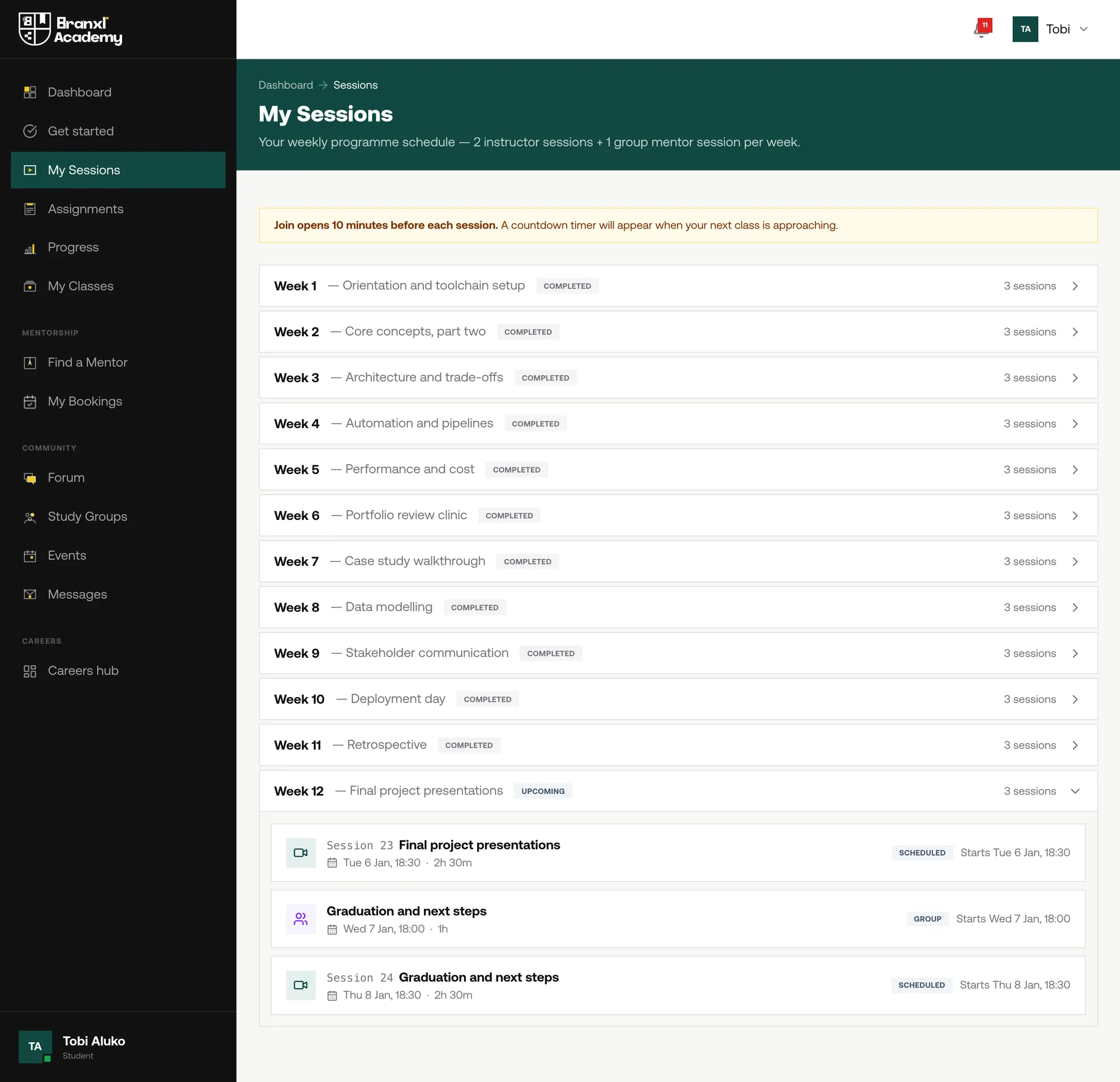
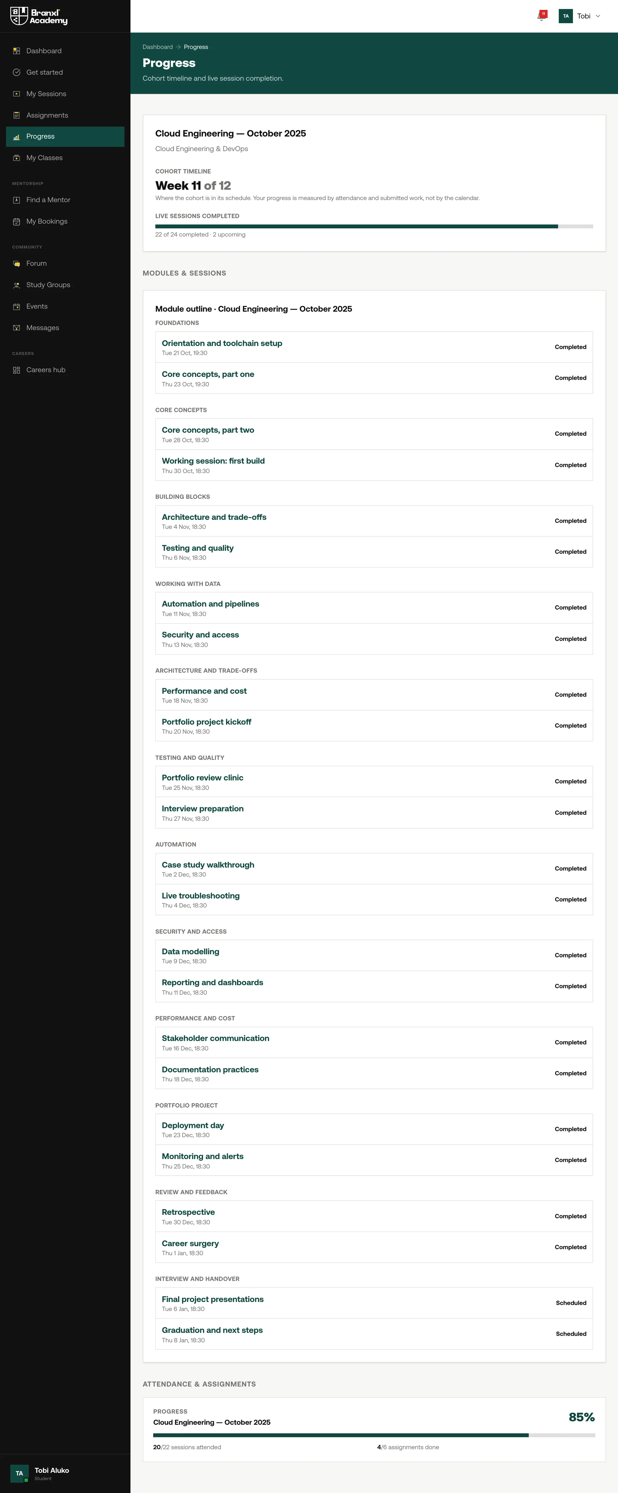
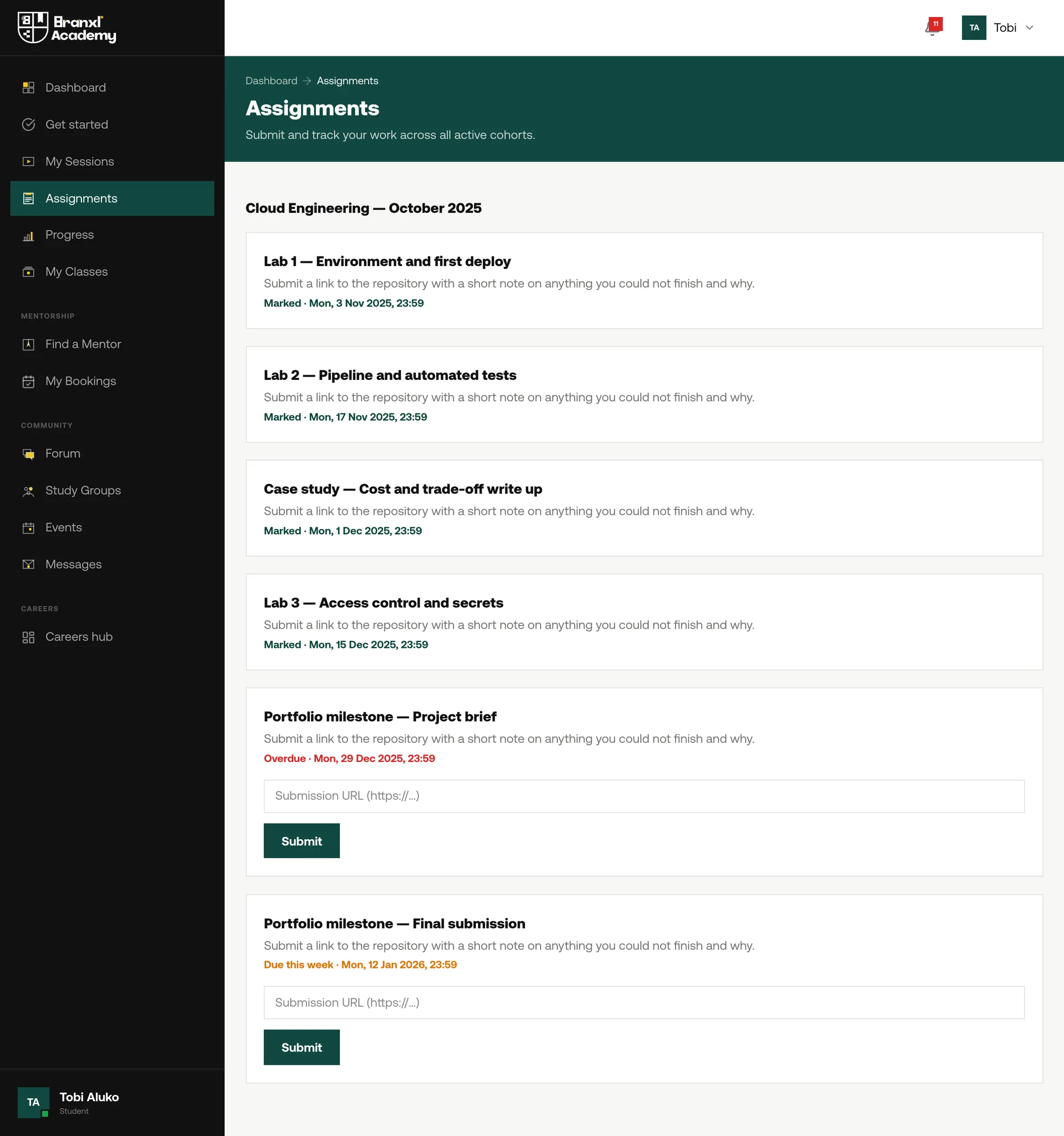
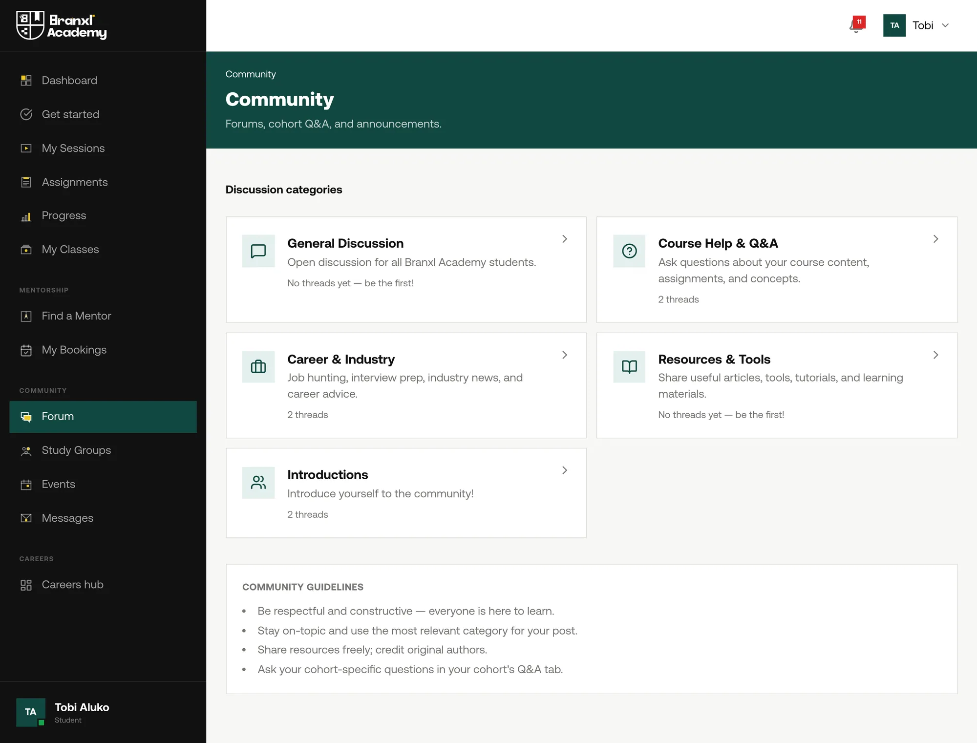
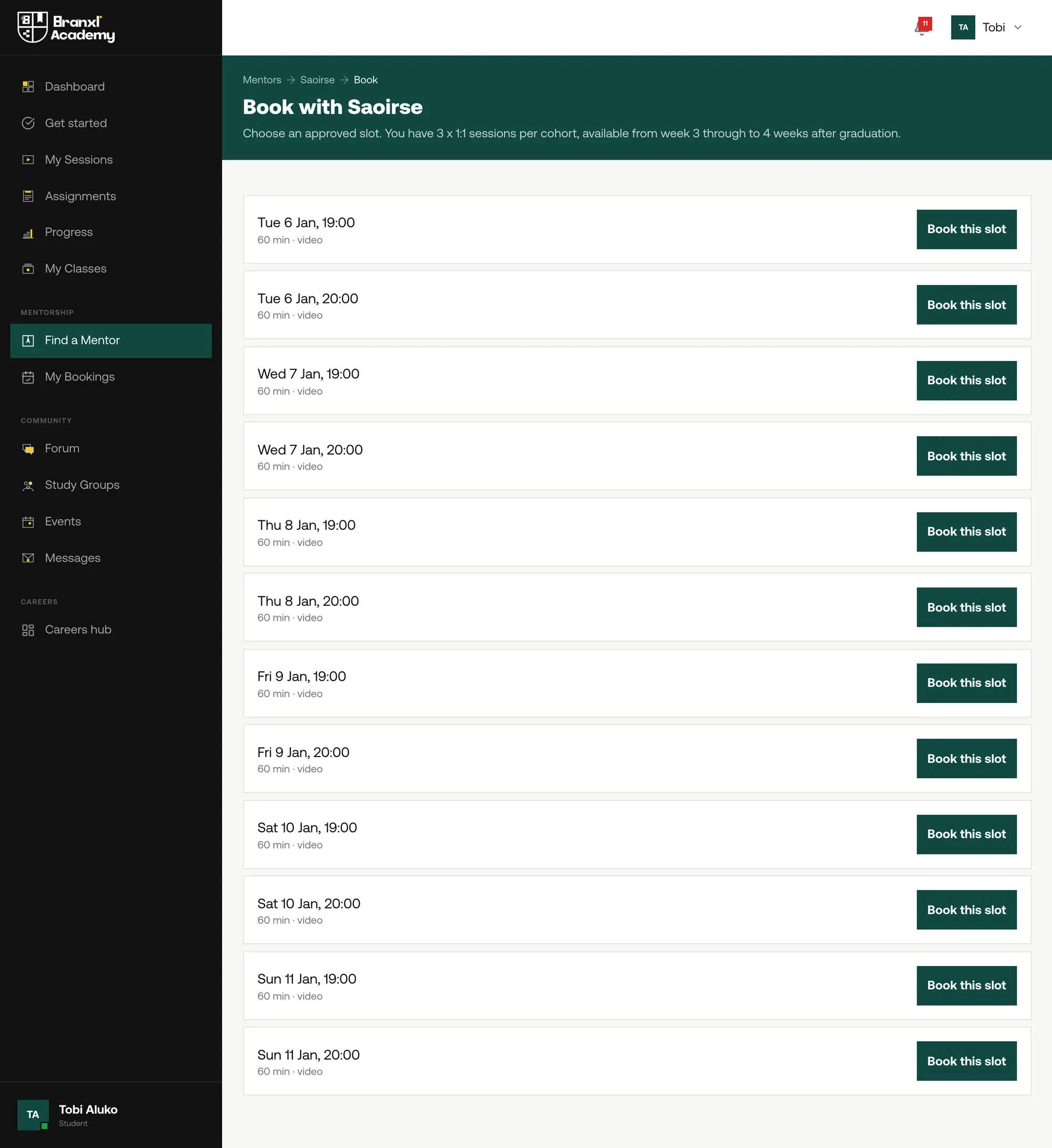
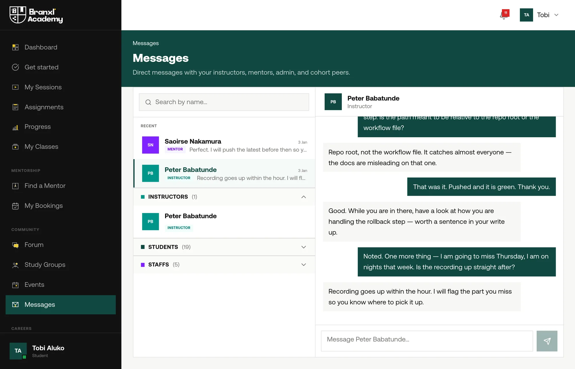
The research said students lack structure, feedback and something to show at the end. The portal is built around exactly those three: what is next, how you are doing, and who can help. Shown at week eleven of twelve, with work submitted, one piece missed and one still to come.
The instructor
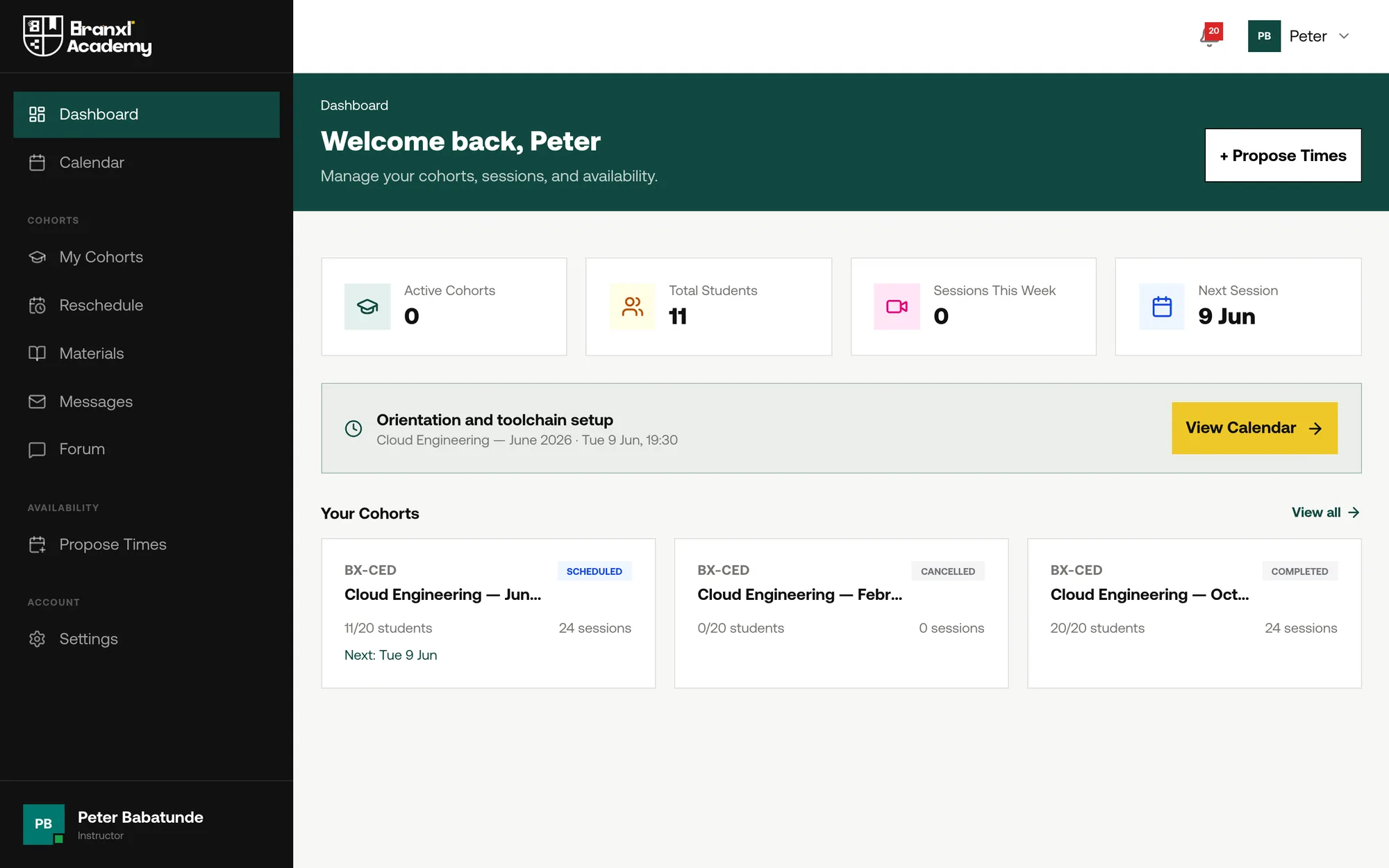
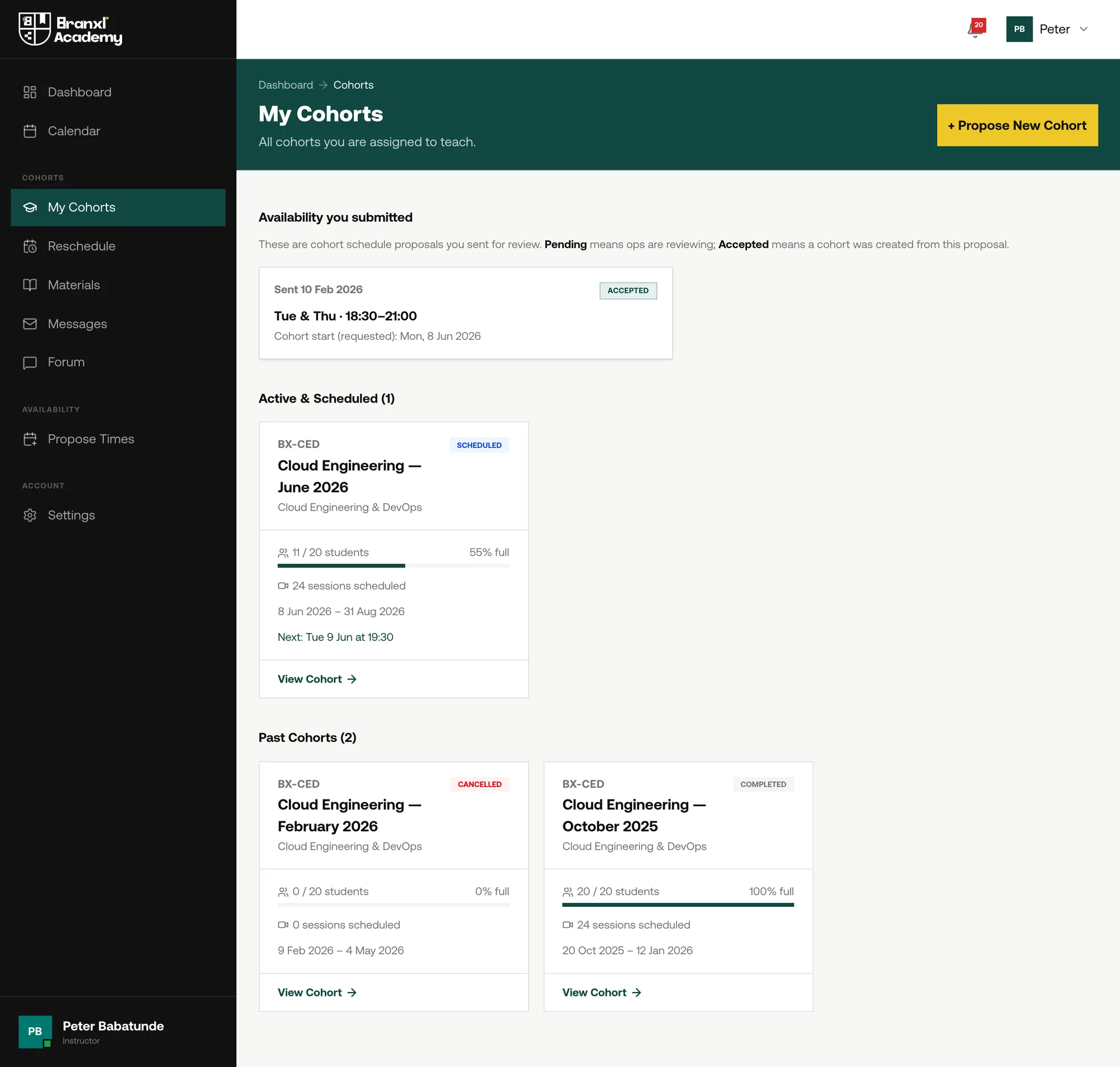
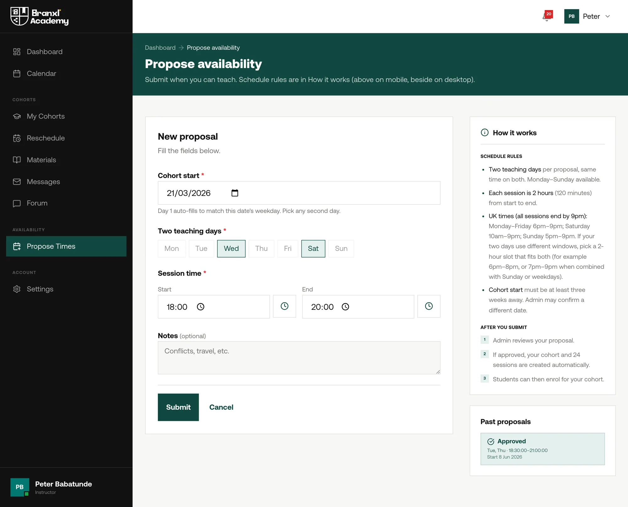
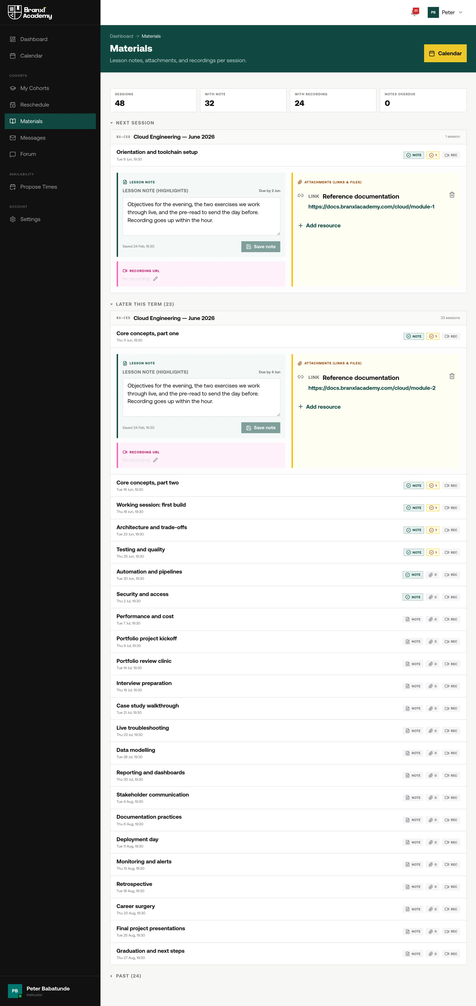

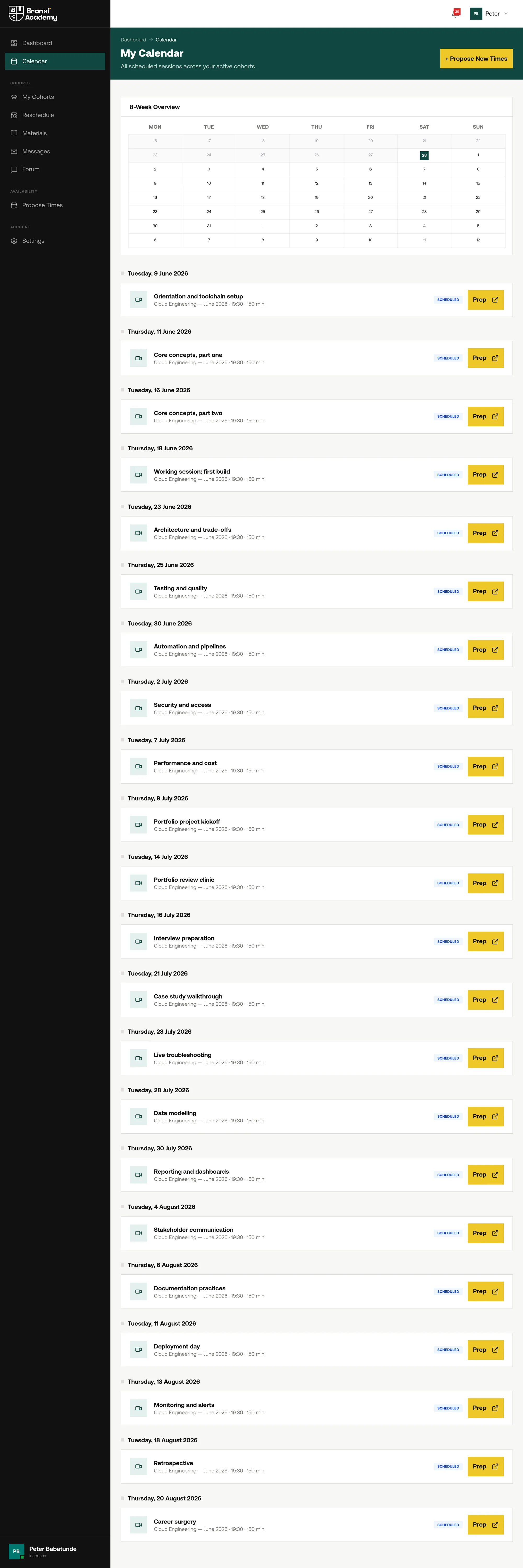
Instructors are the half nobody sees in a marketing screenshot, and the half that decides whether the academy can run more than a few cohorts at once. Shown at the end of February, between intakes: one cohort finished, one pulled, one being prepared.
The mentor
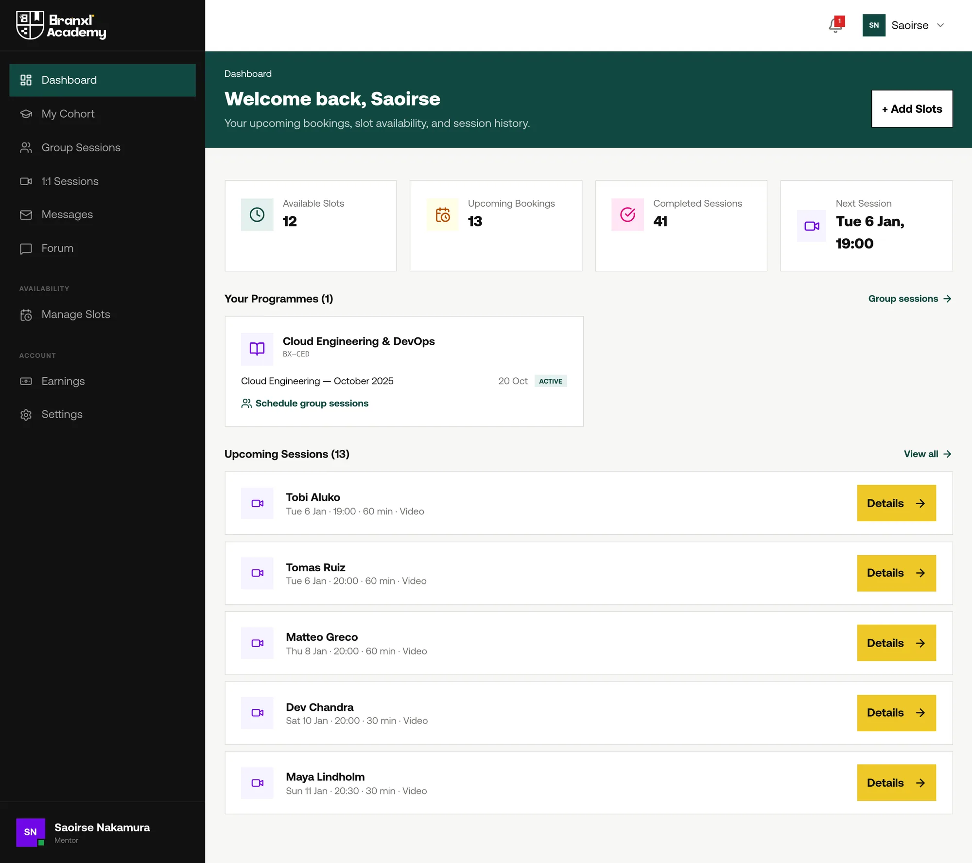
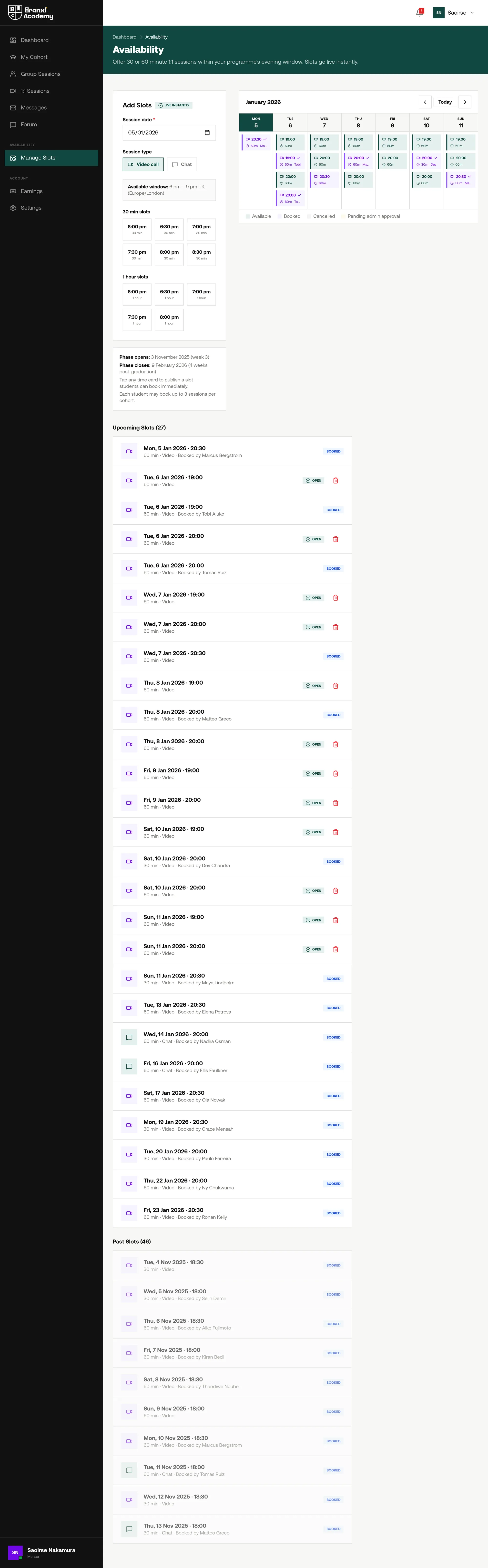
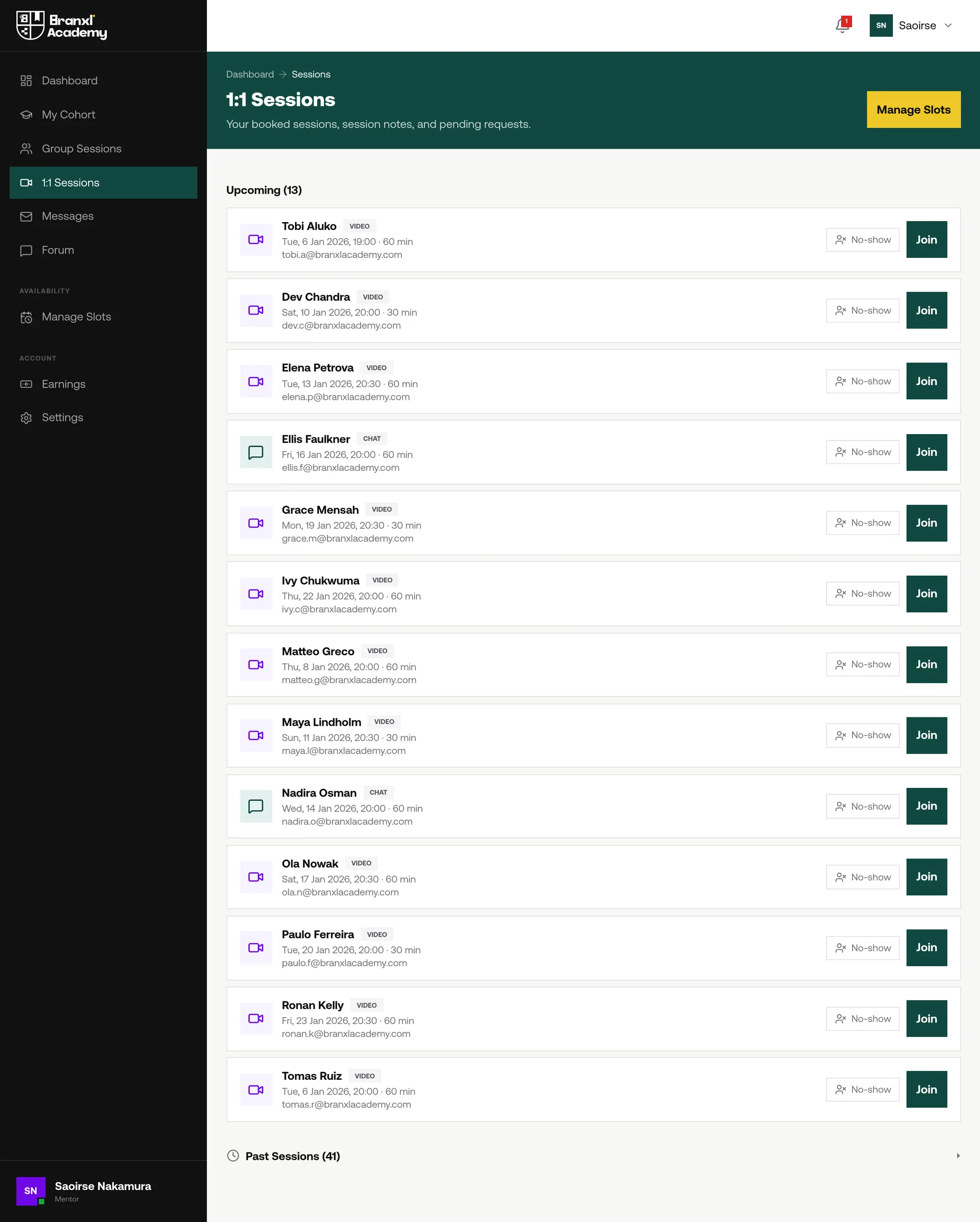
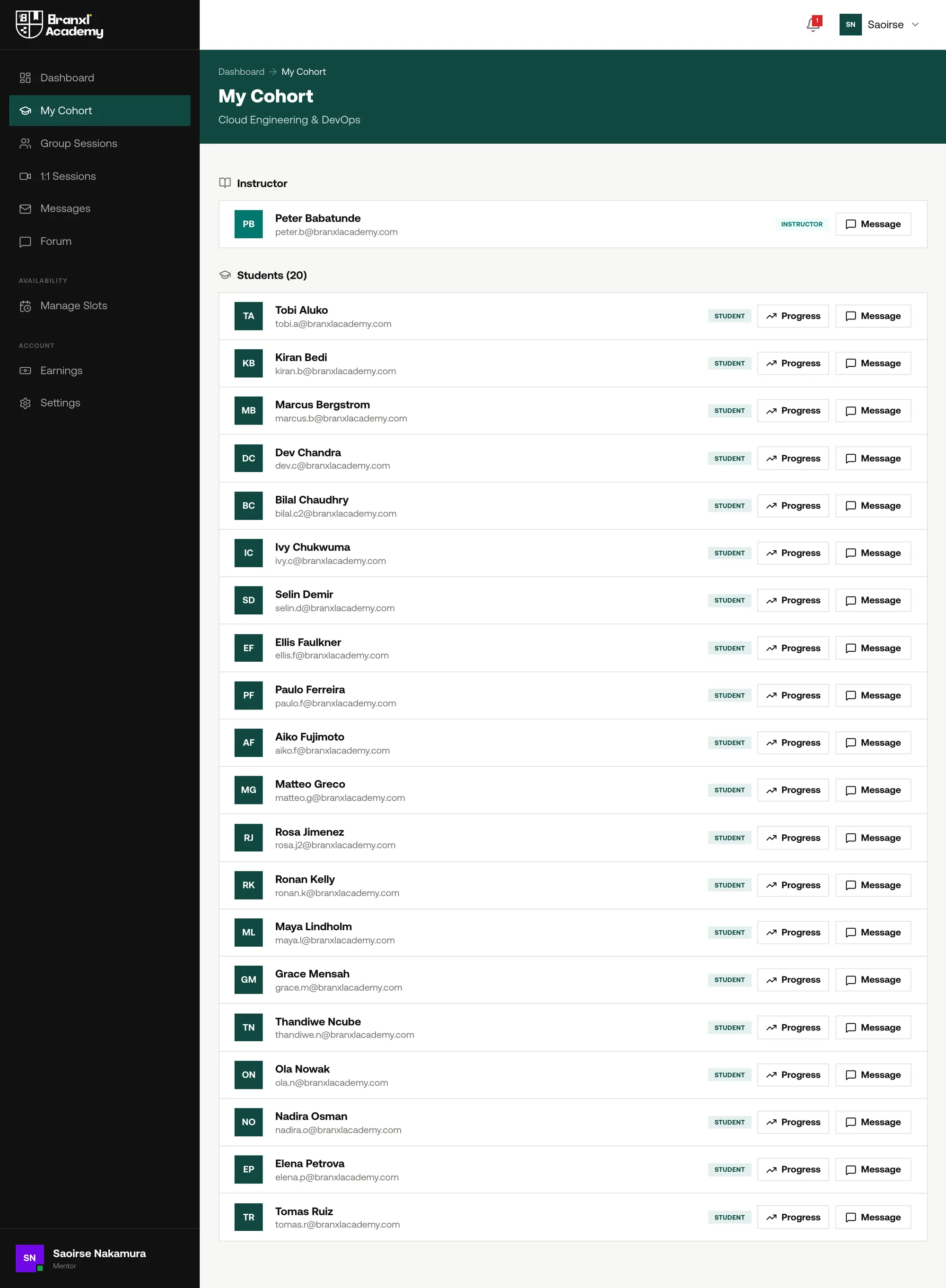
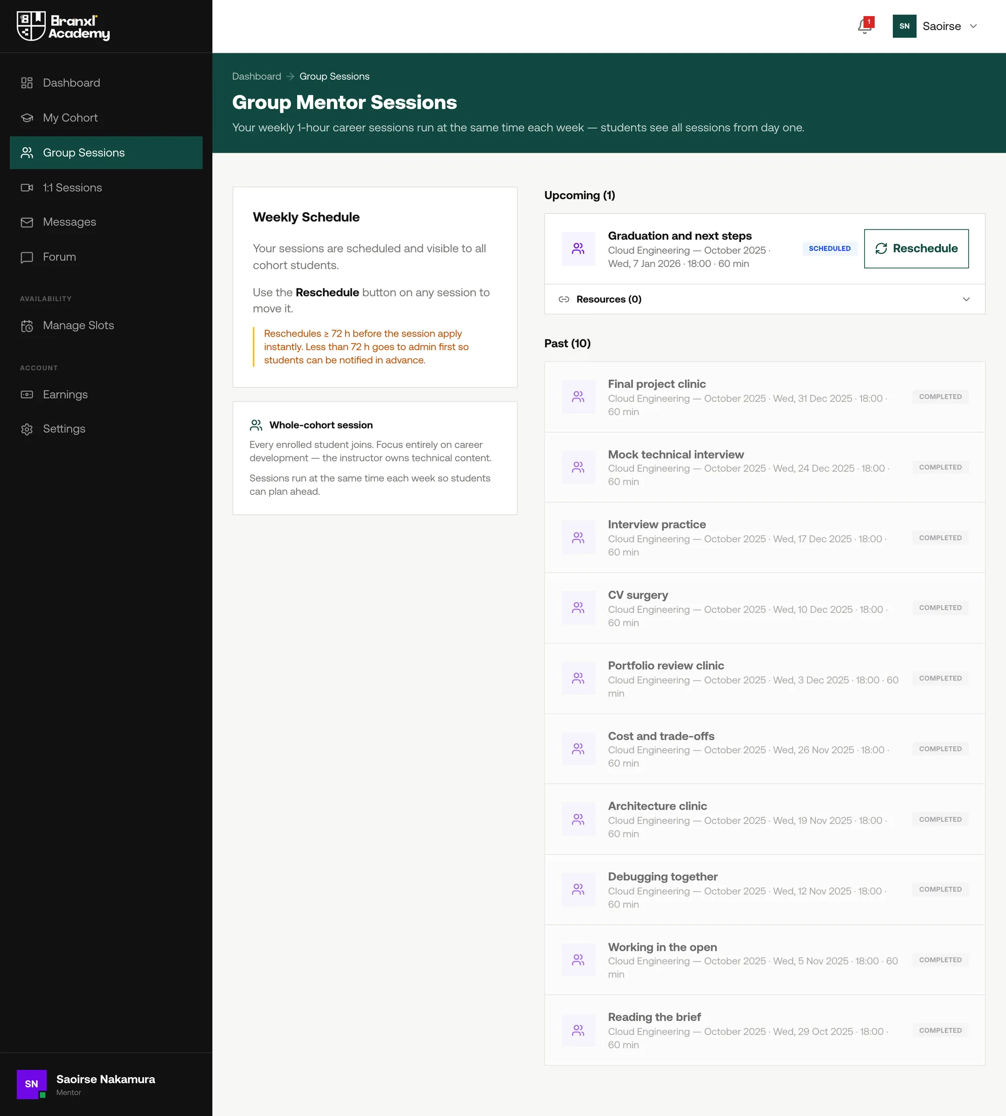
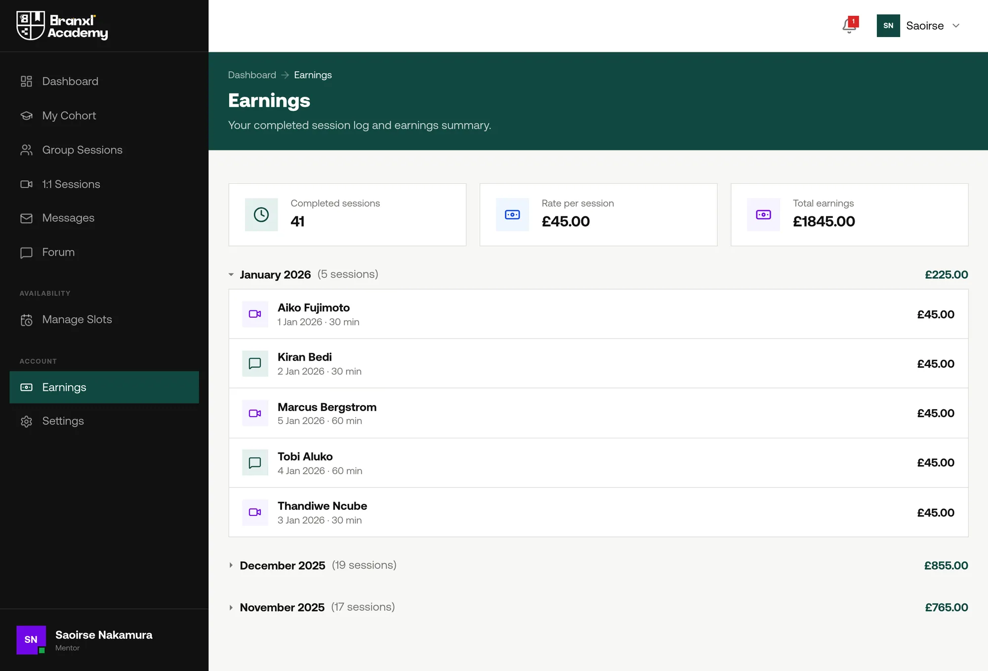
Mentoring is a different job to teaching and needed a different product. An instructor runs a cohort on a fixed schedule; a mentor carries twenty students, sells hours against their own availability and is paid per slot. Three one-to-ones per student is sixty sessions a cohort, so the tools are built for volume.
Running the academy
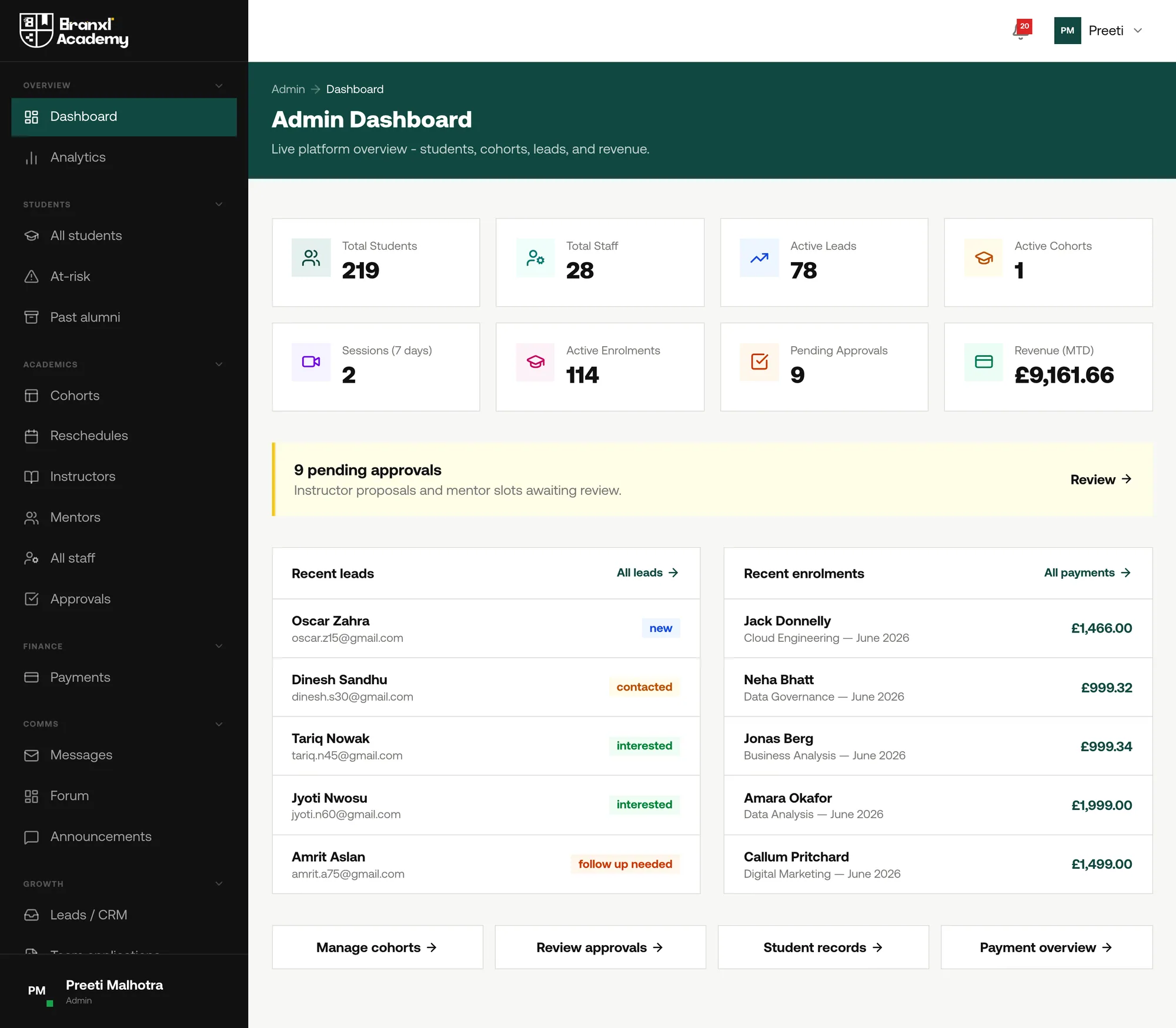
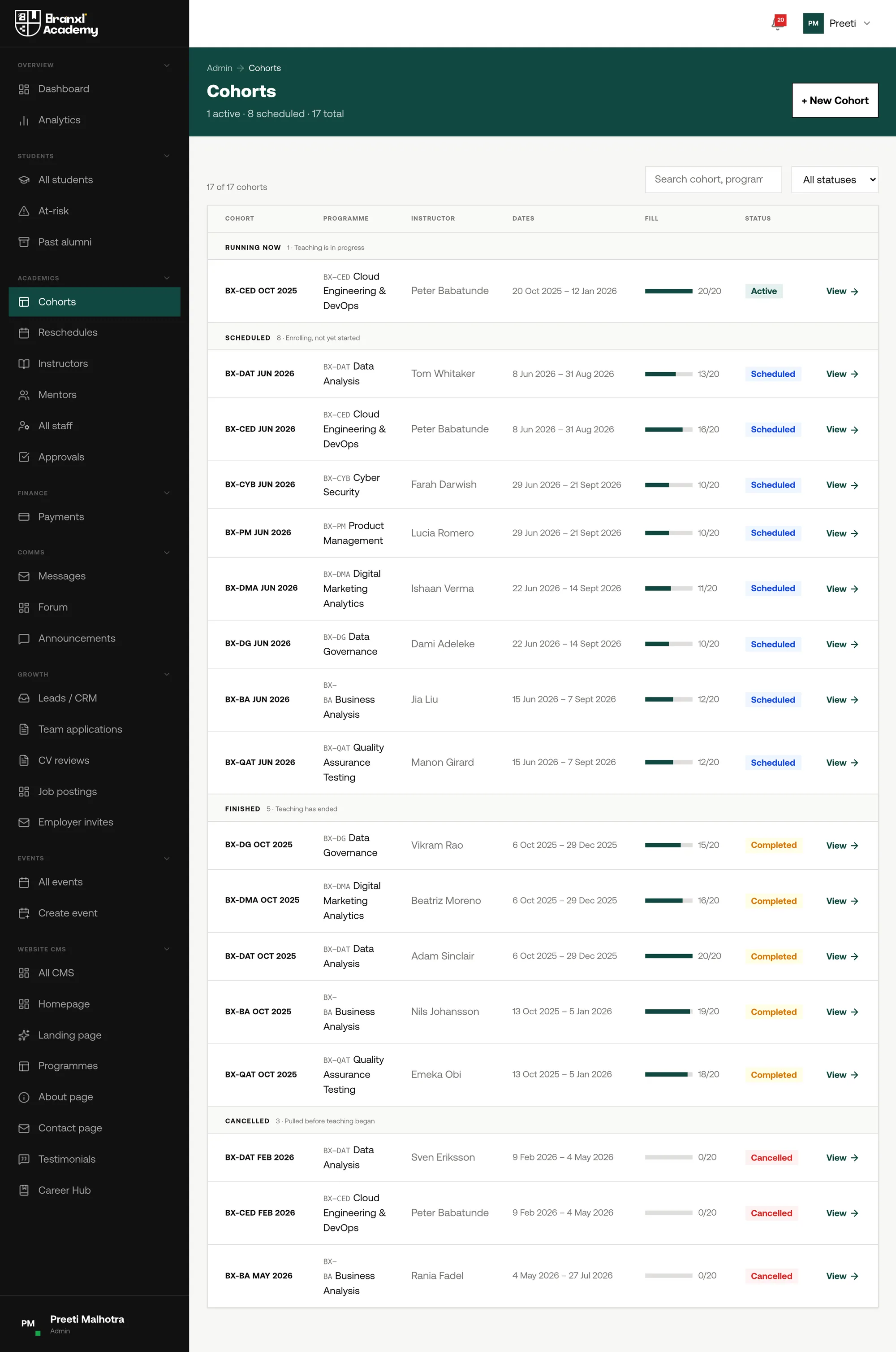
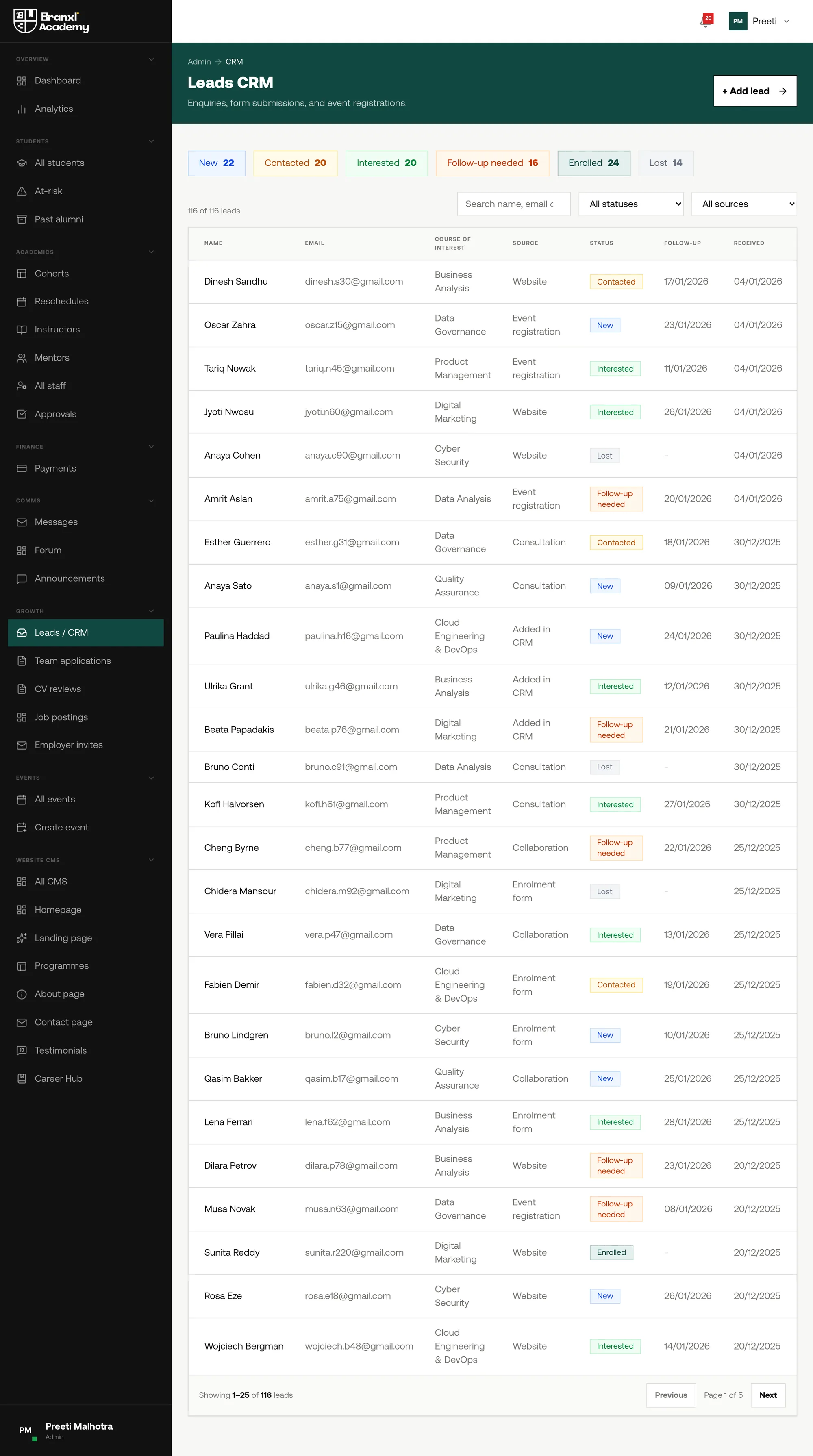
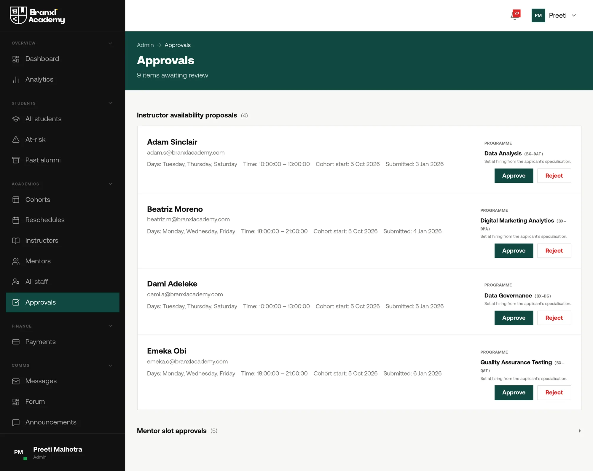
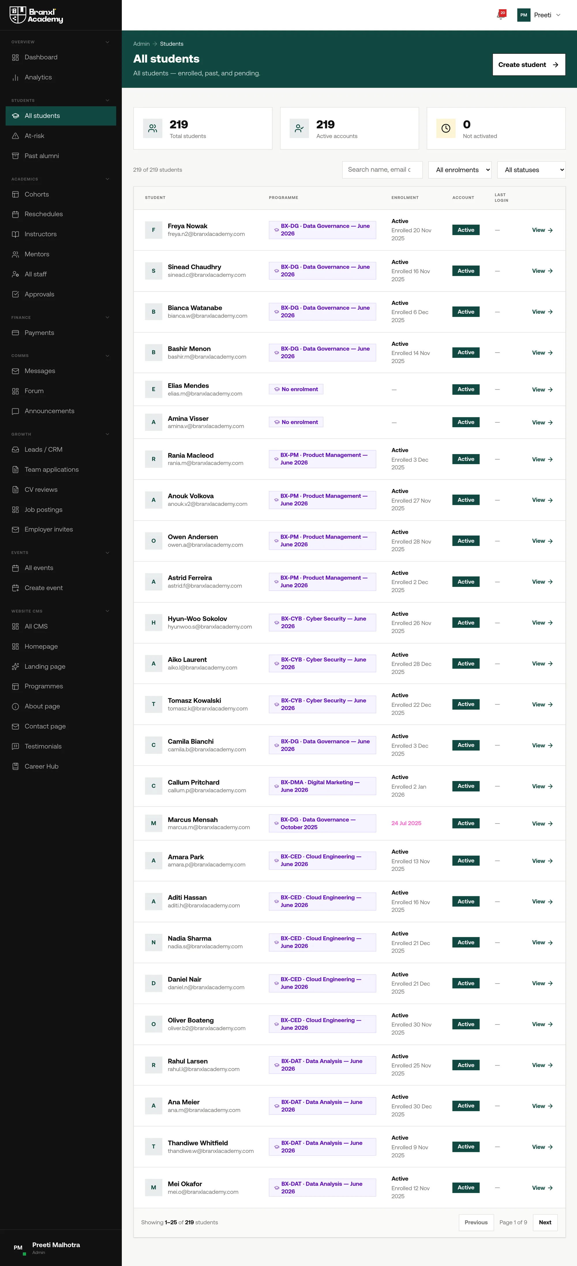
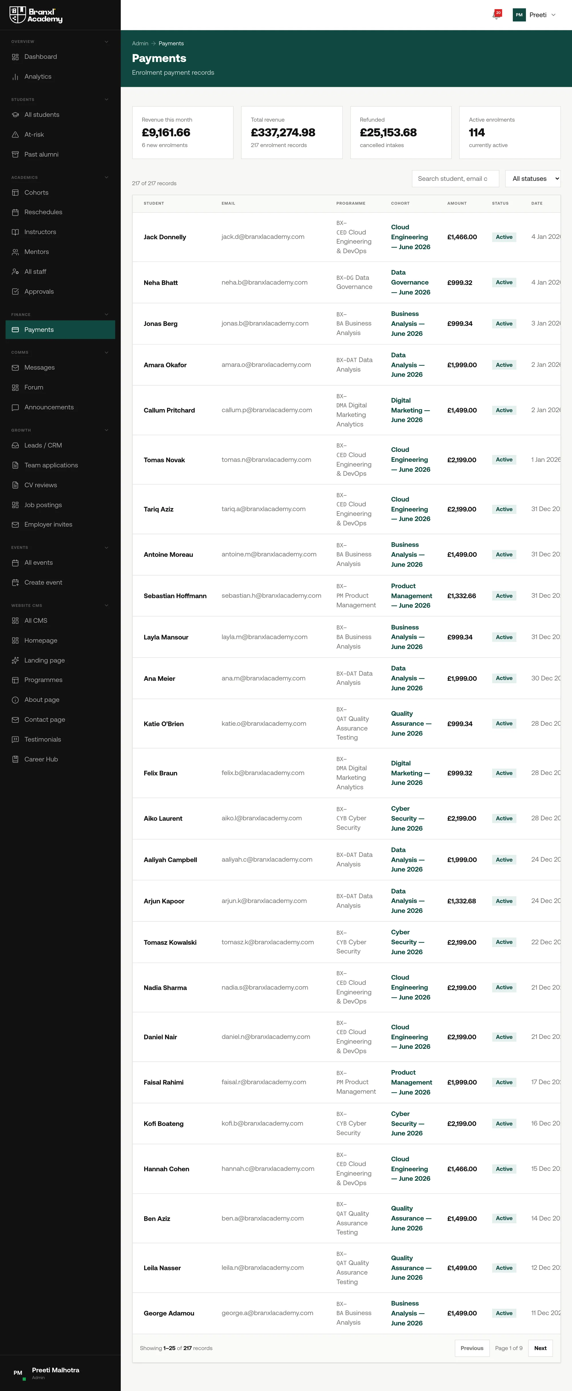
The back office is where an education business is actually run, and the part I would show first to anyone asking whether a designer can handle density. Seventeen intakes and two hundred and nineteen learners do not fit into a dashboard of four tiles. Seen from January, one cohort is teaching, eight are filling for June and three were cancelled — and the screens have to hold all three states at once without flattening them.
See the whole thing
Six journeys is the short version. The full build runs to more than a hundred screens across the student portal, the instructor and mentor tools, and the admissions back office.
Outcome
Branxl Academy launched in October 2025 running six cohorts of twenty places. It now runs ten. Bookings, attendance, assignments, intake and payments all sit inside the platform, and the team adds courses and campaign pages themselves rather than commissioning a designer each time.
Students from the first cohorts have gone on to jobs in the fields they trained for, which is what the academy was set up to do. The brand has held alongside it: a student sees an institution in its own right, and anyone who knows the studio sees the connection immediately.
What I took from it
Resolving the relationship to the parent brand before drawing anything is what made the rest of the project fast. Carrying one distinctive element across, rather than reworking the whole mark, gave the academy its own presence while keeping the family connection legible. It is the approach I would use on any sub-brand now.