Sector
Art, fashion and media production
Position
Lead brand designer
Year
2025
Scope
Brand refresh, guidelines, digital application
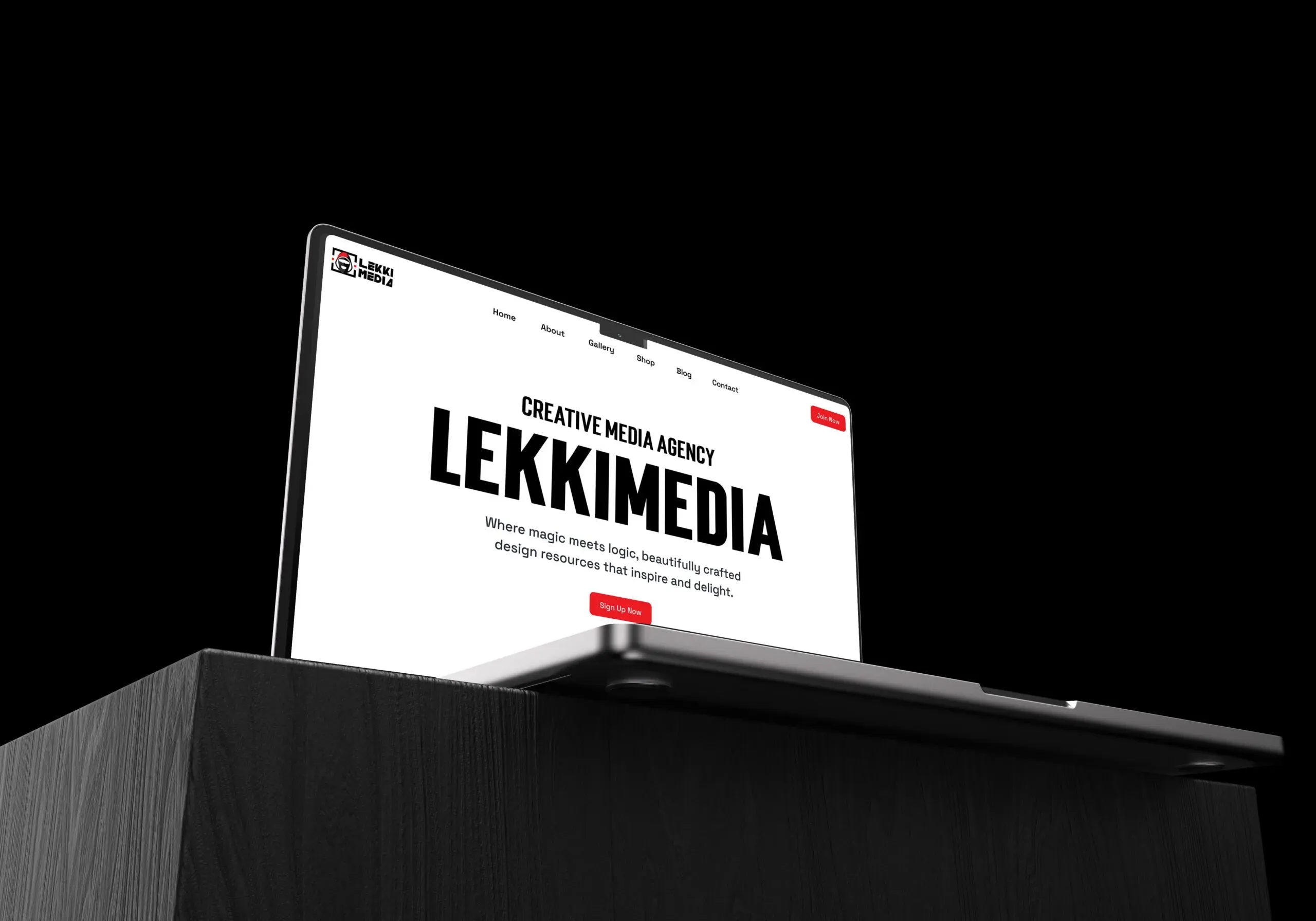
Overview
LekkiMedia is a creative media house working in art, fashion and media production. The brief was a refresh rather than a rebuild: keep what the audience already recognised and rebuild everything around it.
I led the design at Branxl Design. Two designers supported the brand audit and the early moodboard exploration. I set the direction, rebuilt the mark, built the system around it and wrote the guidelines.
The challenge
A refresh is harder than a rebuild. The mask motif carried real recognition and could not be discarded, but everything around it had accumulated without a system: no consistent palette, no typographic rules, no logic for how the brand behaved from one surface to the next.
The brand also appears alongside the work it produces, which is a specific problem. It needed enough presence to hold a poster on its own, and enough restraint to sit beside a fashion image without competing with it.
Process
The work ran in four stages: discovery, strategy, design and delivery. Discovery established what was working and what had drifted. Strategy set the positioning and the rules the identity would follow. Design rebuilt the mark and the system around it, and delivery covered guidelines, templates and handover.
The first job was working out what could change and what could not. On a refresh that decision governs everything after it, and settling it early is what stops the project becoming a negotiation over every element.
Discovery
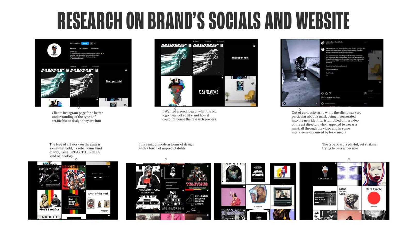
We ran a brand audit alongside competitor research and sessions with the client to establish what was working and what had drifted. The audit was the useful part: seeing every existing application in one place made it obvious that the brand had no system, only a collection of one off decisions.
Why the mask stayed
The client was insistent the mask had to be kept, and I wanted to understand why before treating it as a constraint. Going through their channels and video content gave me the answer: the art director wears a mask in their videos and in the interviews the agency runs. The mask is not a motif they had grown fond of. It is the founder's public face.
That changed how I approached the refresh. The mask was not something to work around, it was the one asset with real equity, and everything else was open. The same research showed their output reads as deliberately rebellious, a break the rules approach with a playful streak, which fed straight into the direction.
Strategy
Before any design work, we settled positioning, tone of voice and the words the brand would be built from. Three came out of the research: bold, modern and playful. Those became the brief for everything that followed.
The conclusion that shaped the design was about restraint. A brand that appears beside creative work cannot compete with it, so the system needed to be built from a narrow palette and a small number of repeatable devices rather than from variety.
Three directions
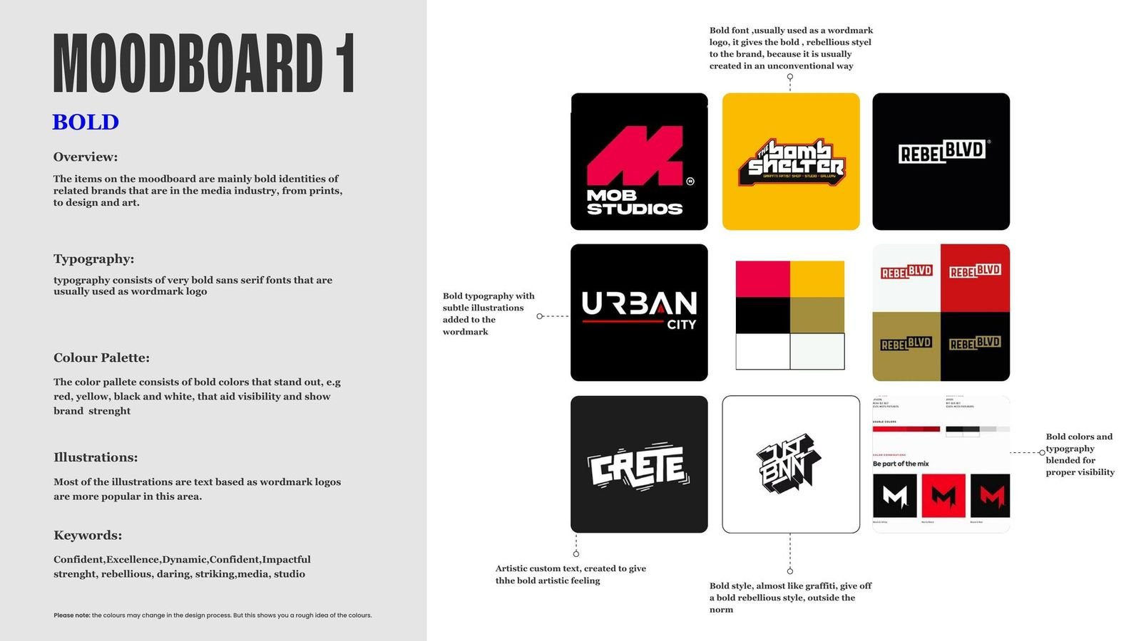
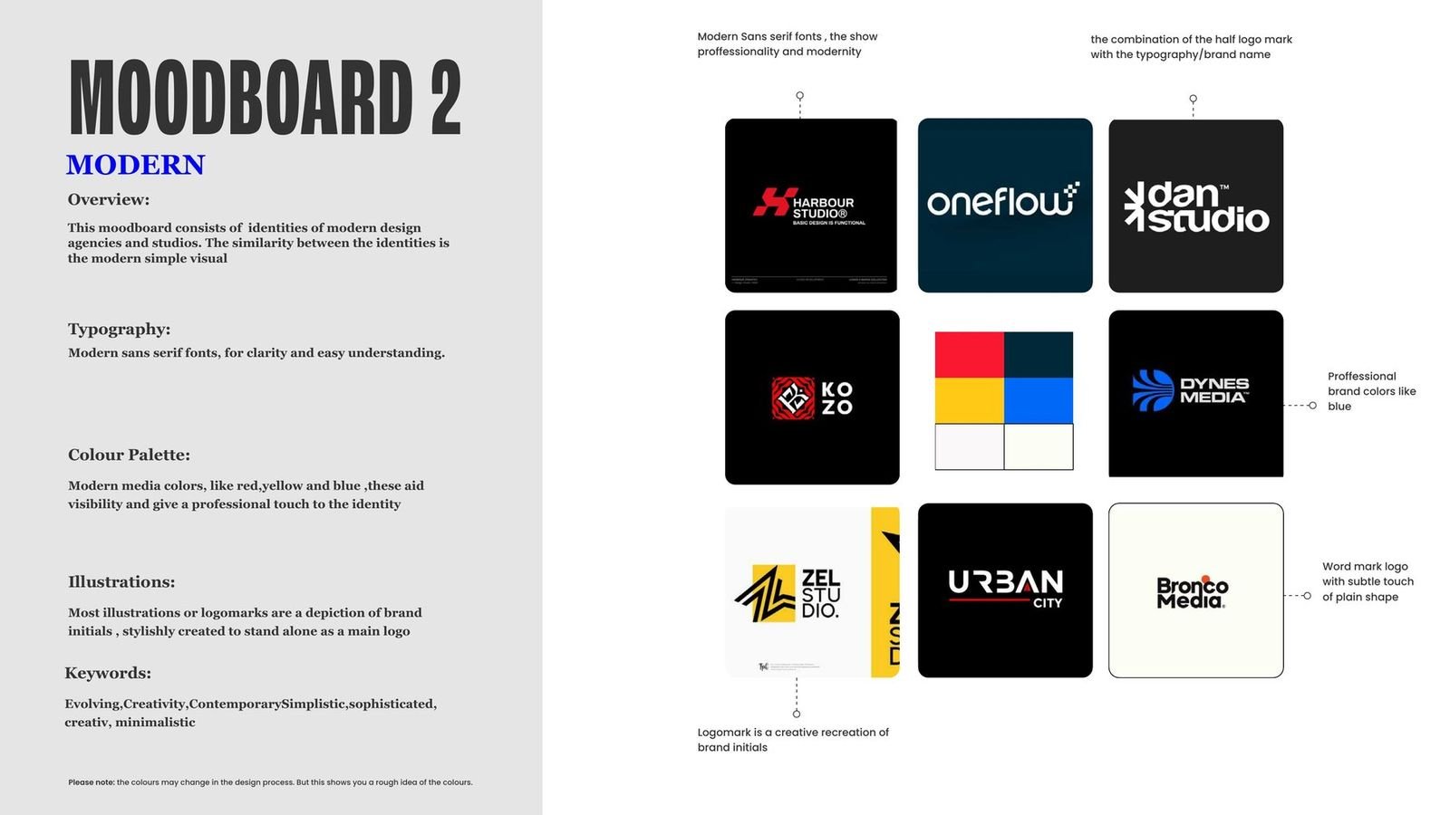
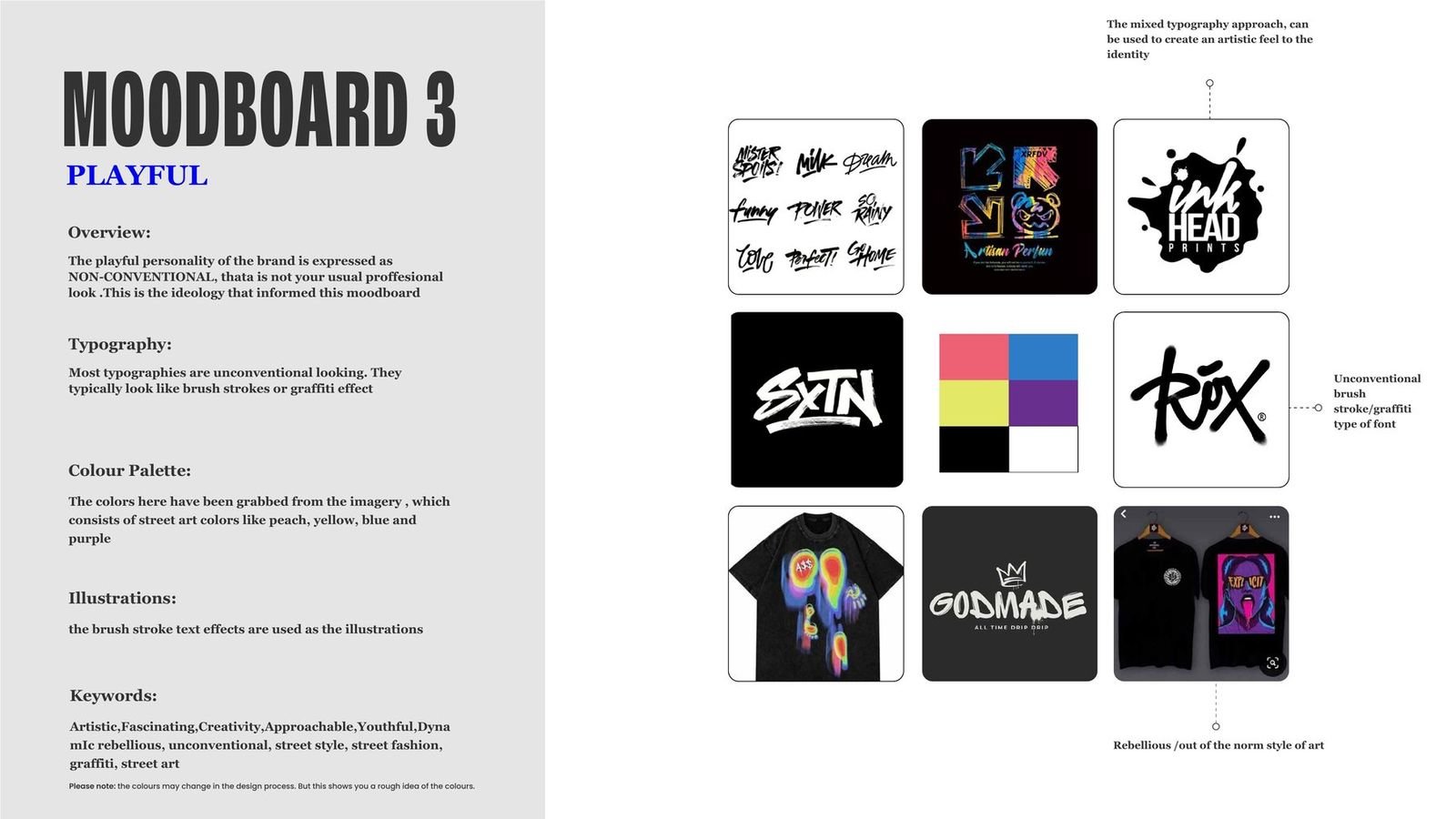
Rather than present one route and ask for a reaction, I built a moodboard for each of the three brand words, so the client could choose between genuinely different outcomes. Bold explored heavy wordmarks and high contrast colour, the language studios in the same space are already using. Modern looked at simpler, more professional identities built around a logomark. Playful went unconventional, brush strokes and graffiti, closer to street art than to a design studio.
The client chose Bold, with an element of Modern carried into it to keep the result professional rather than purely artistic. That combination produced the final direction: a heavy, confident mark with a restrained system around it.
Design
With the strategy agreed, the work was rebuilding the identity around the one element that had to stay.
The mark
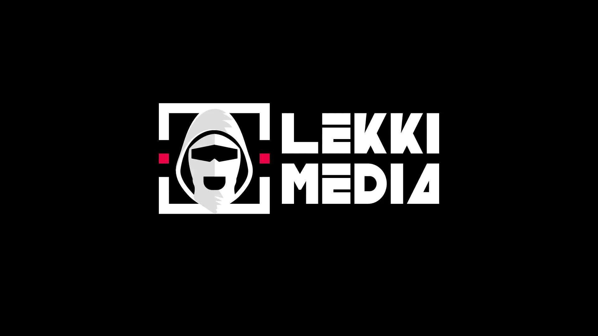
The mask was rebuilt rather than redrawn. The silhouette people recognise is intact, but the construction underneath it was tightened so it holds at avatar scale and at billboard scale, which the original did not. It sits inside a frame that locks it to the wordmark, so the two always relate the same way regardless of where they appear.
Palette and type
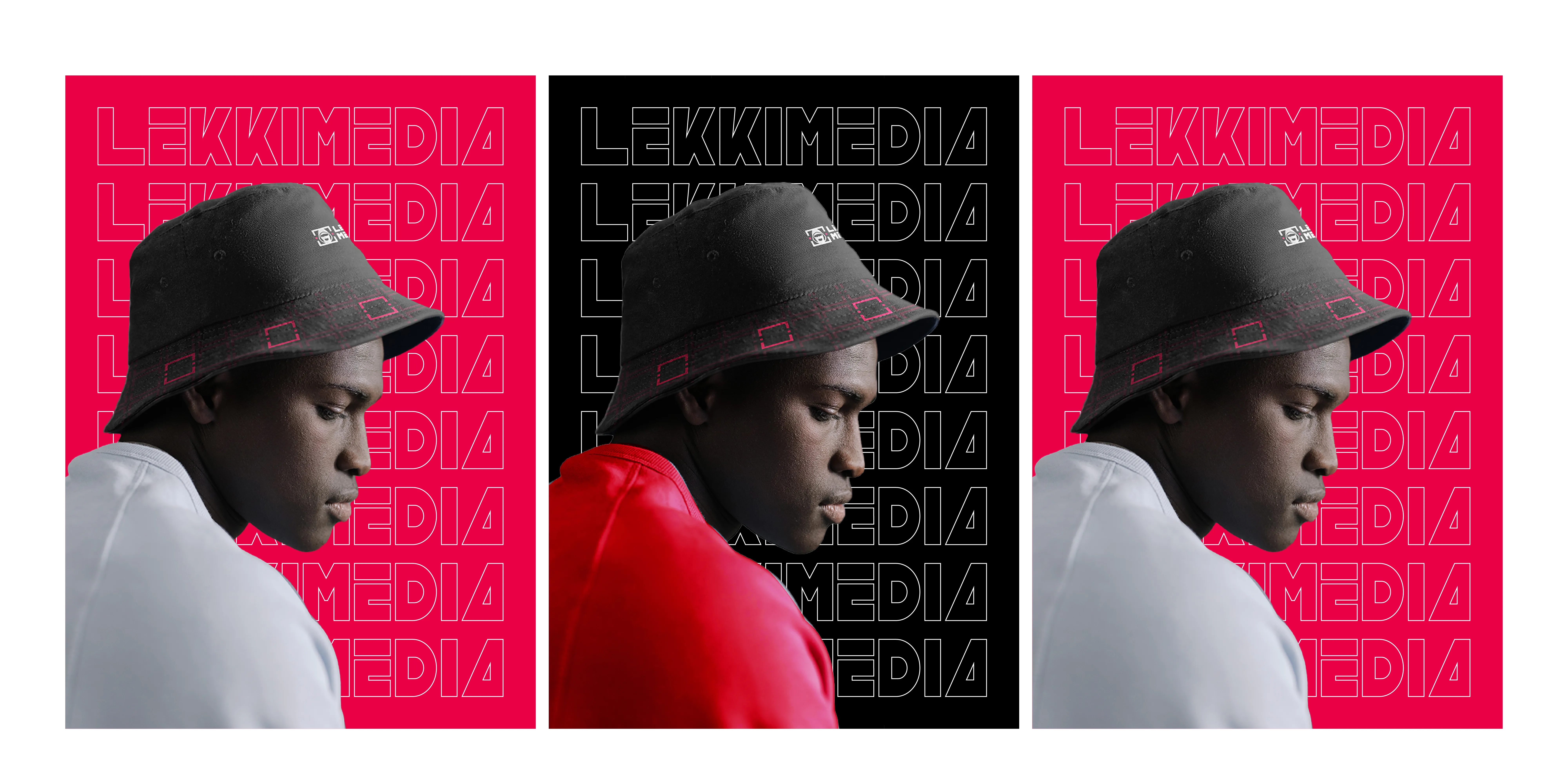
Red, black and white, and nothing else. A narrow palette is what lets the brand sit next to a fashion image without fighting it, and it makes the identity recognisable at a glance in a category where most work is photographic. Typography is heavy and condensed so a headline holds its own on a poster at distance.
The bracket device
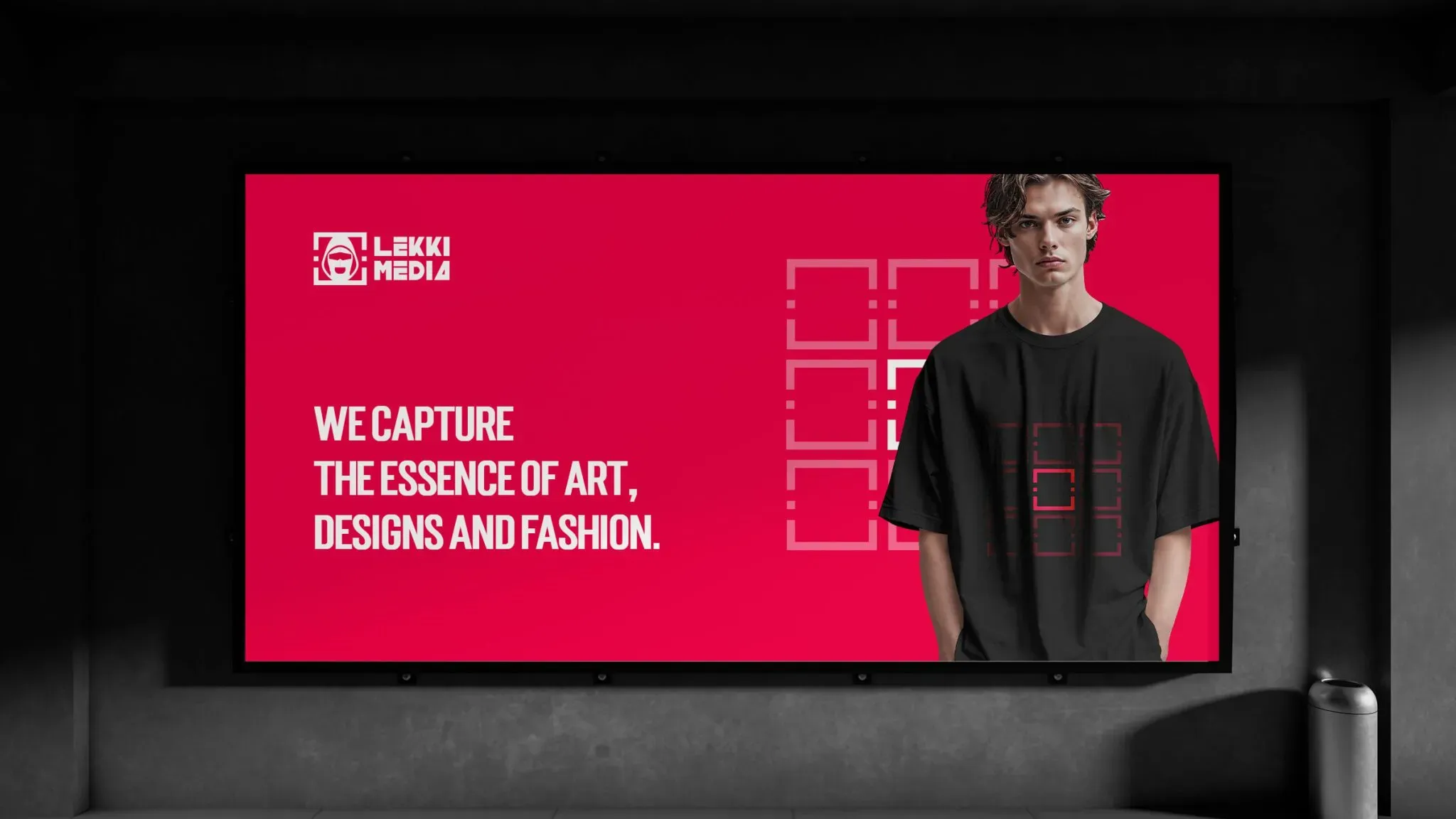
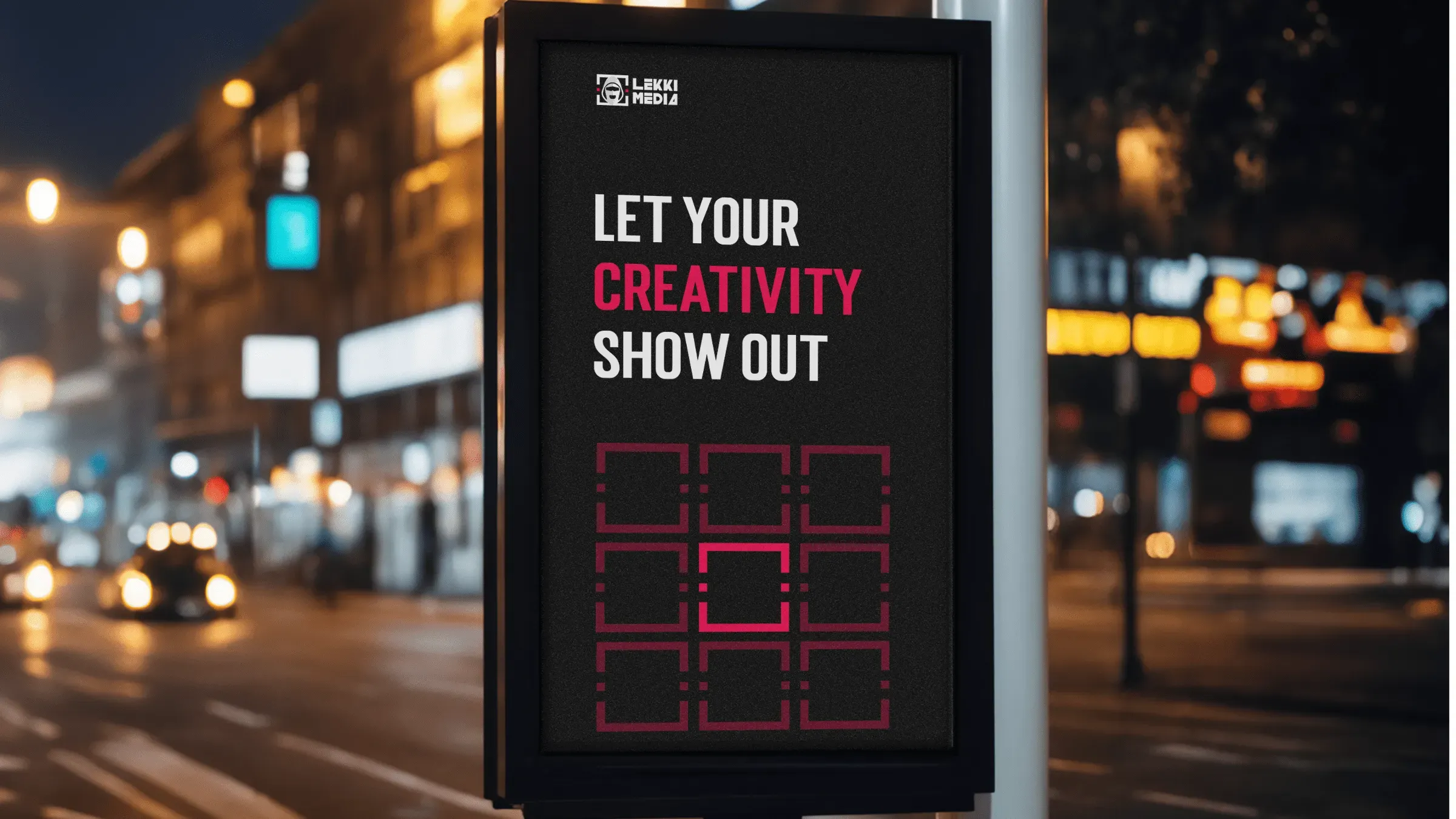
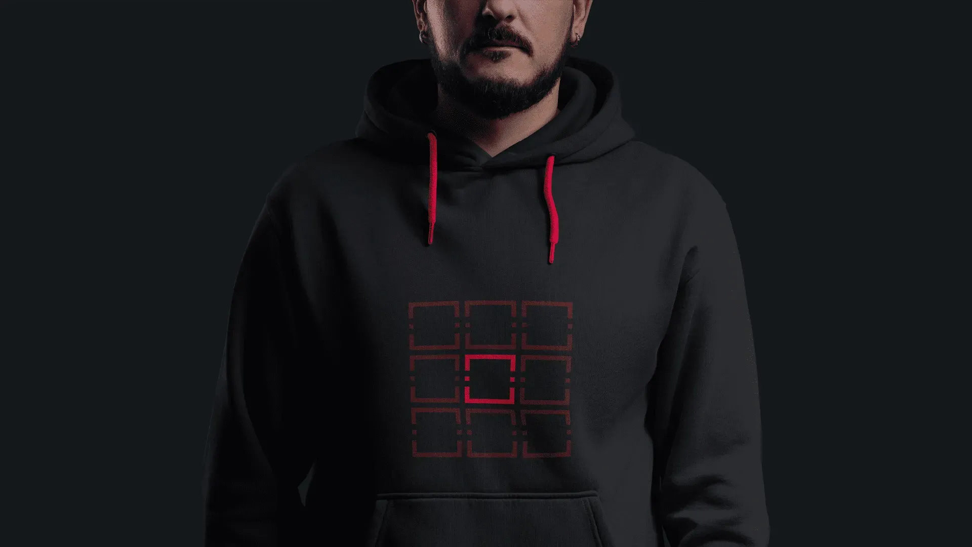
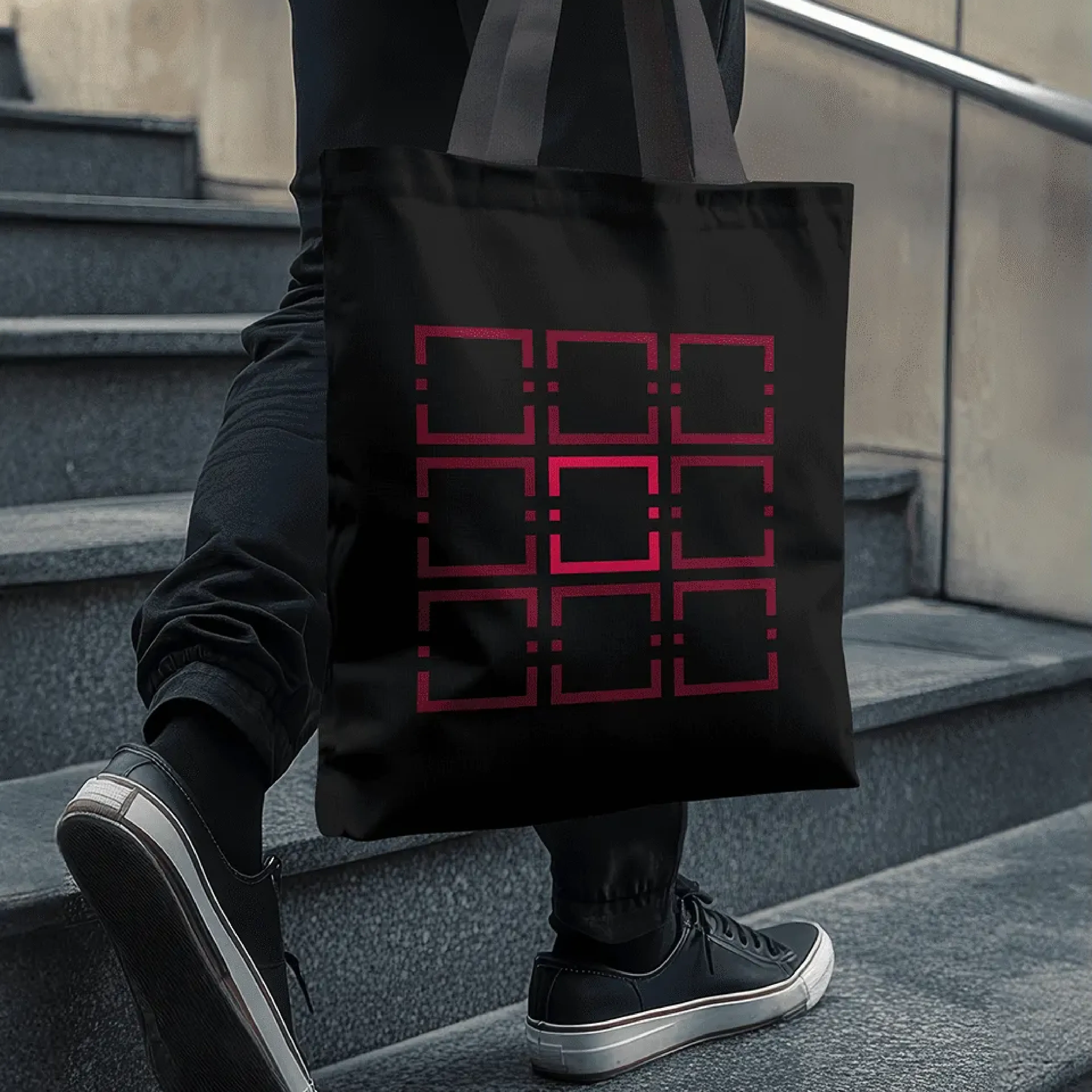
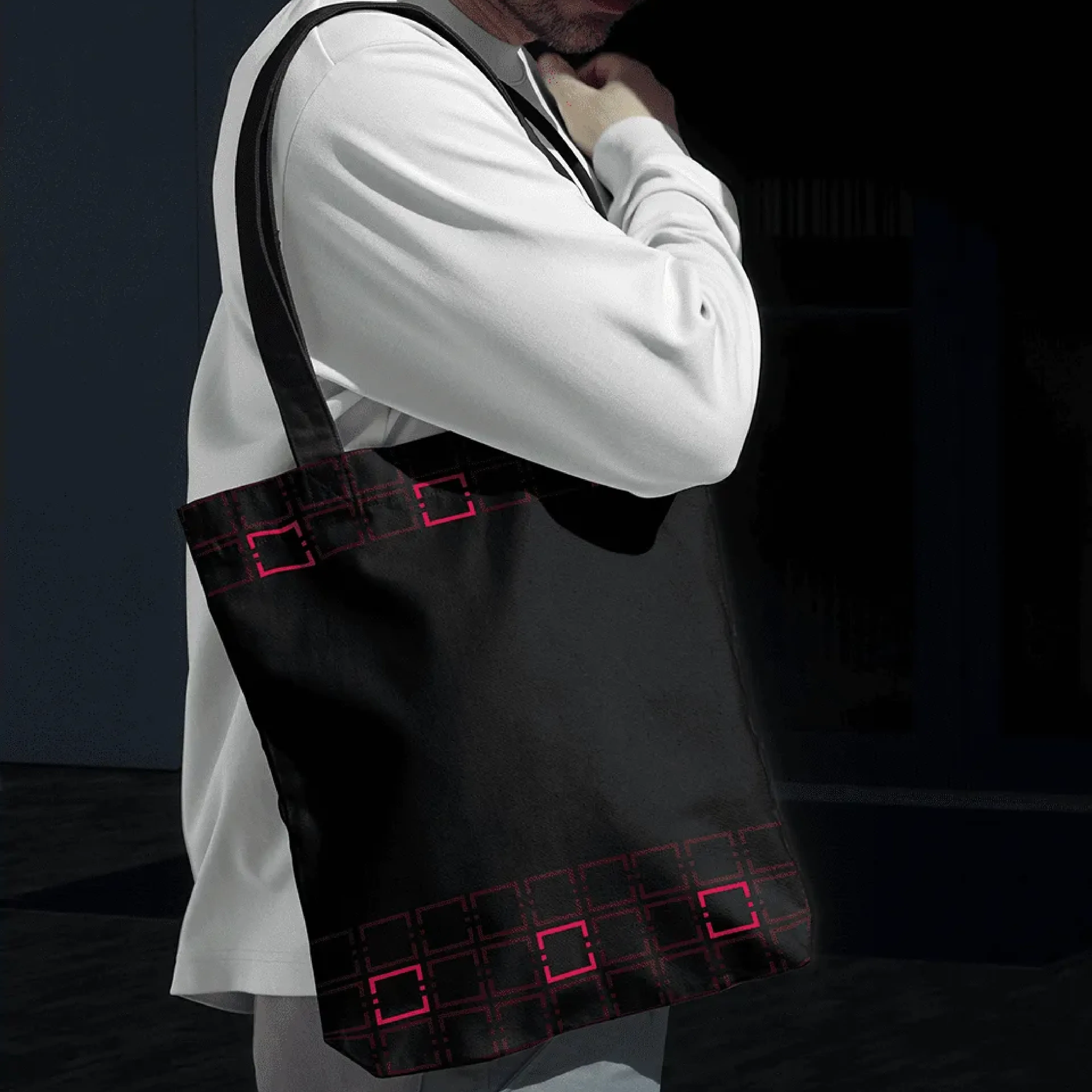
The frame around the mask is pulled out as a graphic device in its own right, a set of brackets that crop, group and point at things. It gives the brand something to say on a surface where the logo alone would be lost, and it scales from a business card to a billboard without redrawing. It is the piece that makes the system feel deliberate rather than assembled.

Delivery
The refresh was handed over as a working system rather than a set of files. Everything was supplied in the formats the team would actually use rather than in a single master file they would need a designer to open.
Because this brand produces a high volume of content, the templates mattered as much as the identity. The team needed to be able to make a poster or a social post that looked right without a designer in the loop each time.
The brand applied
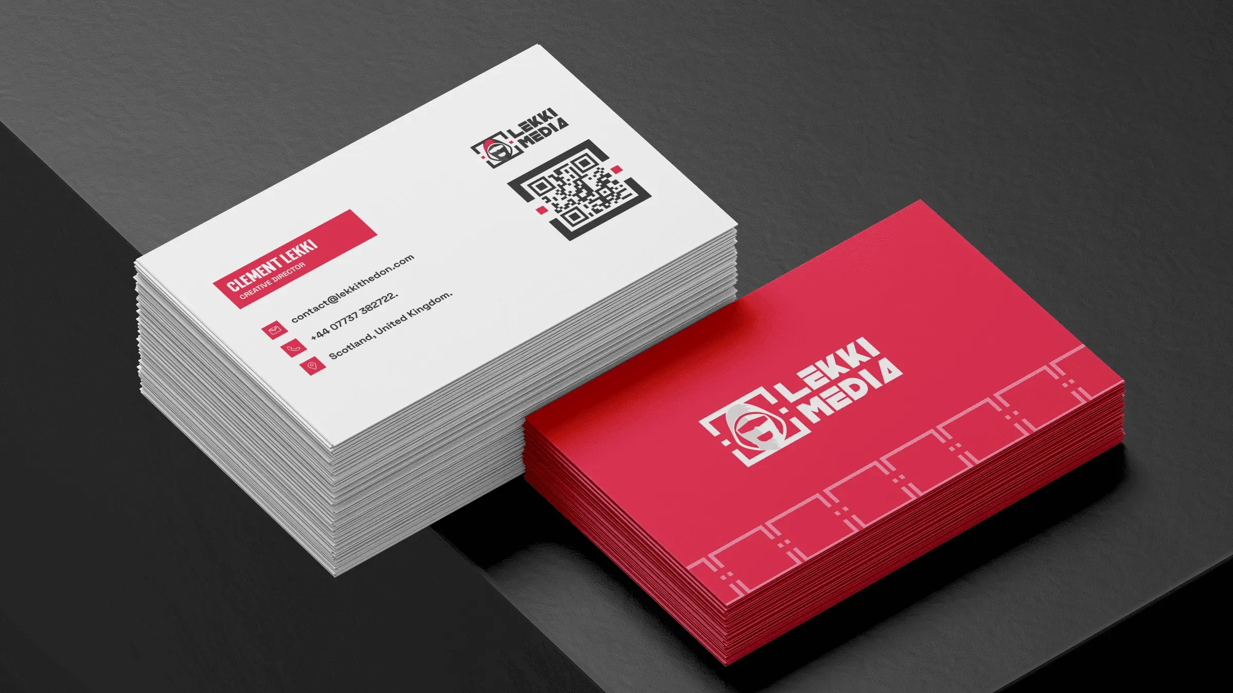
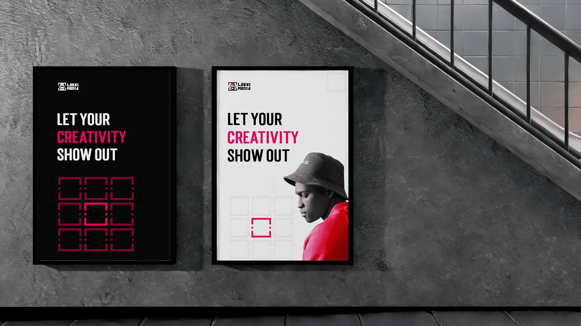
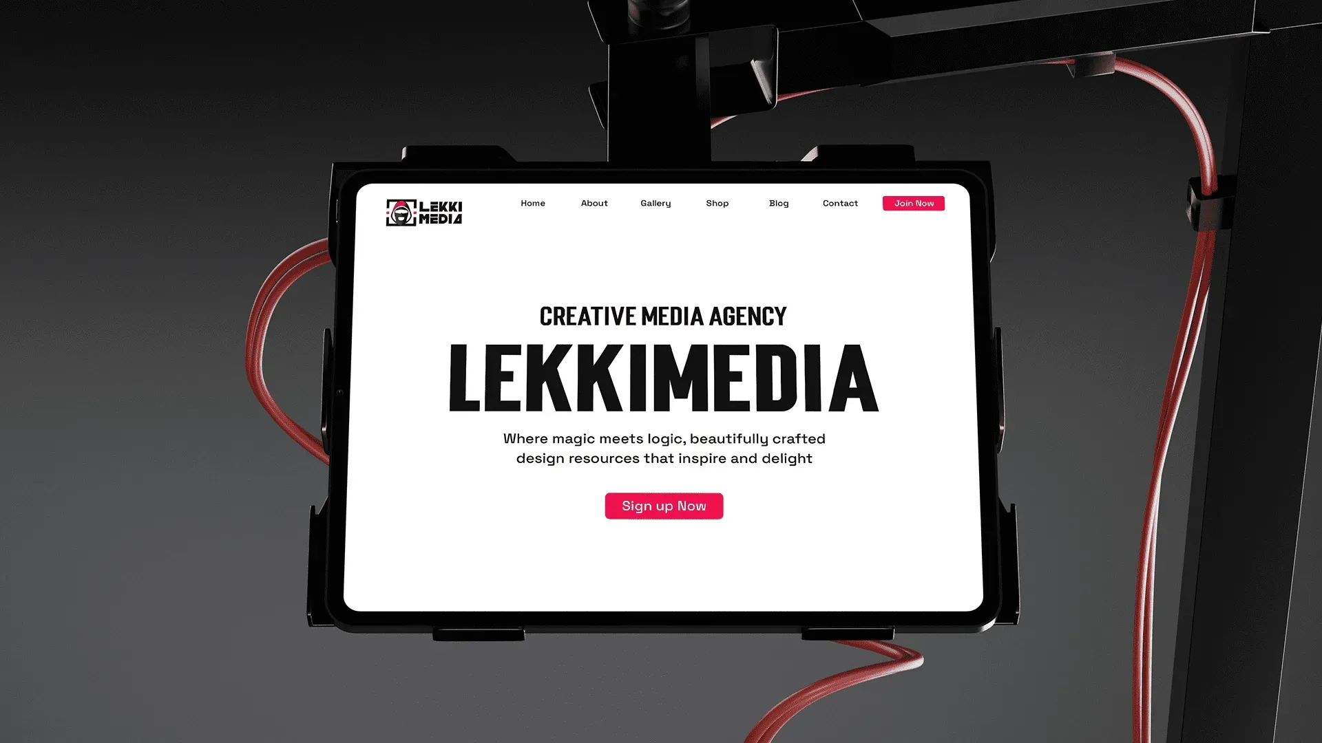
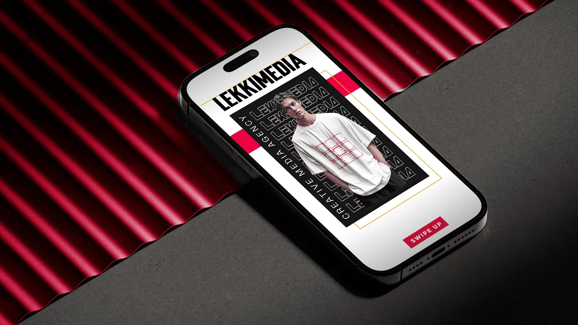
The system was built out across the surfaces this brand actually lives on: posters and out of home, business cards, apparel and merchandise, the website and social, each designed as a template rather than a one off.
Seeing it applied is also what proved the restraint was right. The brand holds a poster on its own and steps back when a fashion image is doing the work, which is the whole argument for a narrow palette.
Brand guidelines
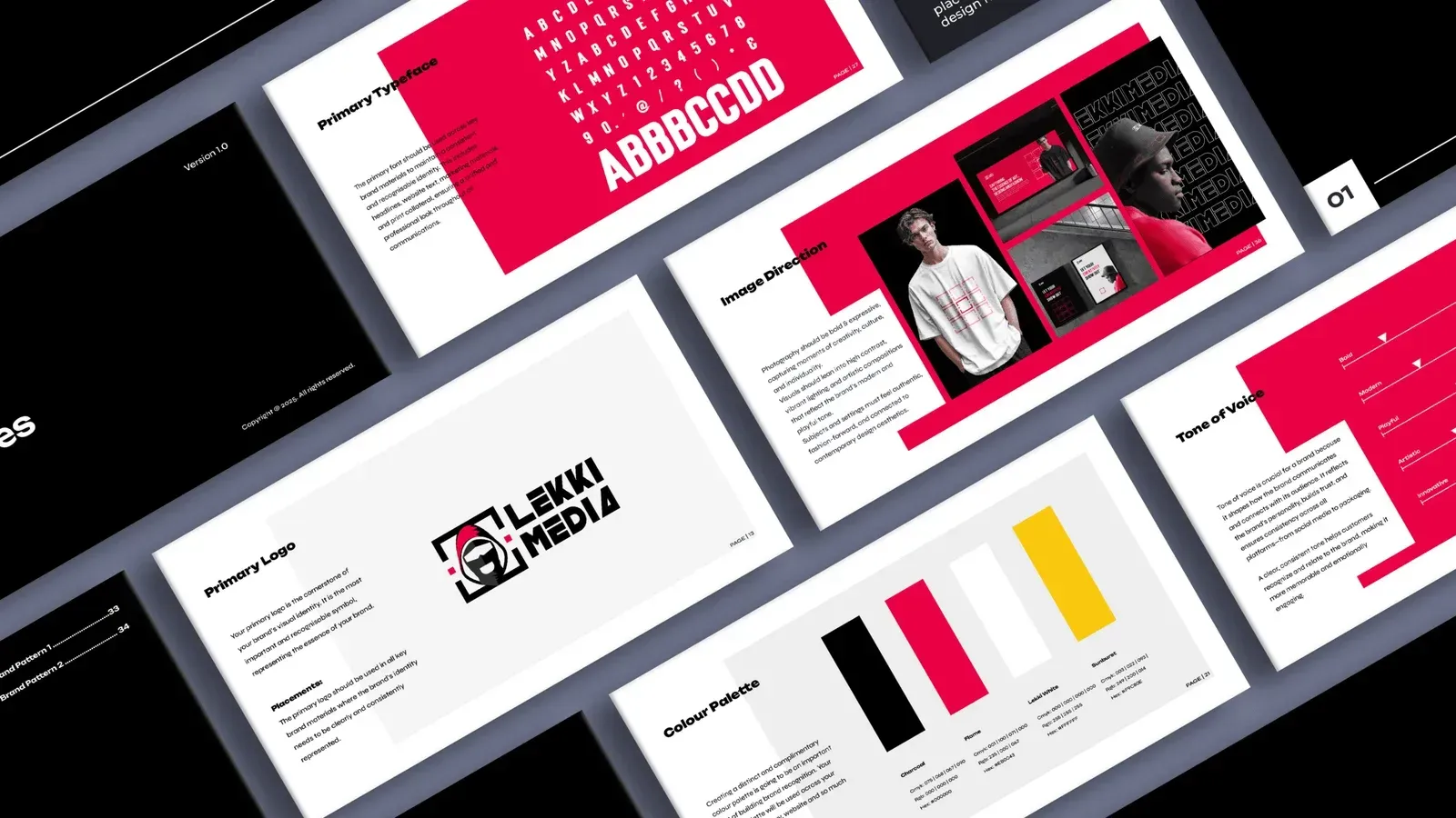
The guide covers logo usage and minimum sizes, typography, colour values, and how the bracket device behaves at different scales, prepared for both digital and print. The point of documenting it was that the team could take the brand onto something new without a designer approving every decision, which is the difference between a system and a set of files.
Outcome
The refresh was delivered in full: a rebuilt mark that holds from avatar to billboard, a colour and type system narrow enough to stay recognisable, the bracket device that gives the brand a repeatable graphic voice, brand guidelines and digital templates across web and social.
“Their attention to detail exceeded expectations, and the new branding has significantly strengthened our market presence, credibility and customer recognition across key channels.”
LekkiMediaWhat I took from it
A refresh is a harder brief than a rebuild, because the constraint is fixed before you start. Working out early which single element had to survive, and treating everything else as open, is what stopped this becoming a negotiation over every decision. I now begin any refresh by agreeing what is untouchable before discussing anything else.