Sector
Food and drink
Position
Lead brand designer
Result
12 stockists in 6 weeks
Scope
Brand identity, packaging, illustration system, print
Overview
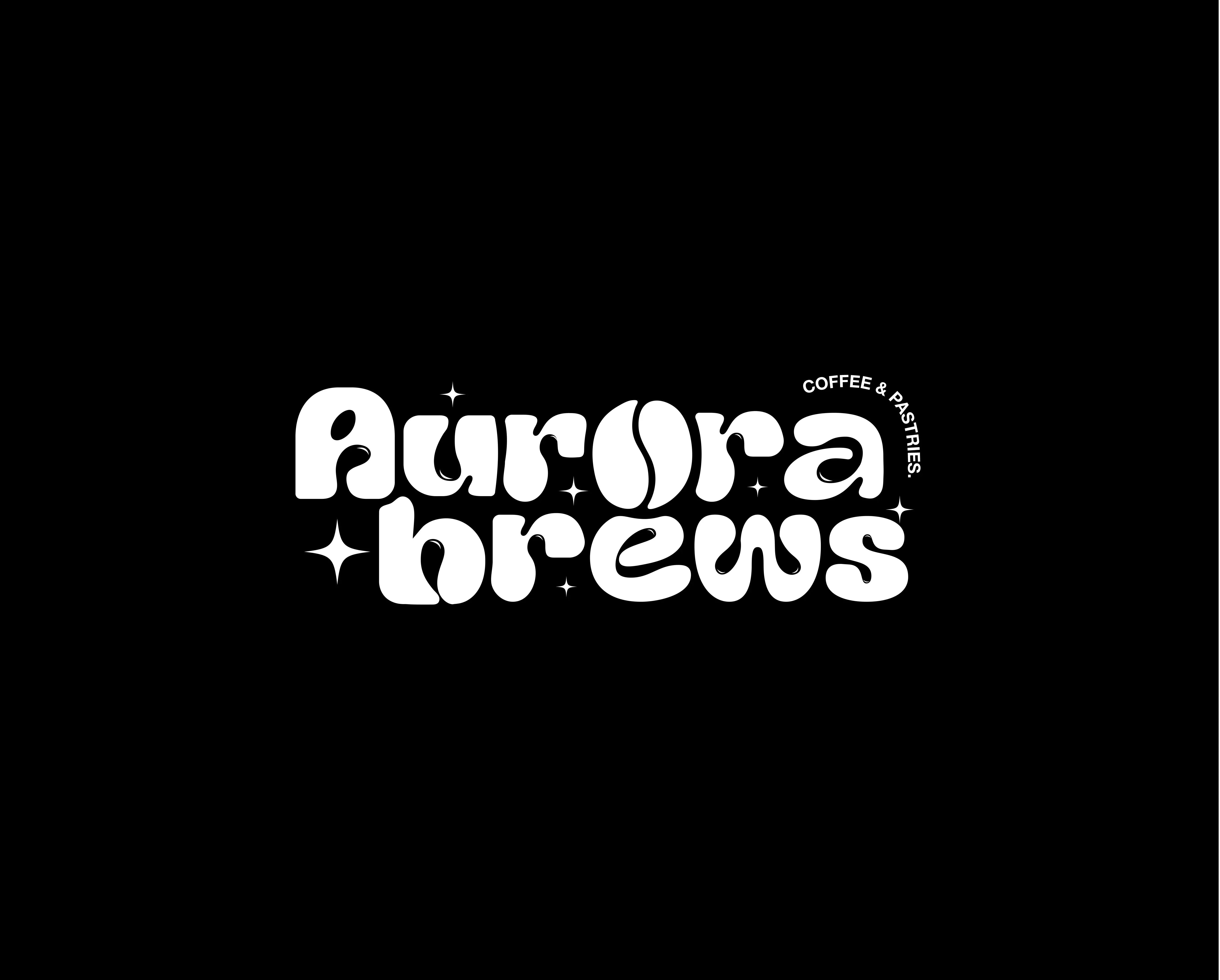
Aurora Brews is a coffee brand and cafe. The brief was a full identity: a name on a bag, a cup, a window and a shelf, and everything in between.
I led the design at Branxl Design, working alongside two designers and a motion designer. We researched the category together and explored routes as a team. I set the direction, drew the mark and the illustration system, and designed the applied work.
The challenge
A coffee bag has a few seconds to do its work, and most of the category spends them the same way: warm browns, earth tones, origin photography. Anything following that pattern disappears into the shelf beside it. The brand also had to be affordable for a young business to print.
Process
The work ran in four stages: discovery, definition, design and delivery. Discovery established what the category was doing and where a new brand could sit.
Definition turned that research into a direction the client could choose, which is where the black and white decision was made. Design built the mark, the illustration system and the packaging, and delivery covered presenting the work applied and handing over guidelines and production ready artwork.
Each stage ended with something the client could respond to. On a project this size that matters more than it sounds, because a small business cannot afford to discover at the end that the direction was wrong.
Discovery
We audited the category together, from independent roasters through to the larger brands, looking at how each was competing for attention on a shelf where everything sits side by side. Alongside that we researched what customers were actually weighing up at the point of purchase, which for a bag of coffee is a decision made in a few seconds and usually on appearance alone.
The finding was consistent enough to be useful. Almost every brand was using the same palette, the same origin storytelling and the same earth toned photography. Nobody was competing on form, which meant form was available. That single observation is what the rest of the project was built on.
Definition
I worked the research into mood boards and sorted it into a small number of routes the client could genuinely choose between, rather than presenting a wall of references and asking them to react. Each route came with the reasoning behind it and an honest account of what it would cost to print, because on a first production run that is not a detail.
Three directions
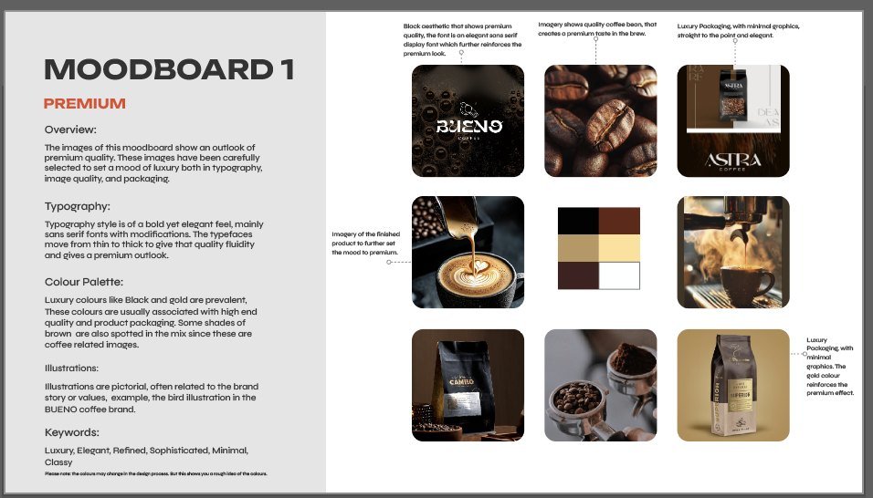
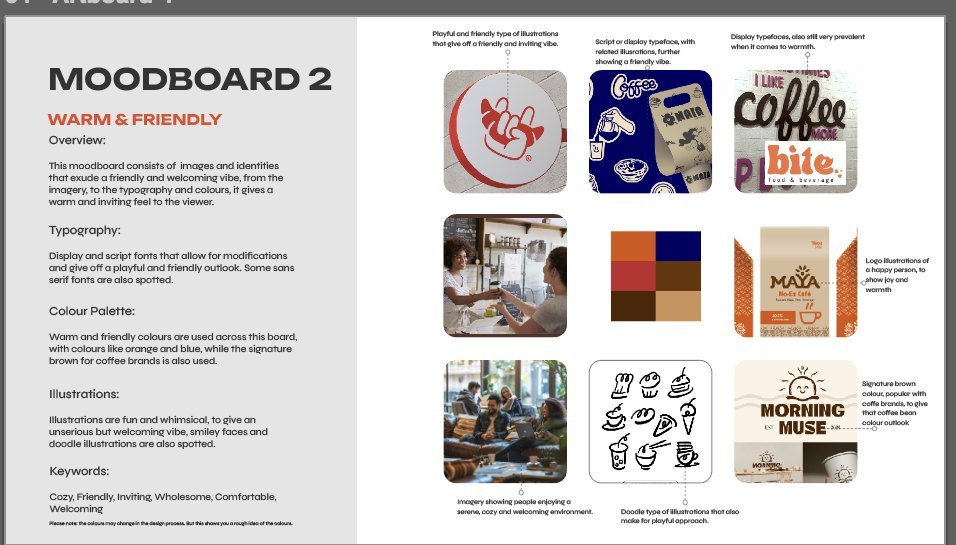
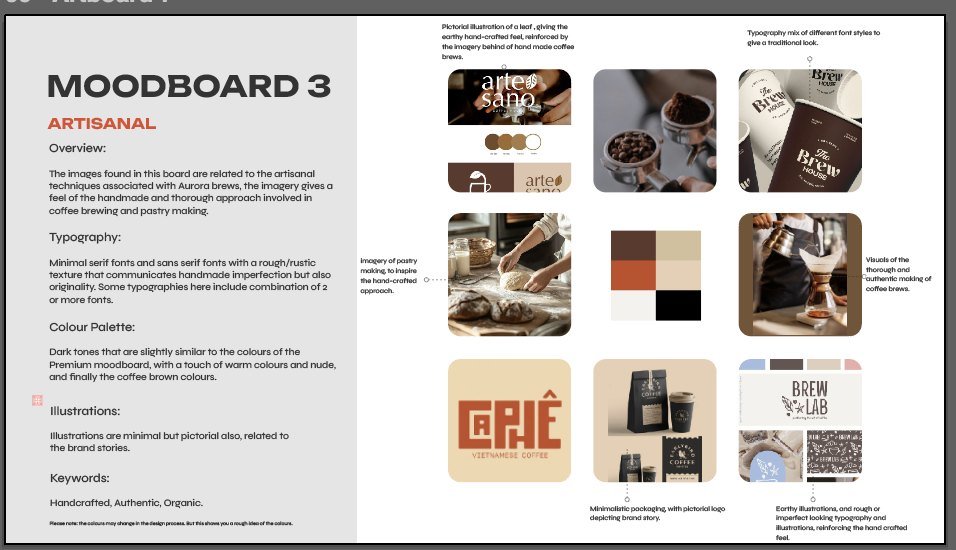
I built a moodboard for each route so the choice was between genuinely different outcomes. Premium looked at black and gold, elegant type and minimal packaging, the language high end coffee already uses. Warm and friendly went the other way, with display and script type, doodle illustration and orange and brown. Artisanal sat between them, rough textures and pictorial marks suggesting something handmade.
Finding the direction
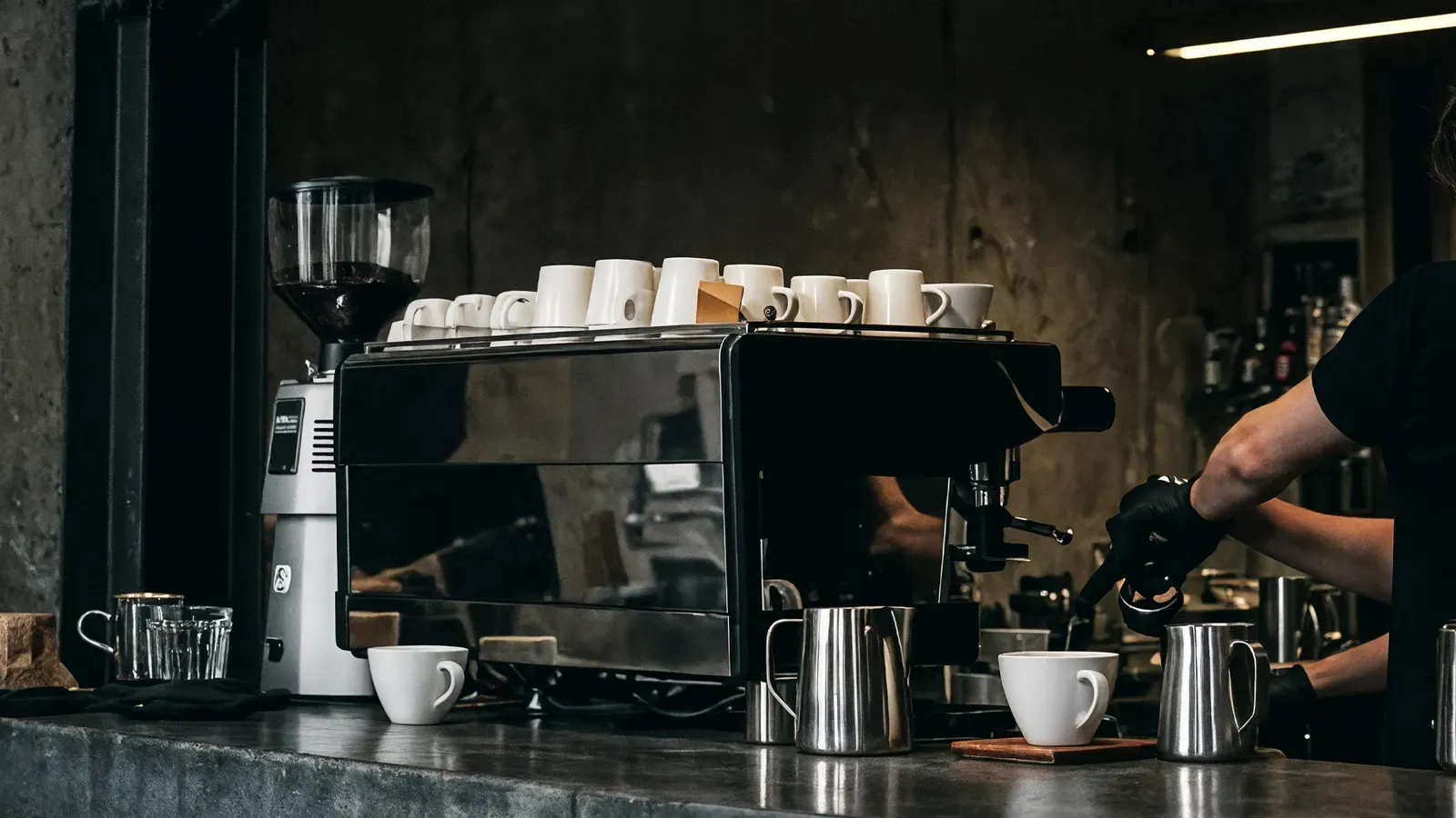
The decisive input came from the shop rather than the category. The cafe interior is dark and stripped back, and the owner wanted the packaging to feel like the room it is sold in. We explored a warm brown route because it was the obvious answer, and it tested as generic against everything else on the shelf. Black and white gave us the owner's aesthetic and the differentiation in a single decision, which is why it held when the alternatives did not.
I presented the direction with the reasoning attached, and it was approved before any design work began.
Design
With the direction agreed, this stage was about building the pieces the brand would run on: the mark, the illustration system and the packaging structure. The constraint set the order of work. With colour gone, the letterforms and the illustration had to carry everything colour normally does, so both had to hold up before anything was applied to a surface.
That meant testing each piece at its hardest condition first, a mark small enough to embroider and a character legible in one ink, and only scaling up once it survived.
The mark
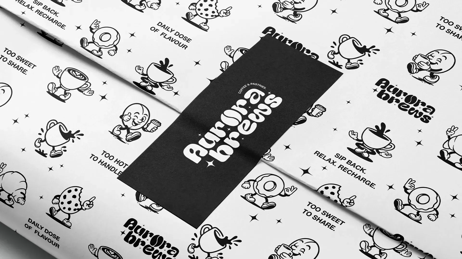
The team explored early routes and I reviewed them, but none were holding the direction, so I took the mark on and drew it. It is soft and rounded, closer to something hand made than the geometric marks the category defaults to, so the brand still reads as warm in pure black and white. I built it into primary and secondary lockups so it works on a bag, a cup, a window and an avatar without redrawing anything.
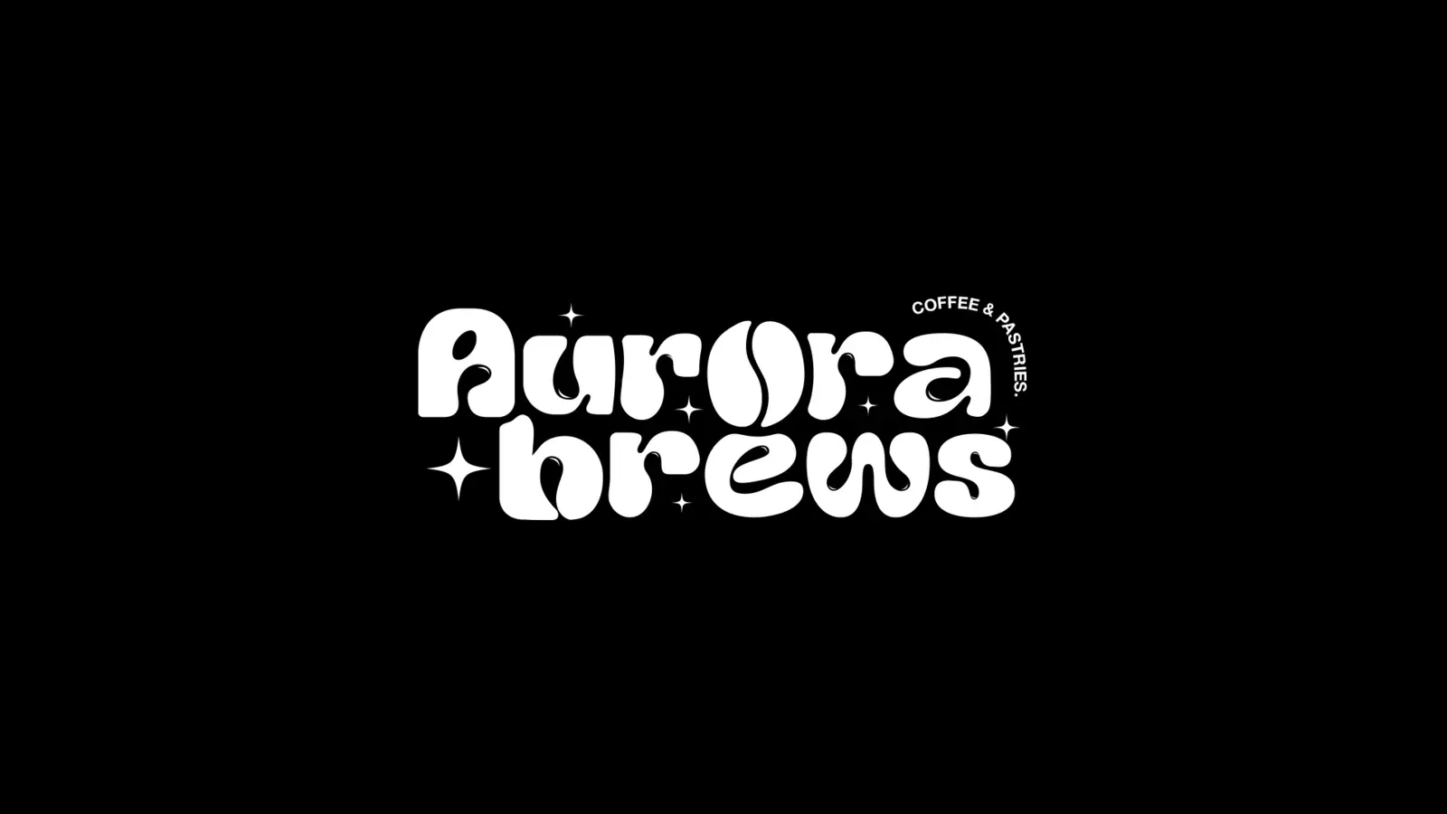
Illustration system
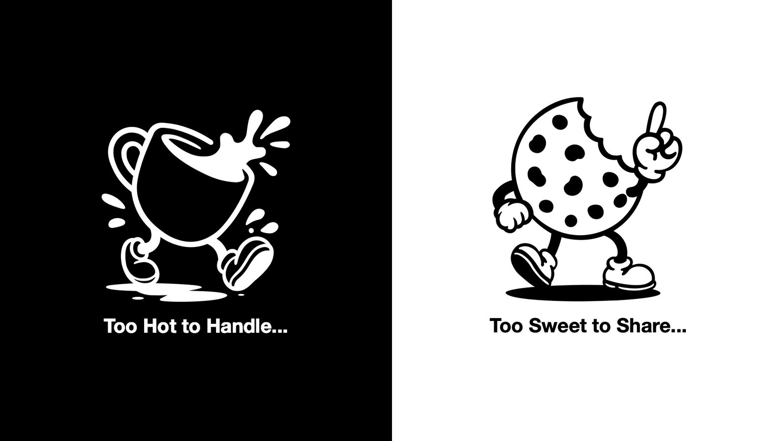
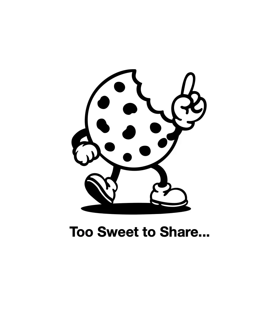
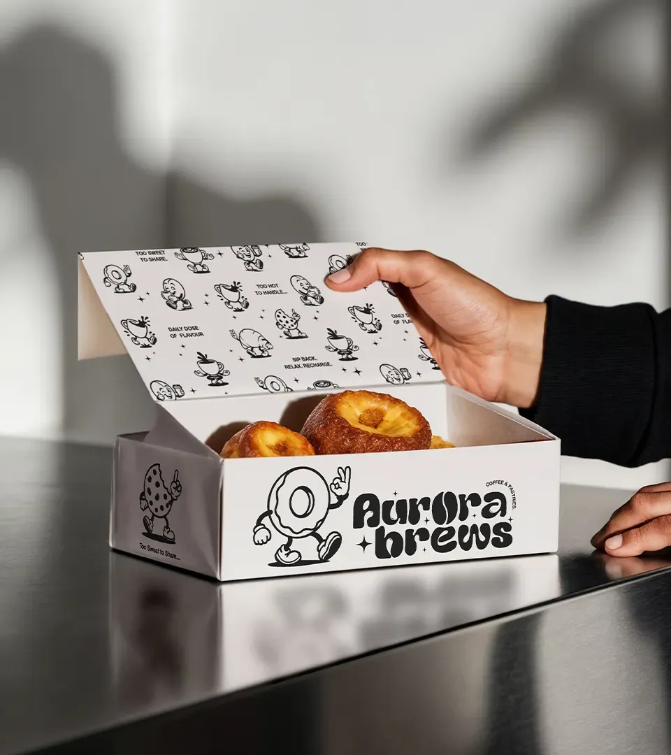
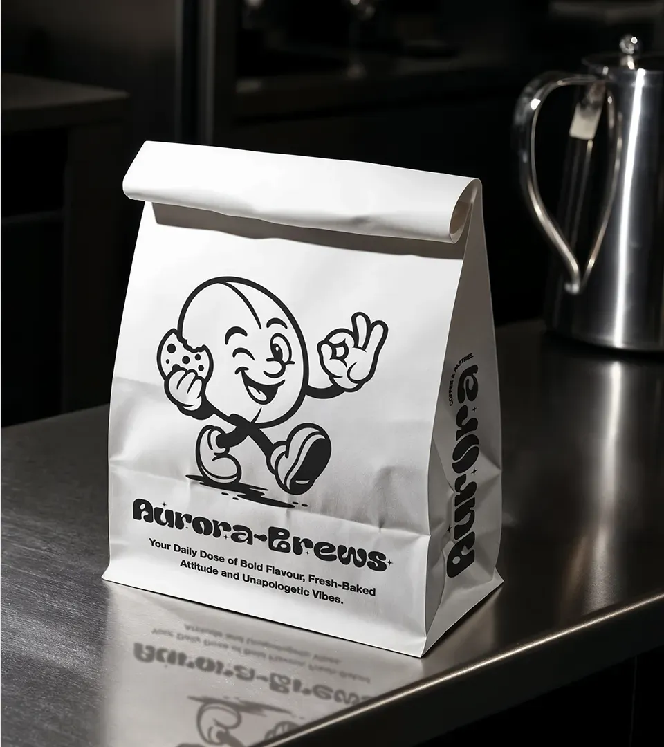
I drew the characters, and they are where the personality lives. Each is a coffee or a pastry with a line of copy attached, so the brand has a voice on every surface rather than just a mark. They also do the job colour normally would: a customer tells one product from another by which character is on it, with no colour code needed across the range.
Packaging
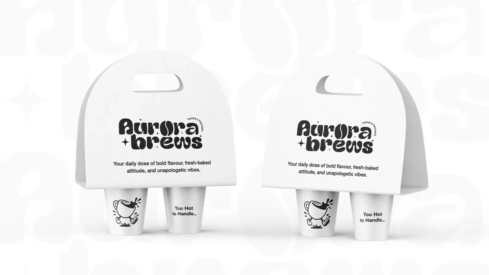
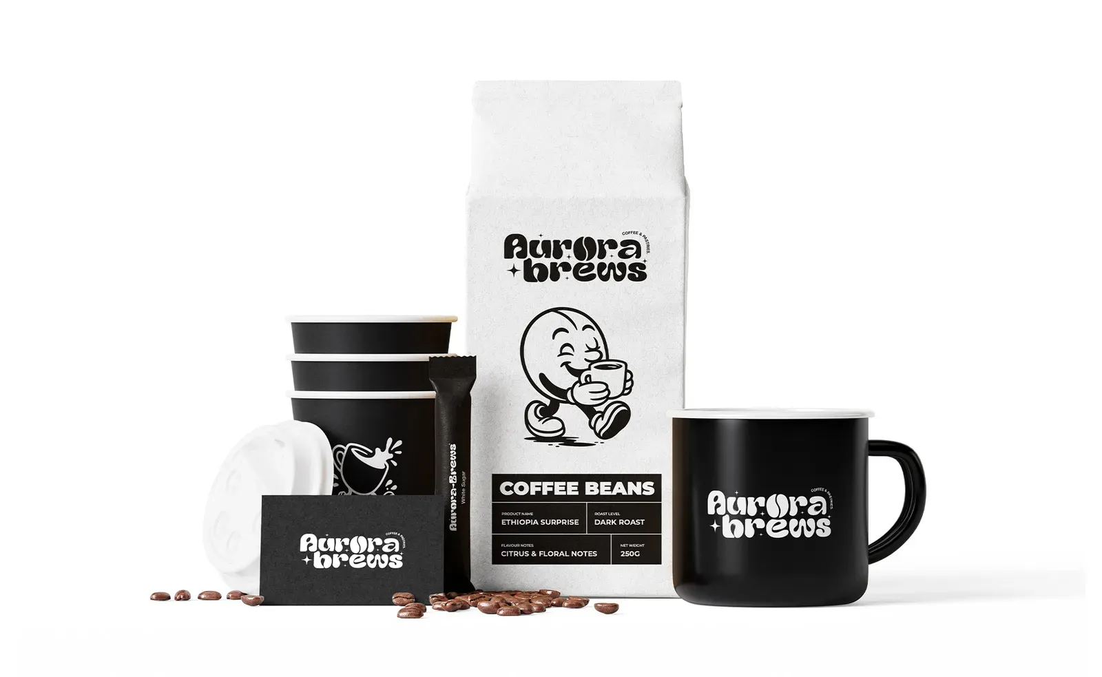
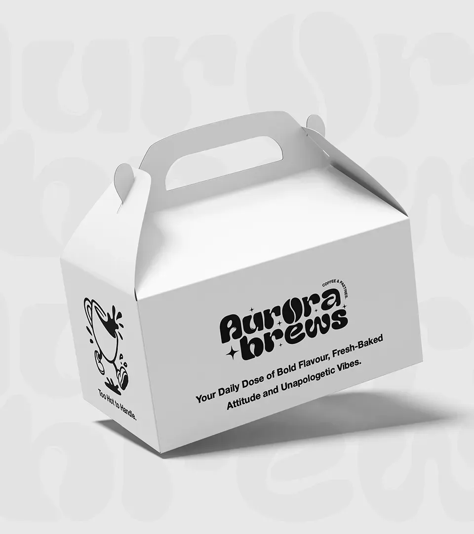
The restraint pays off twice here. A black and white block on a shelf of brown is unmissable, and a single ink system is far cheaper to print, which matters a great deal to a business placing its first orders. Every unit shares one structural layout so the range reads as a single block from a distance, while the illustration and the copy distinguish products up close.
Delivery
I presented the identity applied across the surfaces it would actually appear on rather than as artwork on a page, so the client could judge it the way a customer would. Seeing a bag on a shelf and a cup in a hand answers questions that a logo on a white page never raises, and their feedback at that stage produced the final round of refinements.
It was handed over with guidelines covering logo usage, the illustration system, typography and how the pattern should be applied at different scales, along with print ready artwork specified for each format. The aim was that the client could brief a local printer or supplier directly without coming back to the studio for approval each time.
The brand applied
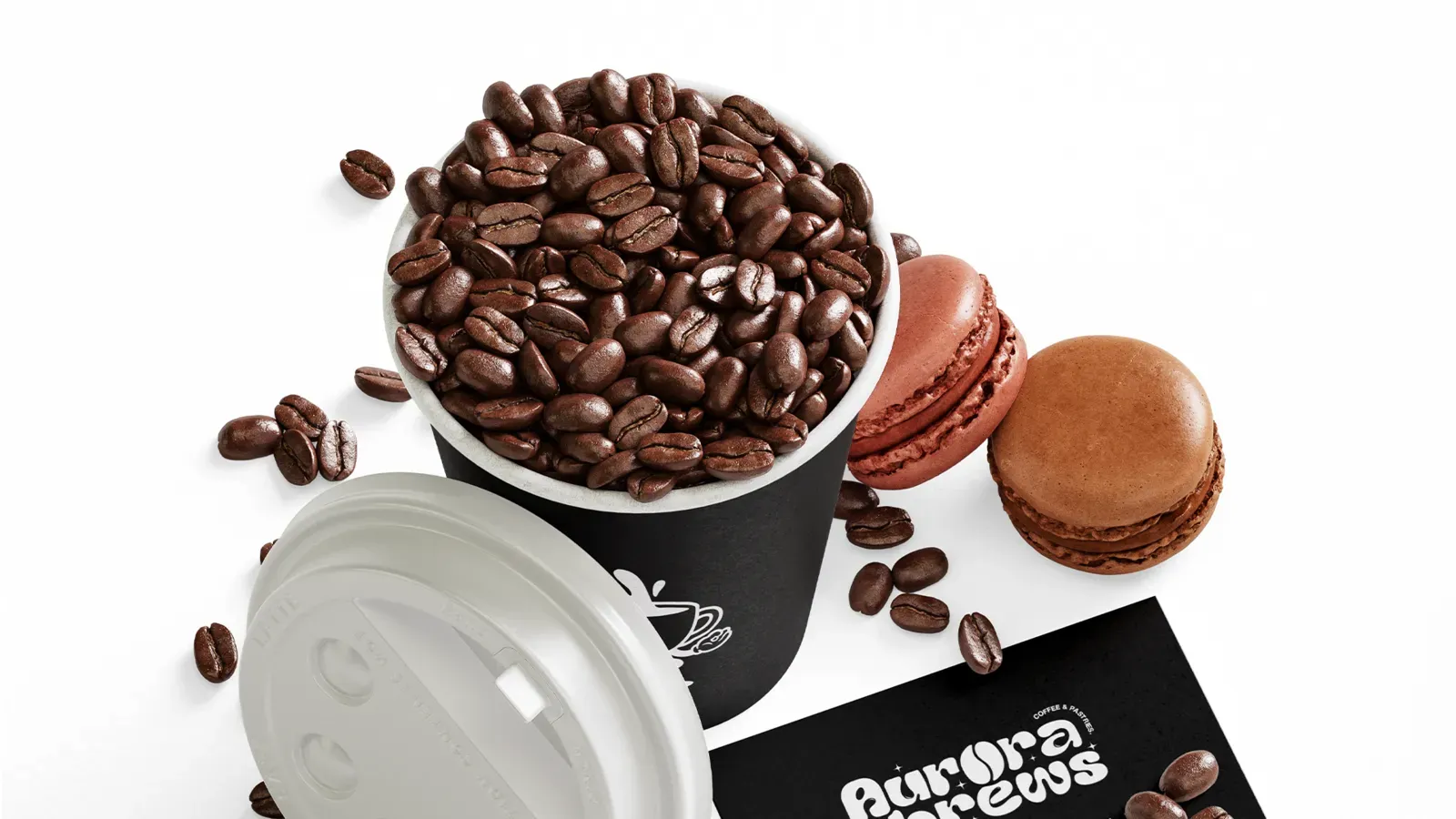
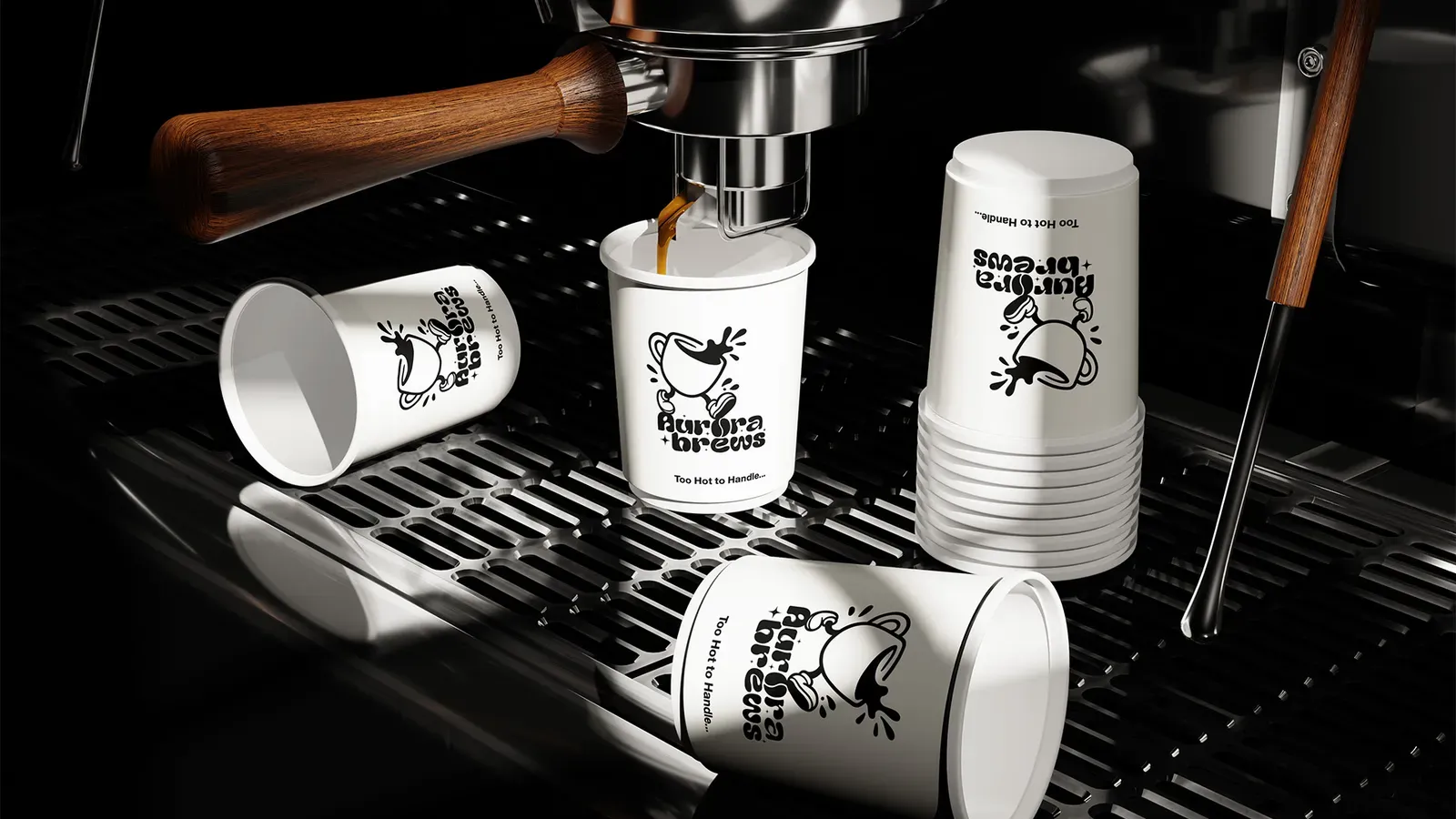
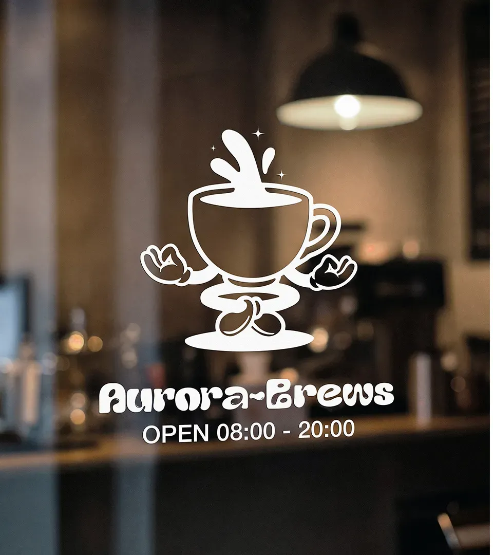
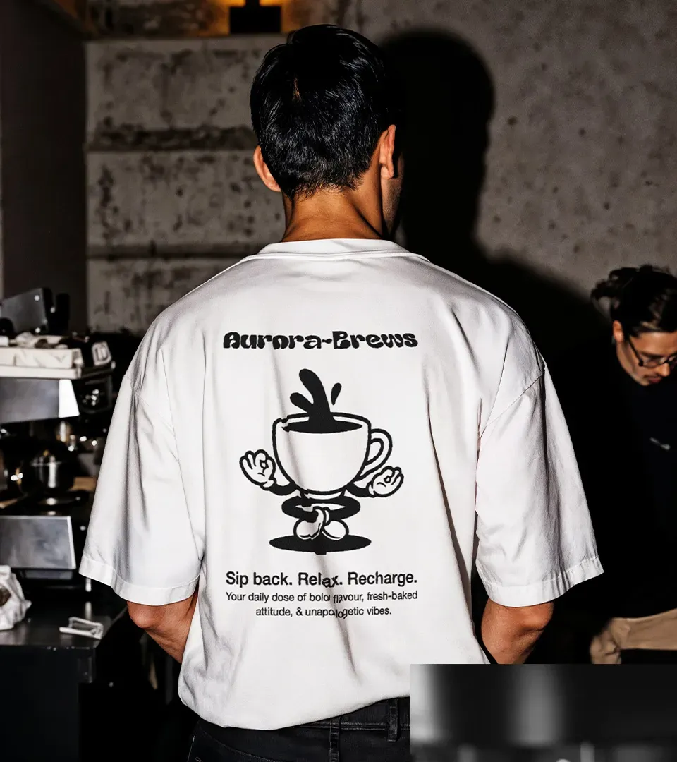
The system was built out across everything a customer touches: bags and boxes, cups and lids, wrapping, signage, apparel and the pastry packaging that sits on the counter. Each piece uses the same structural layout so the range reads as one block from a distance, while the illustration and the copy line change to tell products apart up close.
Presenting it this way rather than as flat artwork is what got the direction signed off. The client could see that a single ink brand would still look considered on every surface it needed to appear on.



Outcome
Aurora Brews reached 12 stockists within 6 weeks of launch, which for a new coffee brand entering a crowded category is the measure that matters most. Getting onto a shelf means a buyer looked at the packaging and believed it would sell.
The single ink system also did what it was designed to do commercially. Print costs stayed low enough for a young business to extend the range without redesigning anything, and the illustration library means a new product can be added by drawing one character rather than reworking the identity.
“A brand that actually stands out. The identity feels distinct without being complicated, and it works just as well on a coffee cup as it does on a shelf.”
Aurora Brews, on the delivered identityWhat I took from it
The strongest decisions usually come from listening to the client rather than to the category. The owner wanted the packaging to feel like their room, and following that took us somewhere far more distinctive than the obvious route would have. Removing colour then forced every other decision to work harder. I now start by asking what a category relies on and whether the brand can afford to do without it.