Sector
Faith organisation
Position
Product designer
Duration
Three months. Currently in development
Scope
Research, information architecture, wireframing, visual design, prototyping, usability testing
Overview
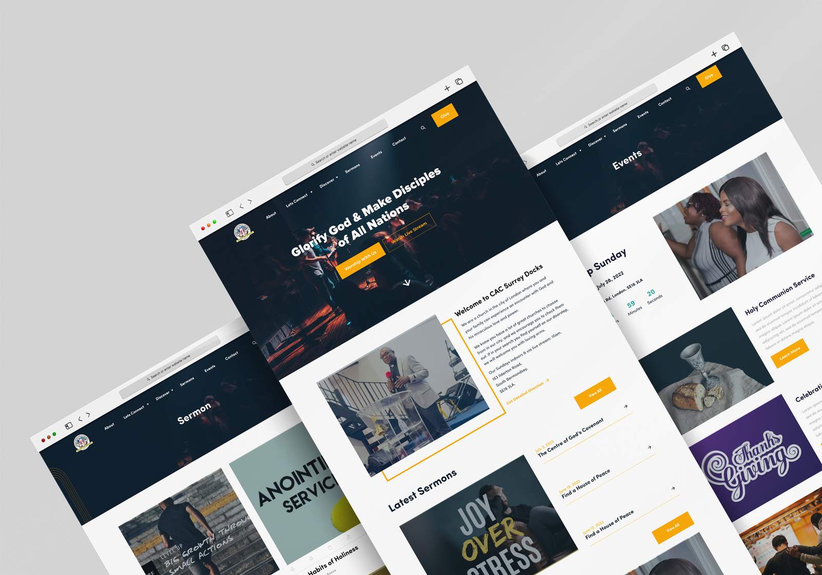
A website redesign for a church in south east London, built so that people can watch past sermons whenever they want, join services broadcast live, and find out what is happening that week without having to ask anyone.
I was approached directly by a board member as part of a wider rebrand of the organisation. I worked as the sole designer across the whole process, from research through to the finished designs, alongside a developer who built the site.
The challenge
The church had been losing members for several years, young adults in particular. The existing website was not reaching new people or telling visitors much of use. It was dated, hard to find your way around, and did not appear in search results when someone looked for a church nearby.
The timing mattered too. The organisation had just appointed a new superintendent and management team, and wanted a site that worked with how they now ran things rather than describing an arrangement that no longer existed.
Project objectives
- Make it easy for someone new to find out what the church is and when it meets, without reading a page of text.
- Put sermons and live services at the centre, since that is what most people come to the site for.
- Bring the look of the site in line with the wider rebrand, so it reads as one organisation.
- Make the site work properly on a phone, which is where most visitors arrive from.
Process
Three things changed. The mask now holds from an avatar to a billboard, which the original construction did not. The brand is recognisable at a glance in a category where almost everything is photographic, because the palette never moves off red, black and white. And the team produces its own posters and social from the templates, so the brand keeps looking like itself between projects.
That last one is the measure of a refresh. It has to work without the designer who made it, and the identity it replaced could not do that. The old brand was a collection of one off decisions with no rule holding them together, which is exactly what the audit found and exactly what the system fixed.
Discovery
I started by going through the existing site as a visitor would, looking for where someone would get stuck, then interviewed church members to find out what they actually came to the site to do.
Reviewing the current site
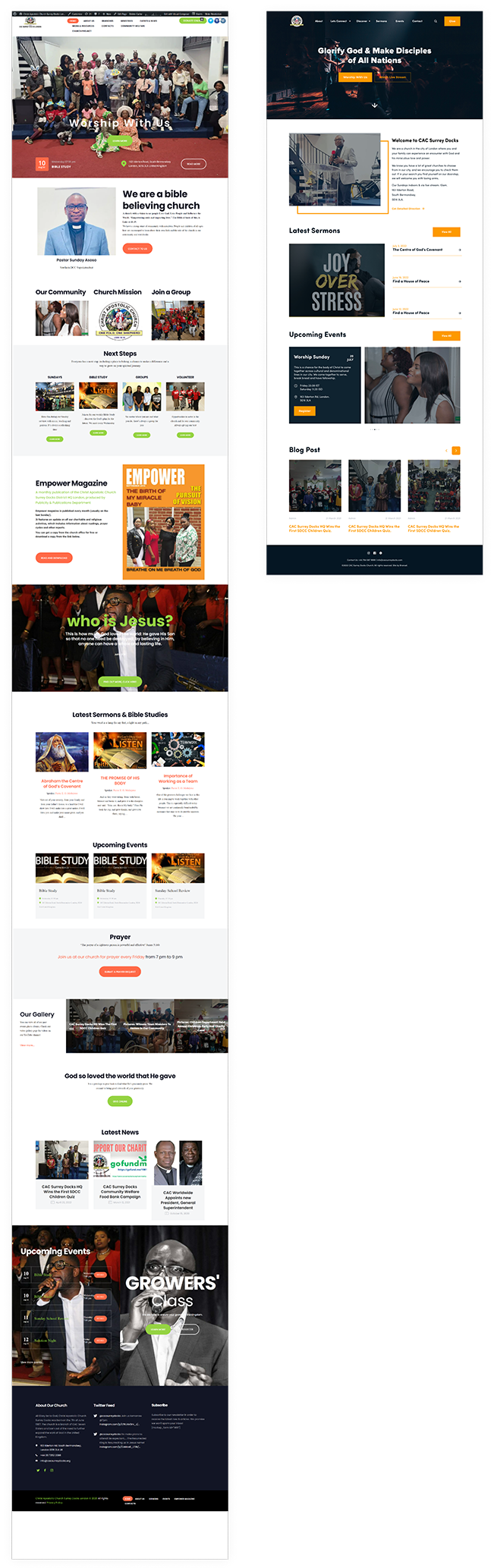
The old site had accumulated links and pages over years without anyone removing anything, so the things people wanted were buried under things they did not. Event descriptions ran long enough that the date and time, the two pieces of information anyone actually needs, ended up below the fold. There was little to tell a visitor what to do next on any given page, and the colours changed from one page to the next, which made the site feel like several sites stitched together.
Competitor analysis
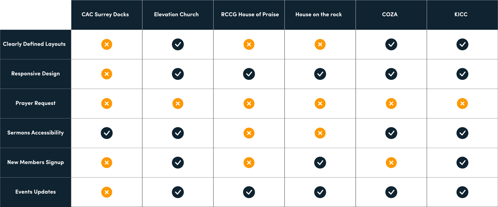
I looked at how other churches and similar organisations handled the same problems, comparing them on the things that mattered here: whether sermons were easy to find, whether the site worked on a phone, whether you could tell what was happening this week, and whether it was obvious how to get in touch. Mapping them side by side made the gaps in the existing site concrete rather than a matter of opinion, and gave me something to show the board that was harder to argue with than a design preference.
What the research found
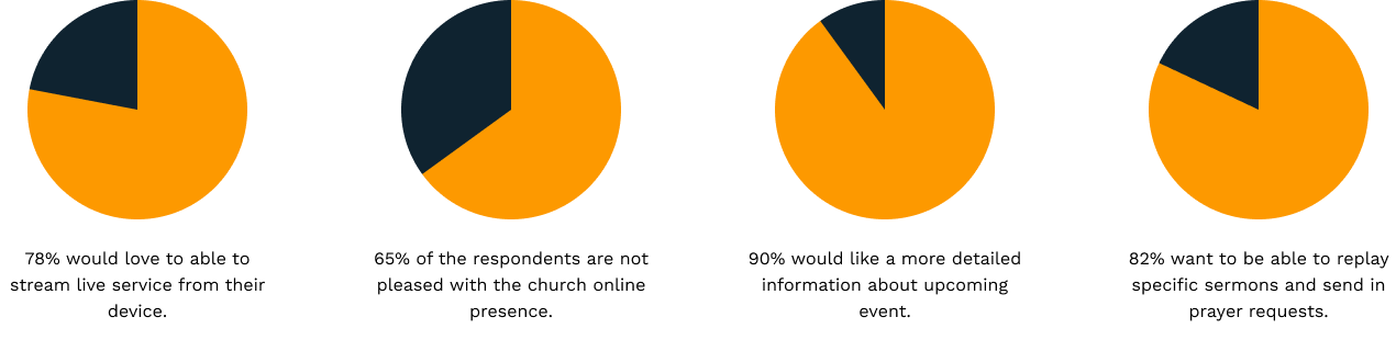
I reviewed the existing site's analytics alongside the interviews, and the picture was consistent: very few people were using it, including members of the church itself. That was the problem the leadership most wanted solved, since a site nobody visits cannot do anything for an organisation trying to grow.
Three things explained it. People wanted sermons they could watch later, on their own schedule, rather than only live. Almost everyone was arriving on a phone, and the existing site did not work properly on one. And the information people needed most, service times, location and what is on this week, took the most effort to find. Those three findings set the priorities for everything that followed.
Definition
With the research in hand I turned it into a plan: who the site is for, what each of those people is trying to do, and in what order the work would happen.
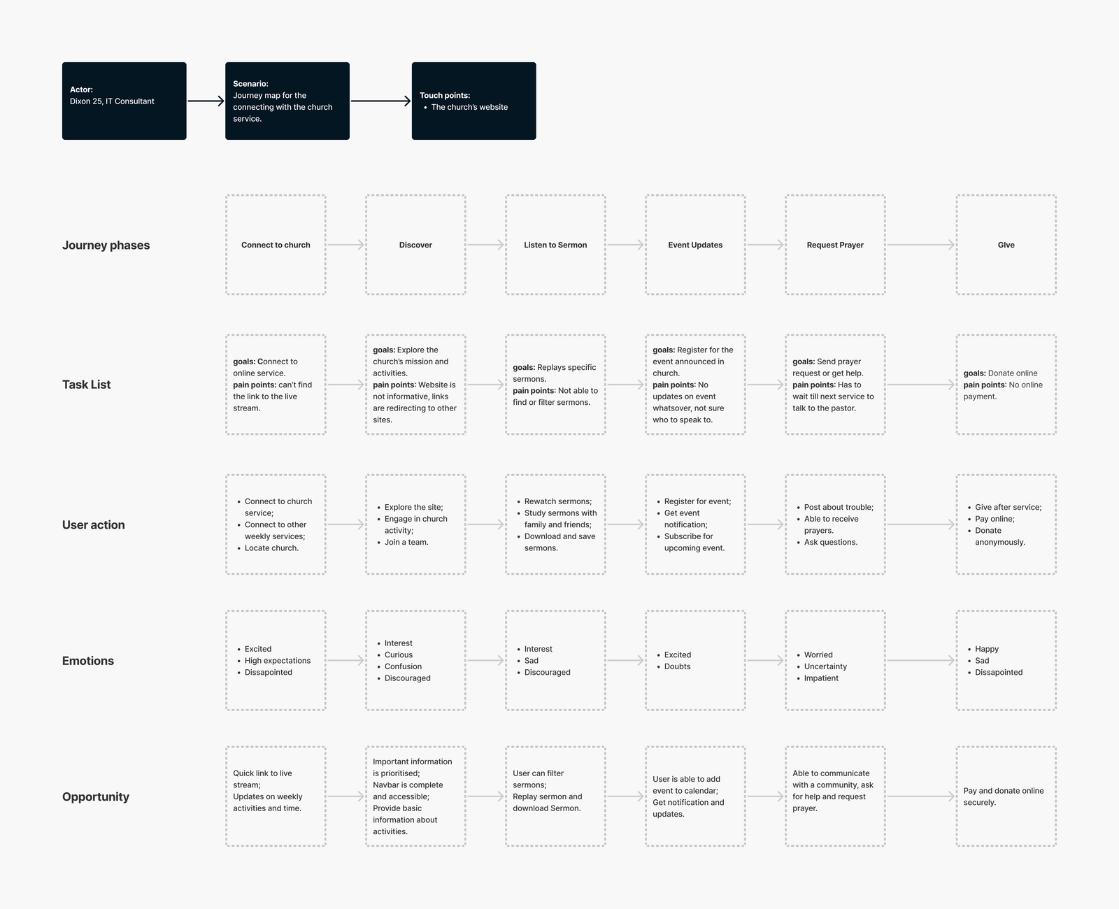
User journeys
I mapped the routes different people take through the site, because a first time visitor and a regular member want completely different things. Someone new needs to know what the church is, where it is and when to turn up. A member wants last Sunday's sermon or this week's events, and wants it in two taps. Laying both journeys out side by side showed that the homepage was trying to serve them with the same content, which is why neither was being served well.
Project roadmap
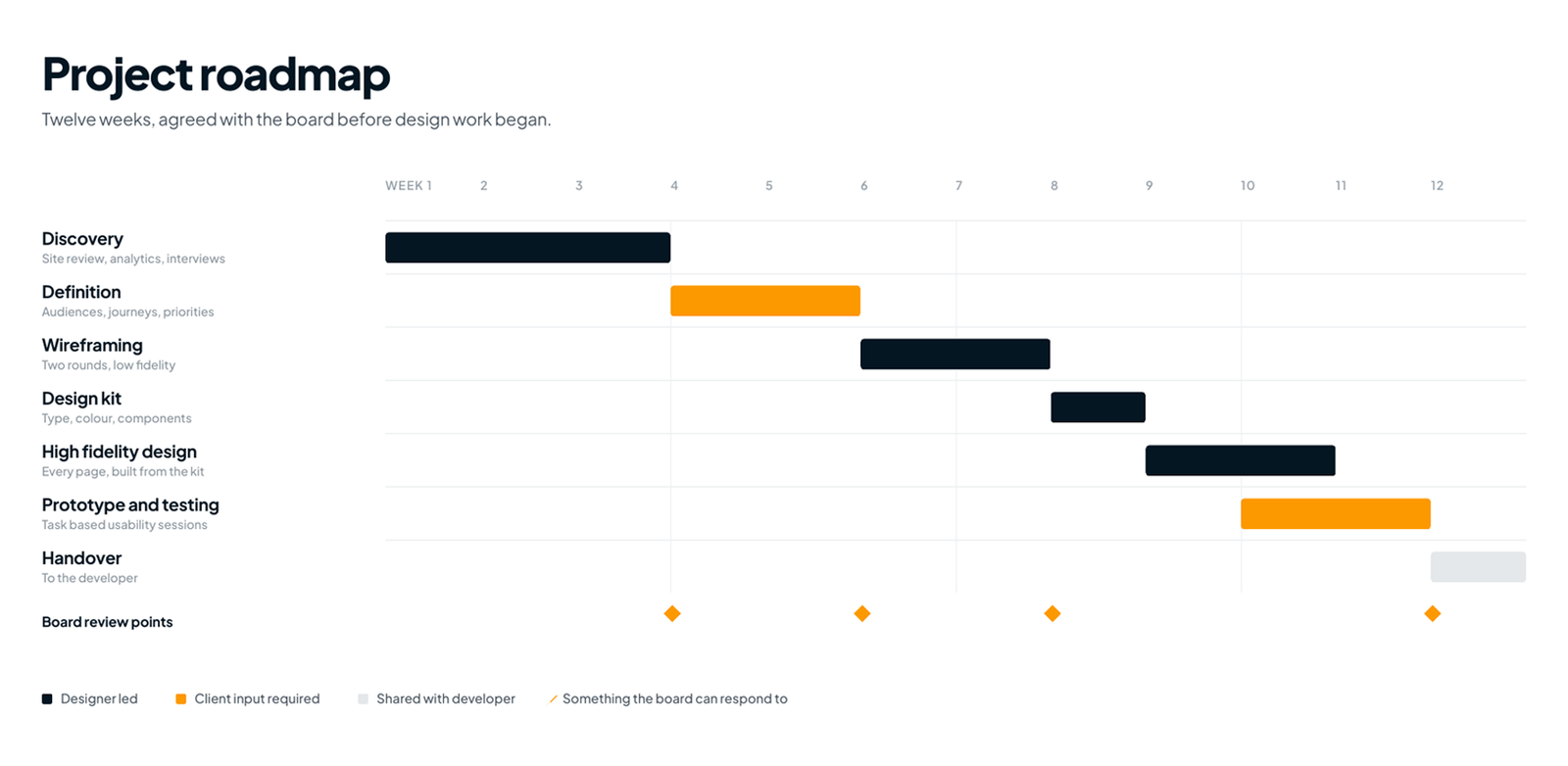
I also set out the sequence of the work with dates attached: wireframes, visual design, prototype, testing, then handover to the developer. With a small volunteer led organisation, agreeing this early is what stops a project drifting, because everyone can see what is coming and when their input is needed.
Design
This is where the research turned into an actual site. I worked in order: structure first, then the visual language, then the finished pages, testing at each stage rather than at the end.
The organising decision was to build the homepage around the two audiences the journeys had separated, giving each a clear route from the top of the page rather than one block of content serving neither.
Sermons moved to the centre of the site rather than sitting under a menu, since watching on demand was the most requested thing in research. Everything else was reorganised around what people actually came for, and a large amount of accumulated content was cut rather than rearranged.
Wireframing
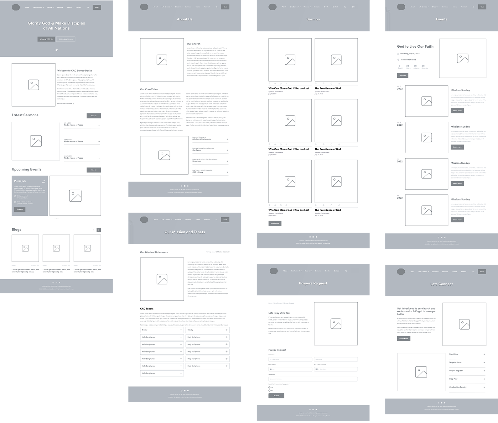
I ran two rounds of low fidelity layouts, testing different approaches to the navigation to see which one people could follow without being told. The first round put everything in a single main menu, which tested badly because the list got long enough that people stopped reading it. The second grouped pages under a smaller number of headings and tested well. I worked in grey boxes throughout, which kept the church's feedback on whether the structure made sense rather than on colours we had not chosen yet.
What testing changed
- Navigation regrouped. The two failing tasks were both buried in menus, so the routes people hunt for were surfaced rather than nested.
- Event information moved up. The date, time and location now sit at the top of an event rather than after the description.
- A search bar was added to the sermons page. People were looking for a specific talk or speaker, not browsing.
Design kit
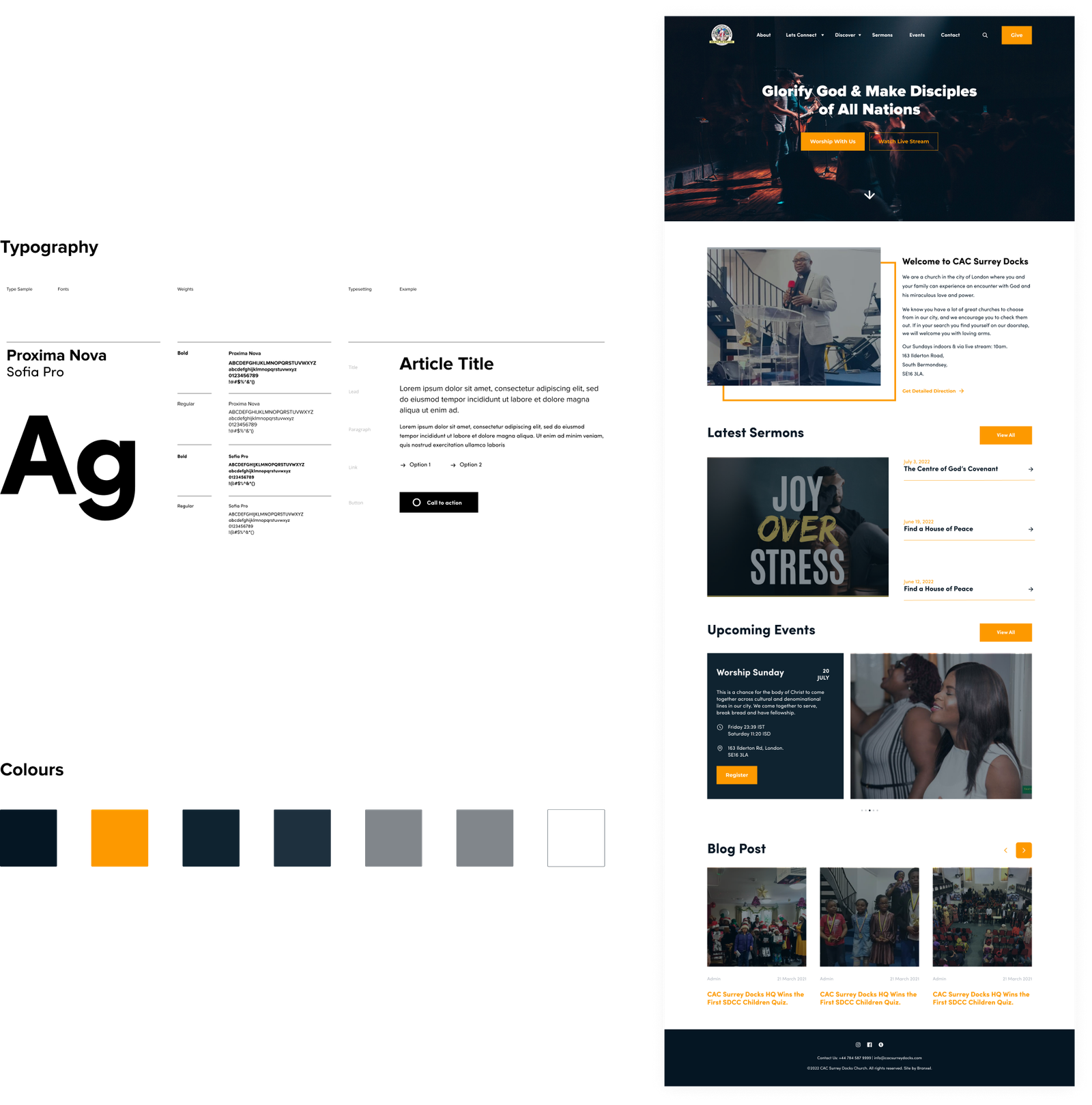
Once the structure held up I built the visual language: typefaces, a colour palette and a set of reusable components for buttons, cards, event listings and sermon items. The palette is anchored on a deep navy with a single warm accent, so the base stays calm and one colour always means the same thing, which makes a call to action recognisable wherever it appears. The old site had used different colours on different pages, so this was as much a fix as a decision. Building it as a kit rather than page by page meant the developer had one set of components to work from, and any page added later would still look like part of the same organisation.
High fidelity designs
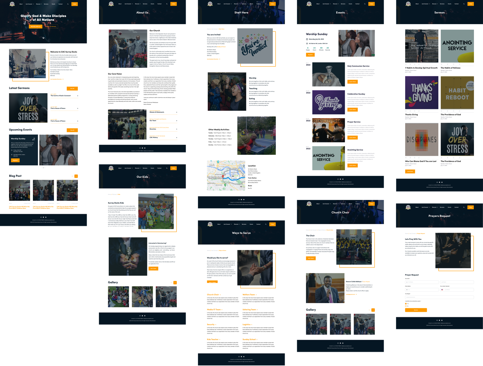
I produced the finished designs for every page from the kit, then built them into a clickable prototype so the board could move through the site as a visitor would rather than look at flat pictures. That matters with a client who does not read design work for a living: people who cannot tell you what they think of a static page will tell you immediately when something does not behave as they expected. Those sessions gave me the last round of changes before handover.
Usability testing
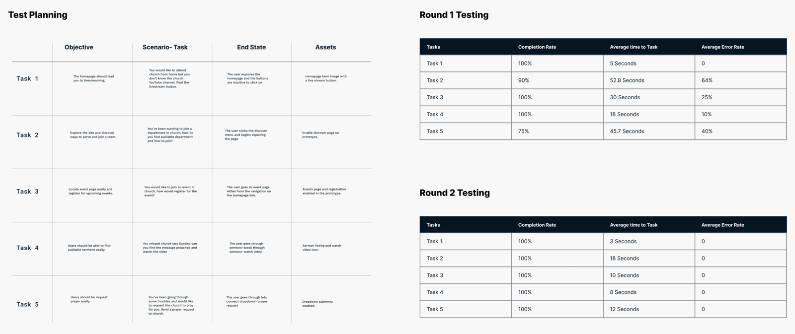
I wrote a test plan first, five tasks, each with an objective, the scenario the person was given, the route they should end up taking, and the assets the prototype needed for it to be testable. Find the livestream from the homepage. Find a department and work out how to join a team. Find an event and register for it. Find last Sunday’s sermon and watch it. Send a prayer request.
For each one I recorded completion rate, average time and error rate, which turns hesitation into something you can act on rather than a vague impression. Two tasks failed. Finding a department took 52.8 seconds with a 64% error rate, and sending a prayer request completed only 75% of the time with a 40% error rate. Both were buried in menus, which is the same problem the first round of wireframes had.
The fix was structural rather than cosmetic: fewer top level headings, with the routes people were hunting for surfaced instead of nested. In the second round every task completed at 100% with no errors recorded, and finding a department dropped from 52.8 seconds to 18.
Outcome
By the second round of testing every task completed, with no errors recorded. Finding a department, the task that had taken 52.8 seconds with a 64% error rate, took 18 seconds. That is the evidence the structure works, and it is what the board signed off on, which for an organisation that had lived with the old site for years mattered more than any presentation would have.
What the redesign gives the church is something its old site could not: a clear front door for people who have never been, and a fast route to sermons and service times for the people who come every week.
I handed over annotated designs setting out how each element should behave, along with documentation explaining the reasoning behind the decisions. The site is being built now and I have stayed involved through that, checking what gets made against the intent and resolving anything that turns out to be impractical. Design that ignores what is buildable only creates work for someone else.
The old site’s analytics give the baseline, and very few people were using it, members included. Once the build is live we will track visits against that, sermon views, mobile behaviour, and whether people reach service times and events without searching.